More on resamples

Machine Learning with caret in R

Zach Mayer

Data Scientist at DataRobot and co-author of caret
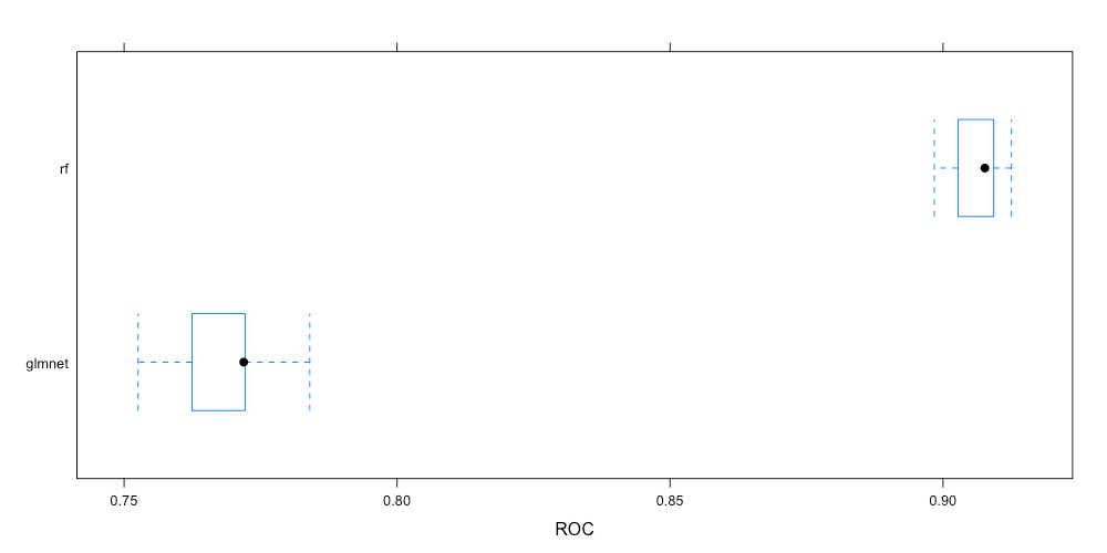
Comparing models

  • Resamples has tons of cool methods
  • One of my favorite functions (thanks Max!)
  • Inspired the caretEnsemble package
Machine Learning with caret in R

Box-and-whisker

bwplot(resamps, metric = "ROC")
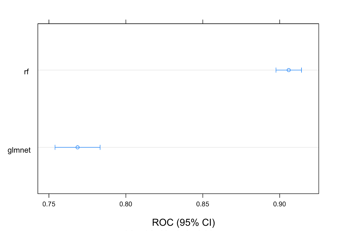
The image shows a box and whisker plot of the resamples. The distribution of ROC is much higher for the random forest model compared to the glmnet model.

Machine Learning with caret in R

Dot plot

dotplot(resamps, metric = "ROC")
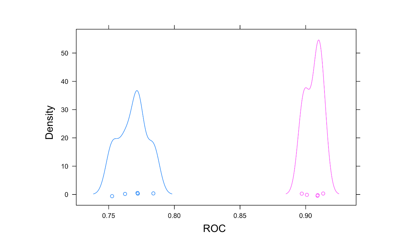
The image shows a dotplot of the resamples. This provides similar information to the box and whisker plot, but you only see the mean and confidence interval of ROC for each model type.

Machine Learning with caret in R

Density plot

densityplot(resamps, metric = "ROC")
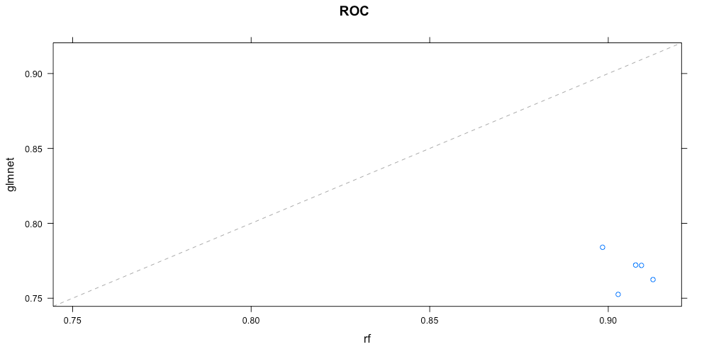
The image shows probability density curves of the ROC for the resamples of each model.

Machine Learning with caret in R

Scatter plot

xyplot(resamps, metric = "ROC")
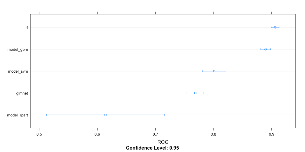
The image shows a scatter plot of the area under the curve scores for glmnet versus random forest. Each point corresponds to one resample.

Machine Learning with caret in R

Another dot plot

dotplot(lots_of_models, metric = "ROC")

The image shows a dotplot of model type versus ROC. The plot demonstrates that dotplots scale really well to displaying many model types.

Machine Learning with caret in R

Let’s practice!

Machine Learning with caret in R

Preparing Video For Download...