Introducing the ROC curve

Machine Learning with caret in R

Zach Mayer

Data Scientist at DataRobot and co-author of caret

The challenge

  • Many possible classification thresholds
  • Requires manual work to choose
  • Easy to overlook a particular threshold
  • Need a more systematic approach
Machine Learning with caret in R

ROC curves

  • Plot true/false positive rate at every possible threshold
  • Visualize tradeoffs between two extremes (100% true positive vs. 0% false positive)
  • Result is an ROC curve
  • Developed as a method for analyzing radar signals
Machine Learning with caret in R

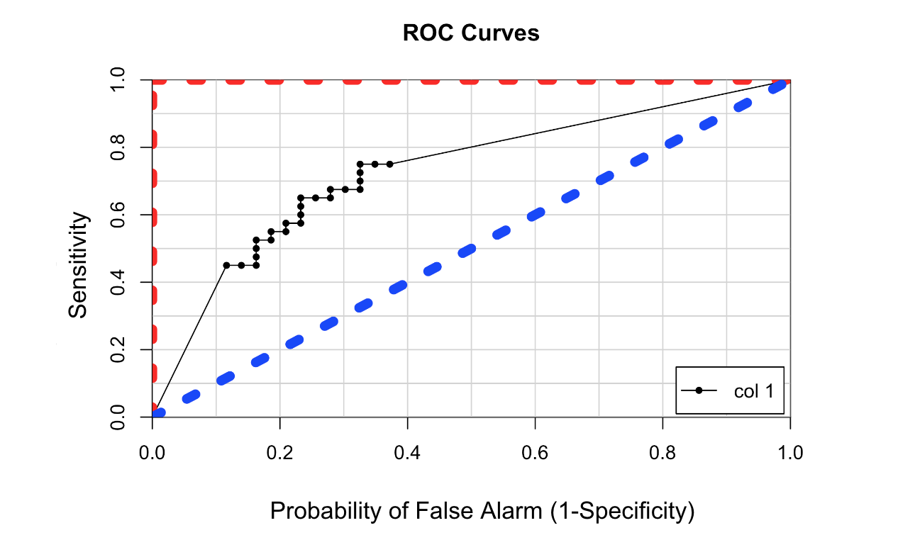
An example ROC curve

# Create ROC curve
library(caTools)
colAUC(p, test[["Class"]], plotROC = TRUE)

The image contains an example ROC curve, which is a line plot of the true positive rate versus the false positive rate

Machine Learning with caret in R

Let's practice!

Machine Learning with caret in R

Preparing Video For Download...