Cohort analysis visualization
Customer Segmentation in Python

Karolis Urbonas
Head of Data Science, Amazon
Heatmap
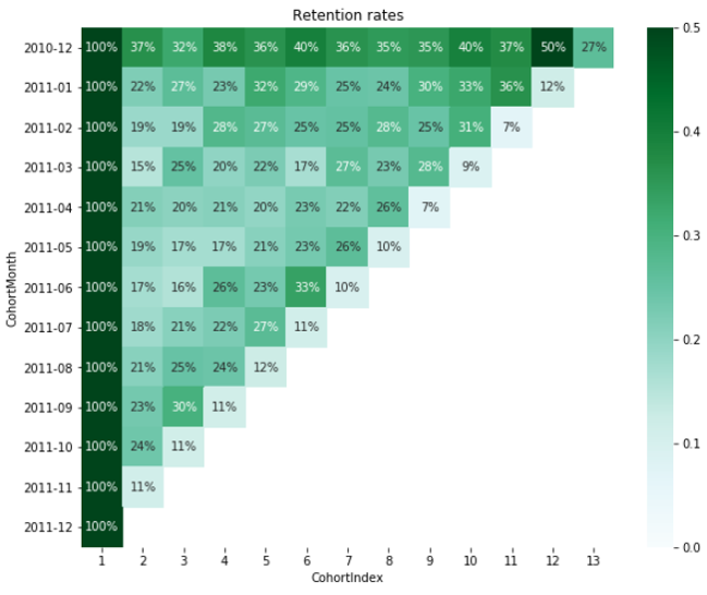
Easiest way to visualize cohort analysis
Includes both data and visuals
Only few lines of code with
seaborn

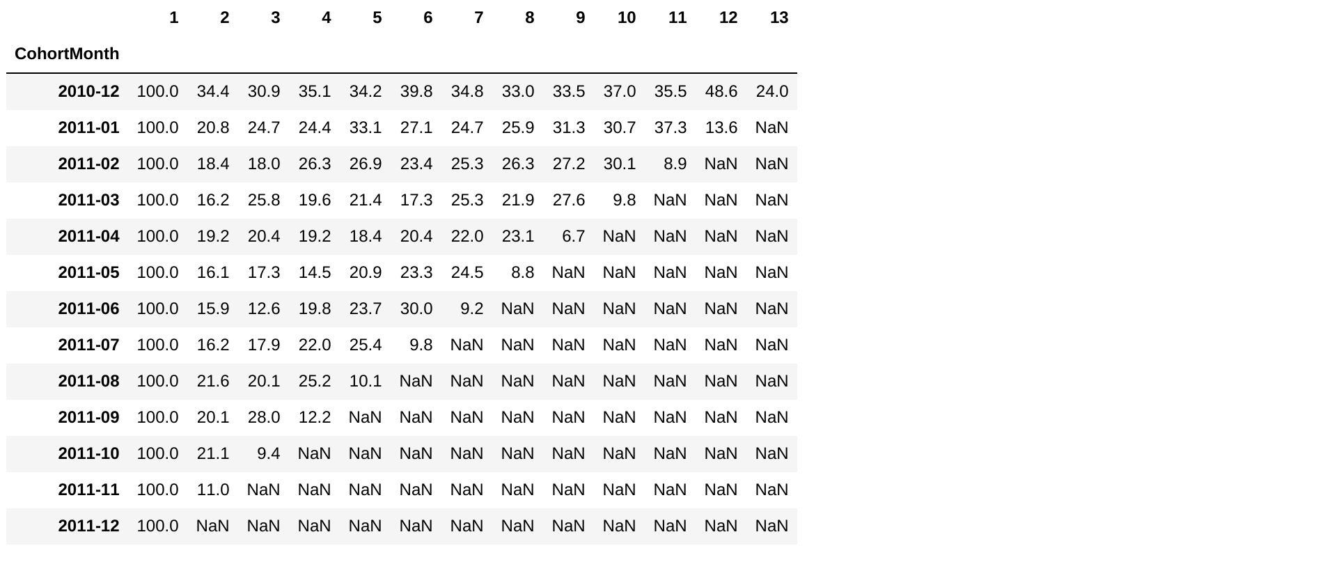
Load the retention table
retention.round(3)*100

Build the heatmap
import seaborn as sns import matplotlib.pyplot as pltplt.figure(figsize=(10, 8))plt.title('Retention rates')sns.heatmap(data = retention, annot = True, fmt = '.0%', vmin = 0.0, vmax = 0.5, cmap = 'BuGn')plt.show()
Retention heatmap

Practice visualizing cohorts
Customer Segmentation in Python

