Graphical visualizations in R using ggplot2

R For SAS Users

Melinda Higgins, PhD

Research Professor/Senior Biostatistician Emory University

ggplot2 package

ggplot2 hexsticker logo

  • ggplot2 is a powerful graphics package for R
  • "GG" in ggplot stands for the "grammar of graphics"
  • ggplot2 uses a layering approach to build graphics
  • One or more geometric objects are added to the base graphics layer
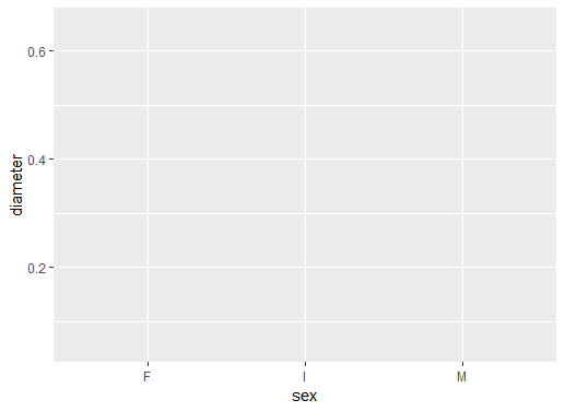
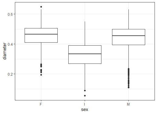
R For SAS Users

Layers - base layer

# Create plot for x=sex and y=diameter
ggplot(data = abalone, aes(sex, diameter))
  • Define base layer with ggplot()
  • Set data = abalone
  • Set aes to sex and diameter

  • No graphical objects in the plot yet

  • x-axis is ready for sex
  • y-axis is ready for diameter
  • grid is laid out

ggplot2 graphic environment no boxplot yet

R For SAS Users

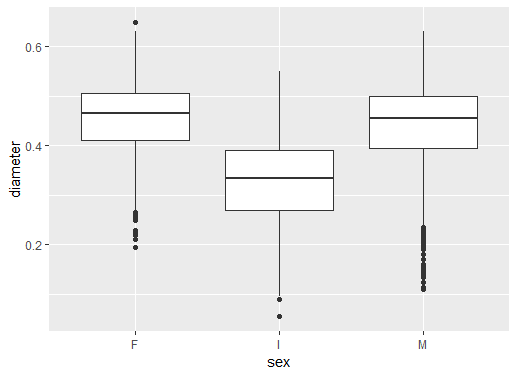
Layers - add boxplot geom

# Add boxplot geometric object or geom
ggplot(data = abalone,
       aes(sex, diameter)) +
  geom_boxplot()
  • Plus operator + adds layer
  • Boxplot geom_boxplot() added

  • Result is series of boxplots

  • Abalone diameters by sex
  • F females, I infants, and M males

ggplot2 boxplots added

R For SAS Users

Layers - add a theme

# Add black white theme
ggplot(data = abalone,
       aes(sex, diameter)) +
  geom_boxplot() +
  theme_bw()
  • Add "theme" layer using theme_bw()
  • Removes grey background
  • Draws black box around the plot

ggplot2 boxplot black white theme added

R For SAS Users

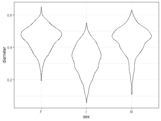
Change boxplot geom to violin geom

# Change to geom_violin()
ggplot(data = abalone,
       aes(sex, diameter)) +
  geom_violin() +
  theme_bw()
  • geom_violin replaces geom_boxplot
  • Creates a shape similar to a violin
  • Reflects data density distribution
  • Simple change to make new figure

ggplot2 violin plot

R For SAS Users

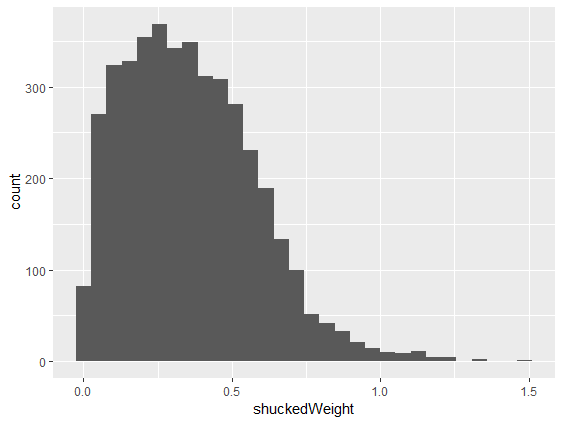
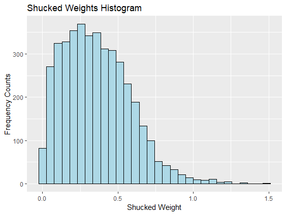
Single variable histogram

# Make histogram of shuckedWeight
ggplot(abalone, aes(shuckedWeight)) +
  geom_histogram()
  • Create a histogram for one variable
  • One variable = one aesthetic
  • Add geom_histogram()
  • Set aes() to shuckedWeight
  • Default colors need changing

ggplot2 histogram all black

R For SAS Users

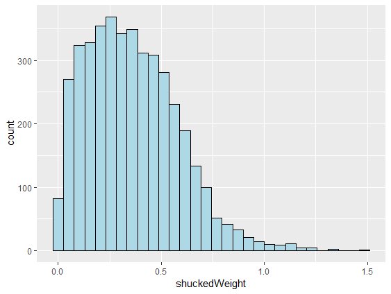
Histogram add colors

# Make lines black and fill light blue
ggplot(abalone, aes(shuckedWeight)) +
  geom_histogram(color = "black",
                 fill = "lightblue")
  • Change graphical parameters
  • Set color of bin lines
  • Set fill color for bins
  • Each option is set inside the ()
  • Histogram looks much better

ggplot2 histogram with blue bars and black lines around bars

R For SAS Users

Histogram add title and axis labels
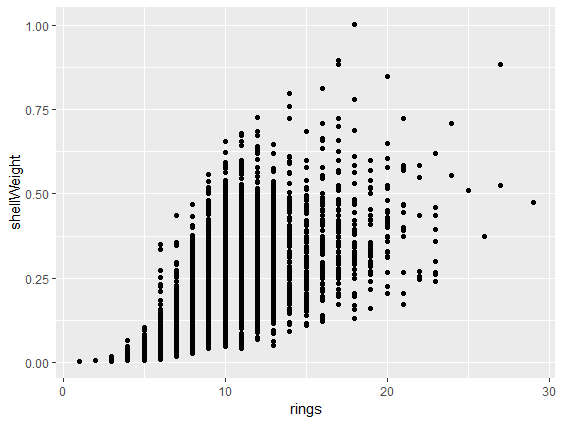
# Add x, y axis labels and title
ggplot(abalone, aes(shuckedWeight)) +
  geom_histogram(color = "black",
                 fill = "lightblue") +
  xlab("Shucked Weight") +
  ylab("Frequency Counts") +
  ggtitle("Shucked Weights Histogram")
  • Add better labels for axes and title
  • Use xlab() and ylab() for axes
  • Use ggtitle() for title
  • This figure is ready to publish!

ggplot2 hitogram axis labels and title added

R For SAS Users

Make scatterplot

# Make scatterplot with geom_point()
ggplot(abalone,
       aes(rings, shellWeight)) +
  geom_point()
  • A scatterplot aes needs two variables
  • geom_point() adds the points
  • Scatterplot of shell weights by rings

ggplot2 scatterplot of shellweight by rings

R For SAS Users

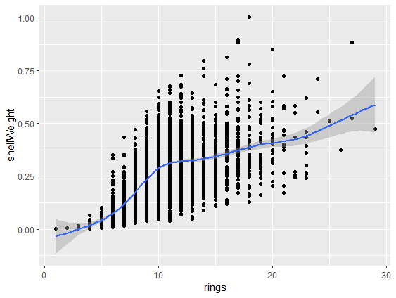
Scatterplot add smoothed fit line

# Add smoothed fit line
ggplot(abalone,
       aes(rings, shellWeight)) +
  geom_point() +
  geom_smooth()
  • To scatterplot, add geom_smooth() line
  • Includes shaded confidence area

ggplot2 scatterplot with smoothed fit line added

R For SAS Users

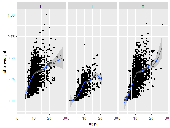
Create panels by another variable

# Add panels using facet_wrap()
ggplot(abalone,
       aes(rings, shellWeight)) +
  geom_point() +
  geom_smooth() +
  facet_wrap(vars(sex))
  • Add one more layer to scatterplot
  • Create panels for each abalone sex
  • Add facet_wrap() layer
  • vars(sex) defines variable for panels

ggplot2 scatterplot with 3 panels by sex

R For SAS Users

Rest of course

  • Chapter 1 finishes with brief introduction to graphics
    • ggplot2 graphical skills foundation
    • visualize abalone measurements by sex
  • Chapter 2 teaches data wrangling skills
    • clean up abalone dataset
  • Chapter 3 teaches data exploration methods
    • descriptive statistics, correlations and comparison tests
  • Chapter 4 teaches modeling and results presentation
    • predict abalone ages by measurements
    • explore models by sex
R For SAS Users

Let's make some plots for abalones

R For SAS Users

Preparing Video For Download...