Quantitative comparisons: scatter plots

Introduction to Data Visualization with Matplotlib

Ariel Rokem

Data Scientist

Introducing scatter plots
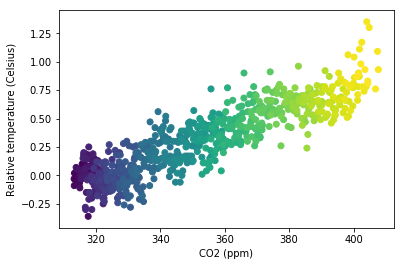
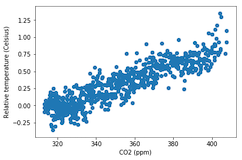
fig, ax = plt.subplots()

ax.scatter(climate_change["co2"], climate_change["relative_temp"])
ax.set_xlabel("CO2 (ppm)") ax.set_ylabel("Relative temperature (Celsius)") plt.show()

Introduction to Data Visualization with Matplotlib

Customizing scatter plots

eighties = climate_change["1980-01-01":"1989-12-31"]
nineties = climate_change["1990-01-01":"1999-12-31"]

fig, ax = plt.subplots()
ax.scatter(eighties["co2"], eighties["relative_temp"], color="red", label="eighties")
ax.scatter(nineties["co2"], nineties["relative_temp"], color="blue", label="nineties")
ax.legend() ax.set_xlabel("CO2 (ppm)") ax.set_ylabel("Relative temperature (Celsius)") plt.show()
Introduction to Data Visualization with Matplotlib

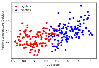
Encoding a comparison by color

Introduction to Data Visualization with Matplotlib

Encoding a third variable by color

fig, ax = plt.subplots()

ax.scatter(climate_change["co2"], climate_change["relative_temp"], c=climate_change.index)
ax.set_xlabel("CO2 (ppm)") ax.set_ylabel("Relative temperature (Celsius)") plt.show()
Introduction to Data Visualization with Matplotlib

Encoding time in color

Introduction to Data Visualization with Matplotlib

Practice making your own scatter plots!

Introduction to Data Visualization with Matplotlib

Preparing Video For Download...