The power of hue
Python for Spreadsheet Users

Chris Cardillo
Data Scientist
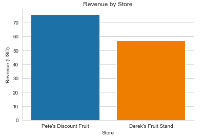
Our nice barplot
The Plot
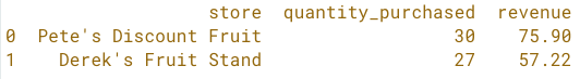
The Data Behind the Plot
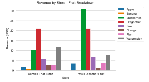
A more granular barplot
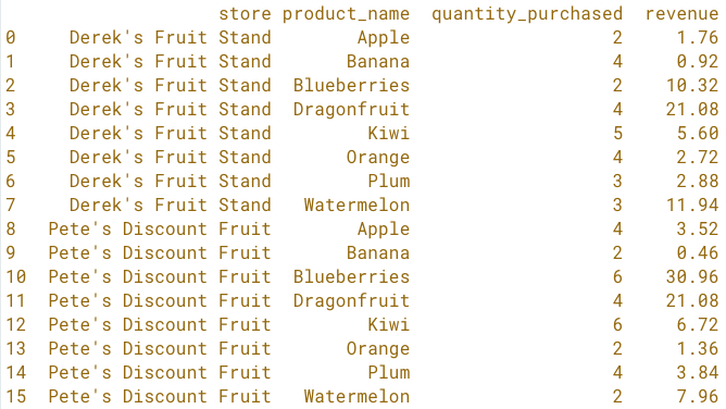
The Data Behind the New Plot
A more granular barplot
The Data Behind the New Plot
The New Plot
Hue
plt.legend()
All together

