Building up the barplot
Python for Spreadsheet Users

Chris Cardillo
Data Scientist
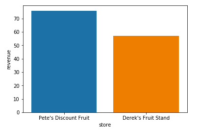
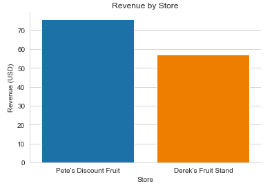
Previous barplot
sns.barplot(x='store', y='revenue', data=totals)

plt.show()
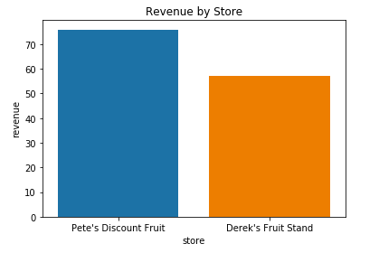
Adding labels
Adding a title with plt.title()
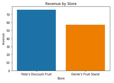
Adding an x-axis label with plt.xlabel()
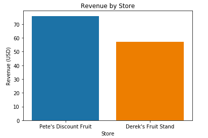
Adding an y-axis label with plt.ylabel()
Removing unwanted borders with sns.despine()

Adding style with sns.set_style()
Side by side
Before
After

