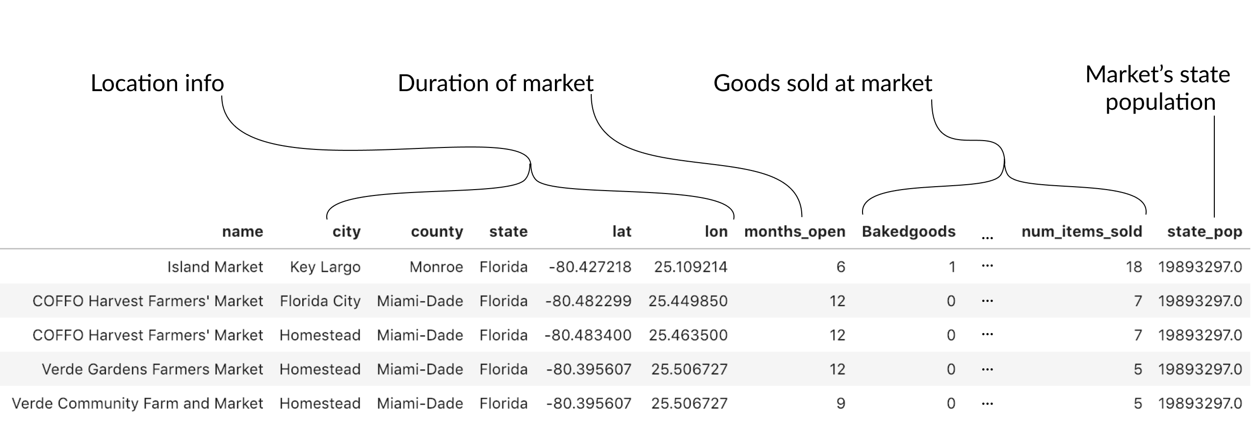
Looking at the farmers market data
Improving Your Data Visualizations in Python

Nick Strayer
Instructor
First explorations of a dataset

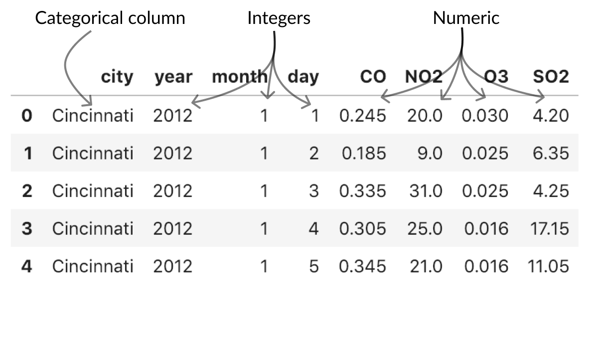
Using your head()
pollution.head()
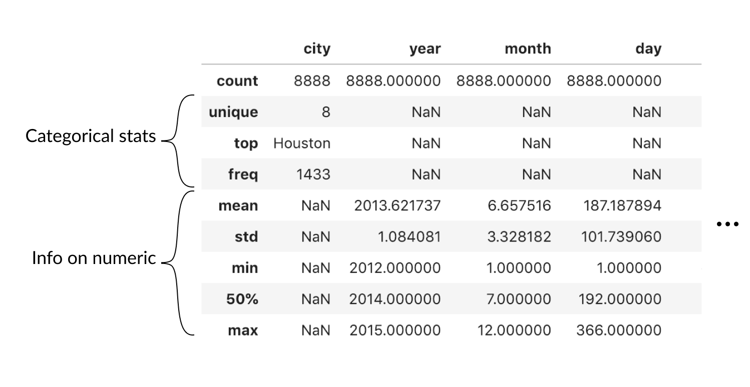
# Just show median
pollution.describe(percentiles=[0.5]
                   # Describe all columns
                   include='all')
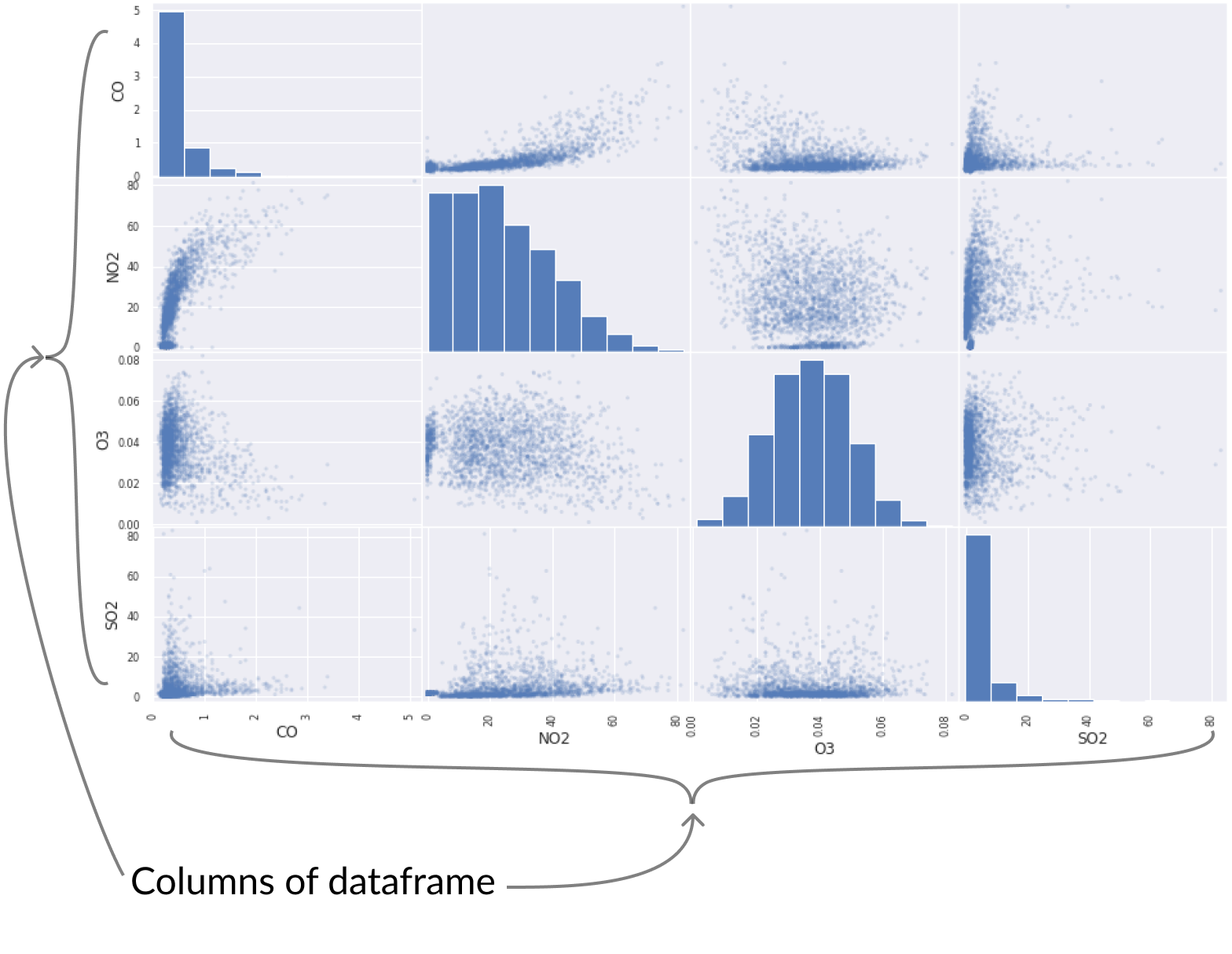
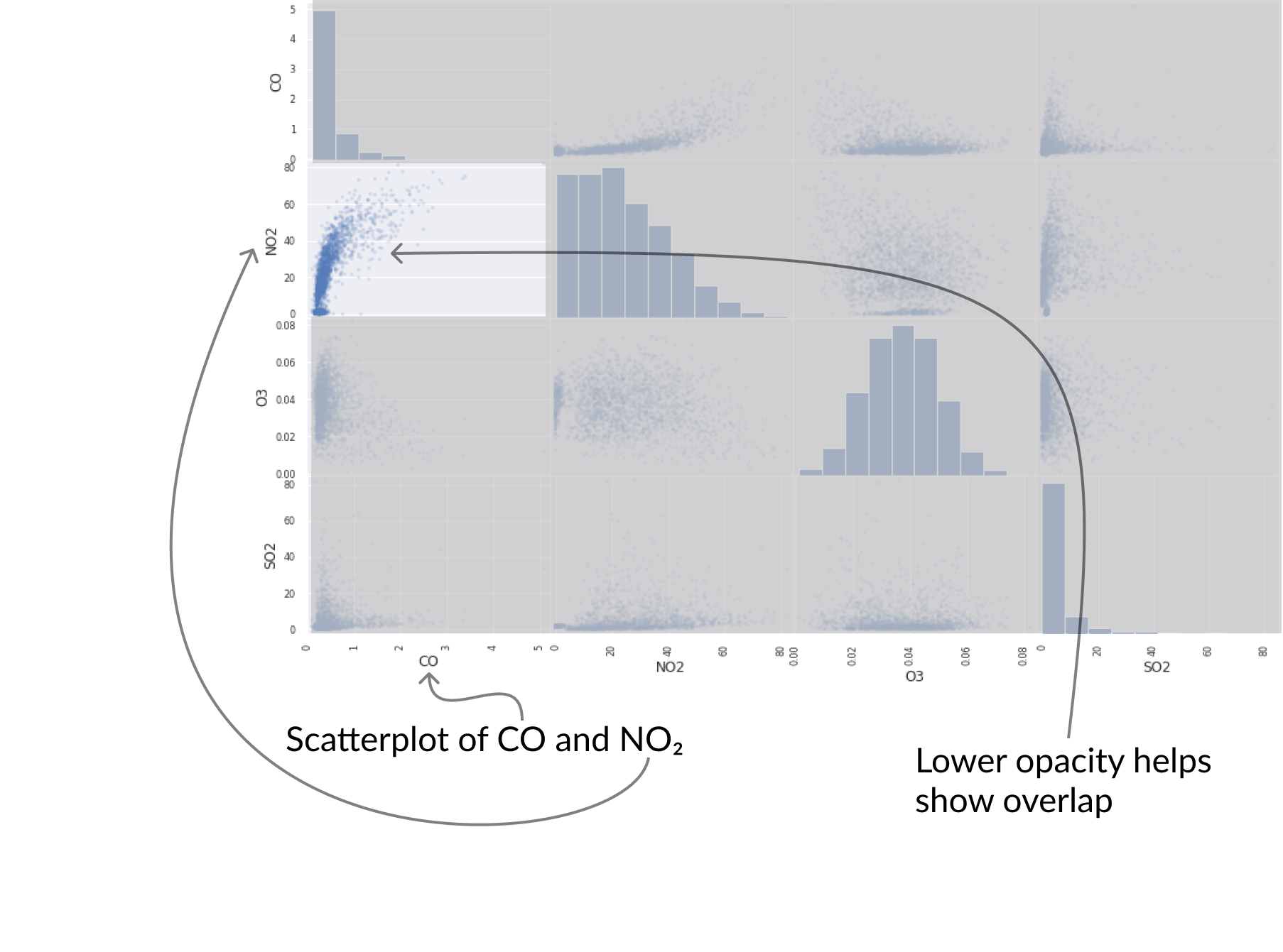
pd.plotting.scatter_matrix(pollution, alpha = 0.2);

markets.head()