Exploring the patterns
Improving Your Data Visualizations in Python

Nick Strayer
Instructor
Digging in deeper
Target audiences

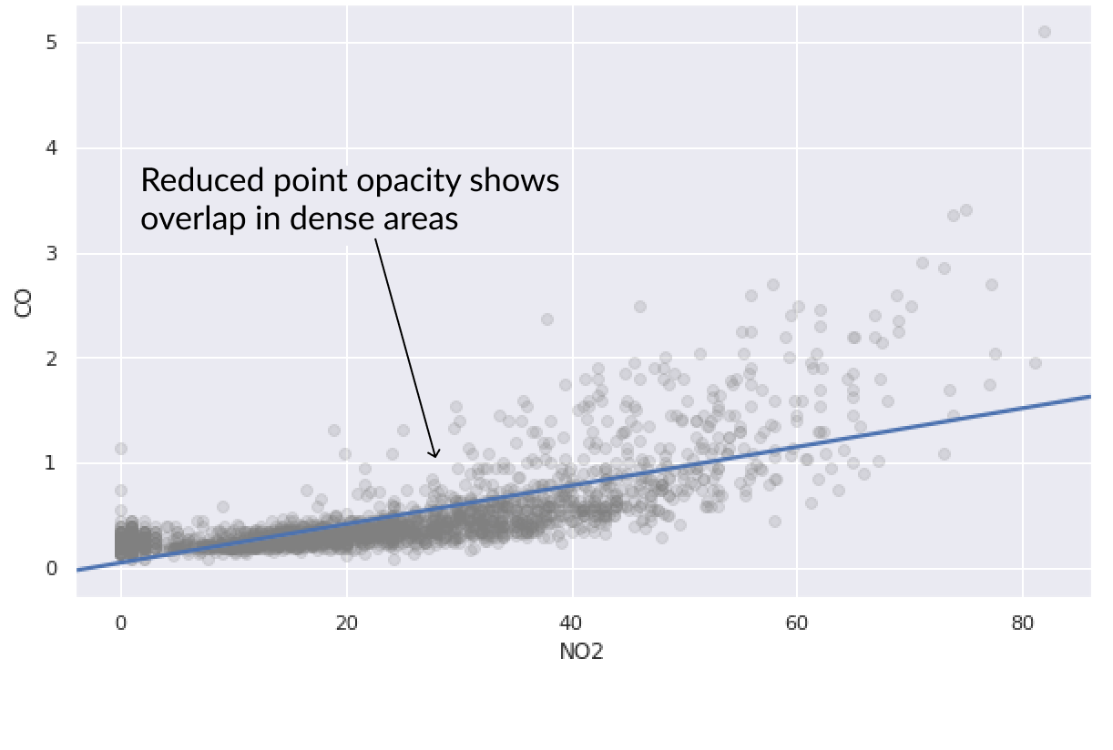
sns.regplot('NO2', 'CO', ci=False, data=pollution,# Lower opacity of points scatter_kws={'alpha':0.2, 'color':'grey'} )
Profiling patterns
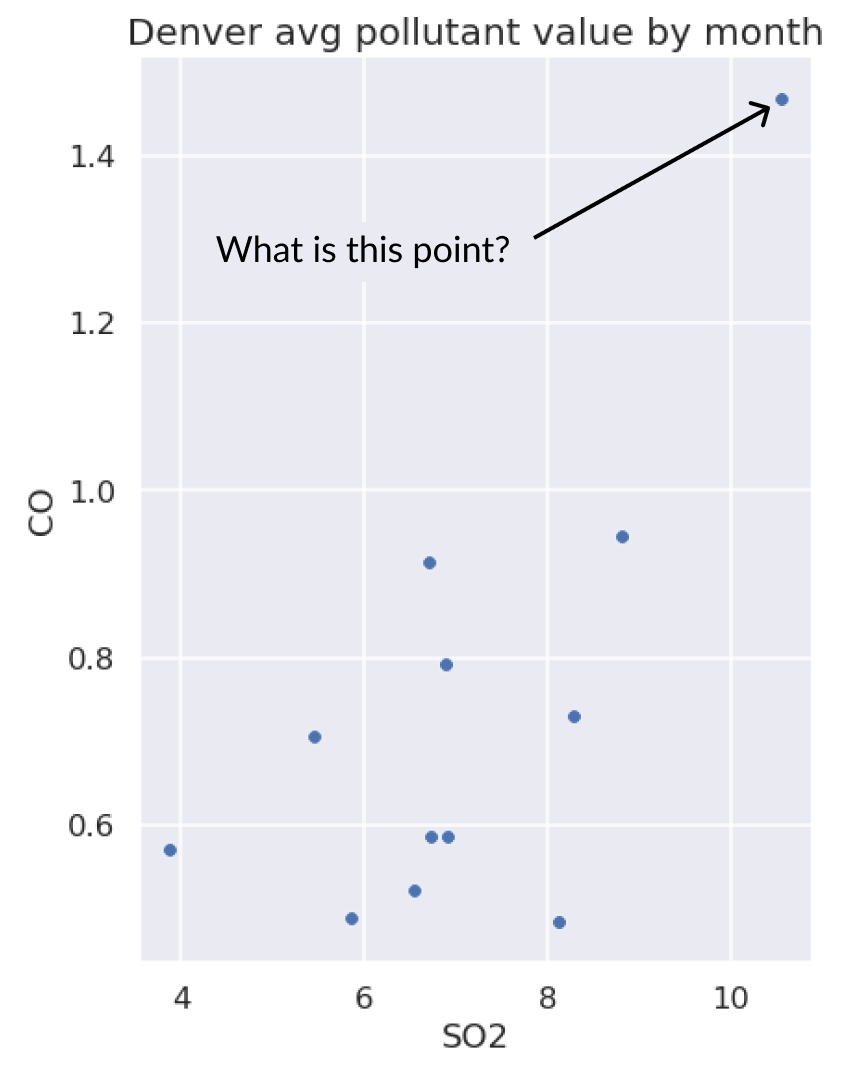
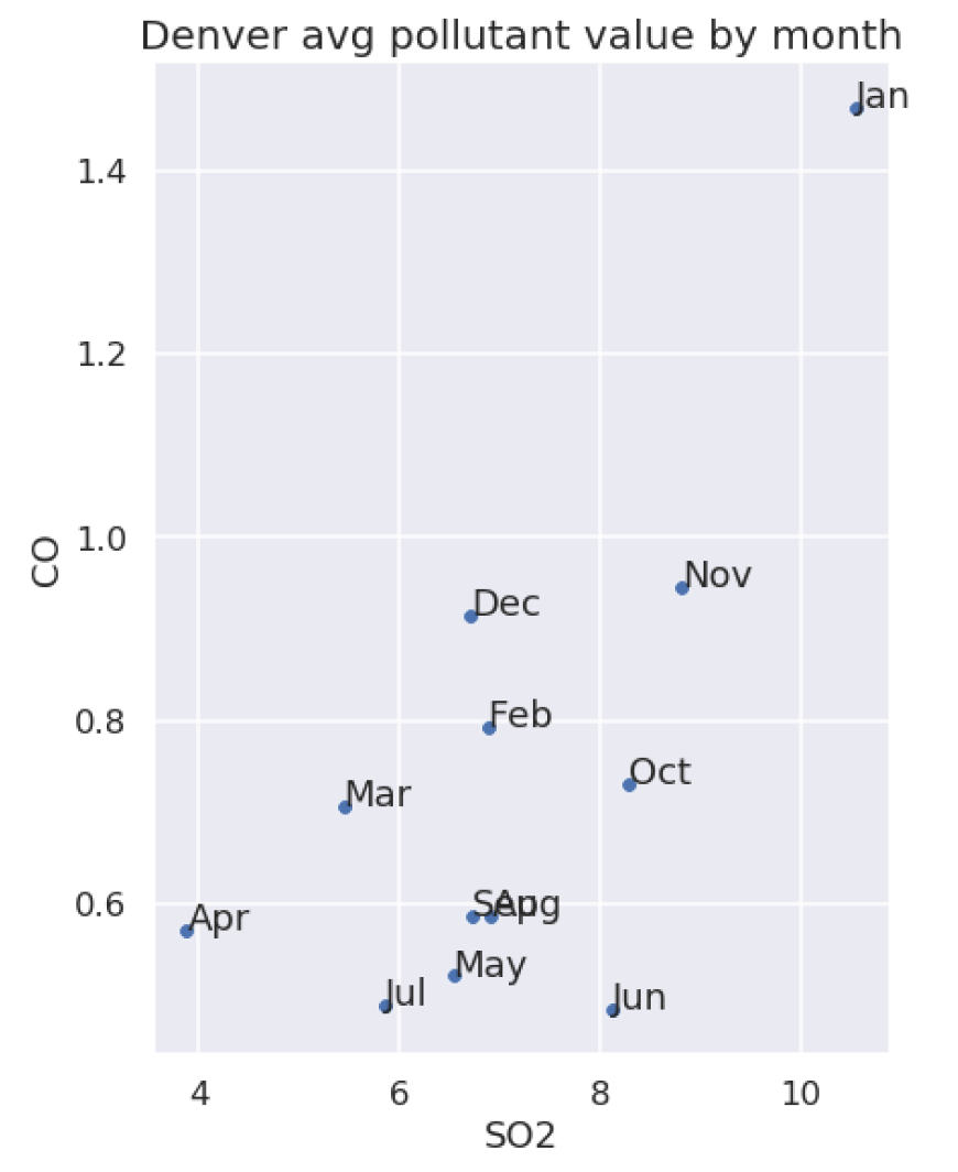
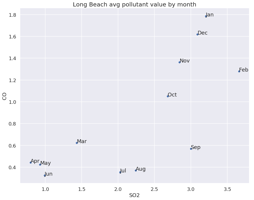
Using text scatters to id outliers