Annotations
Improving Your Data Visualizations in Python

Nick Strayer
Instructor
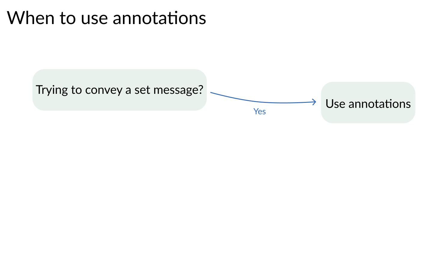
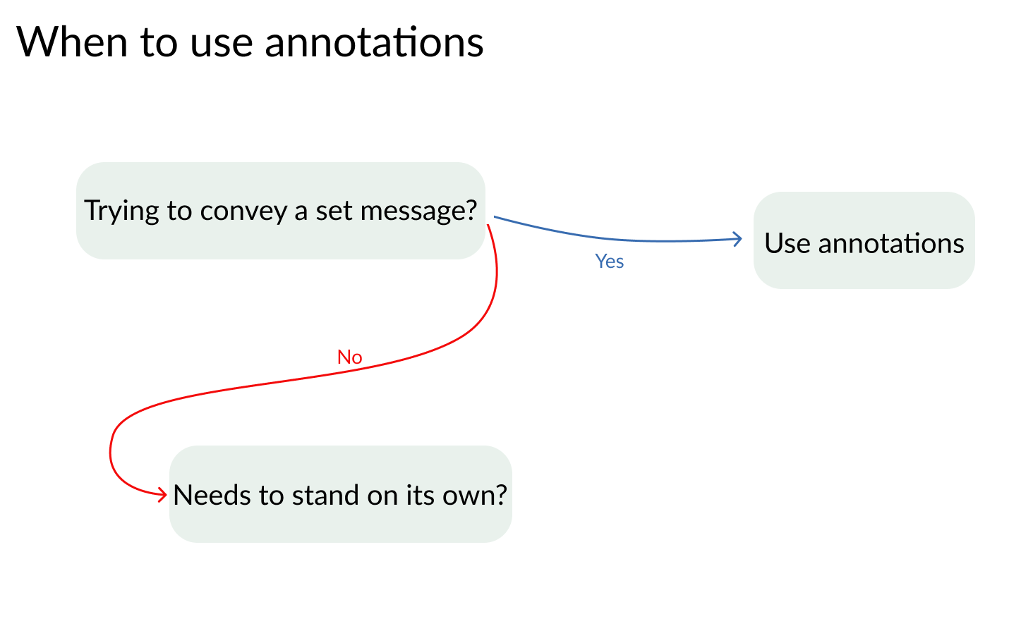
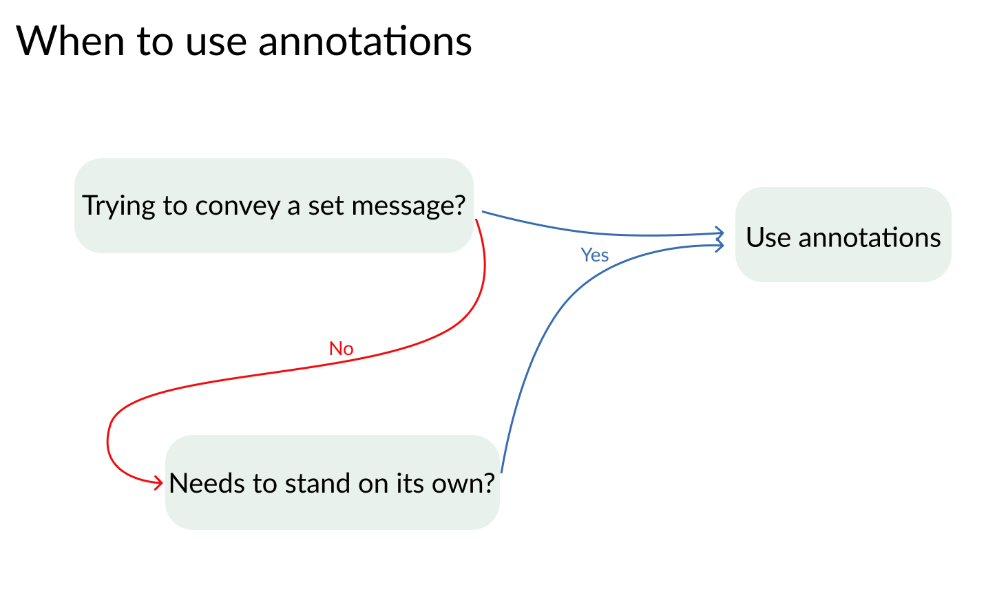
What annotations add
- Compact and efficient communication
- Opportunity to supply deeper insight to data
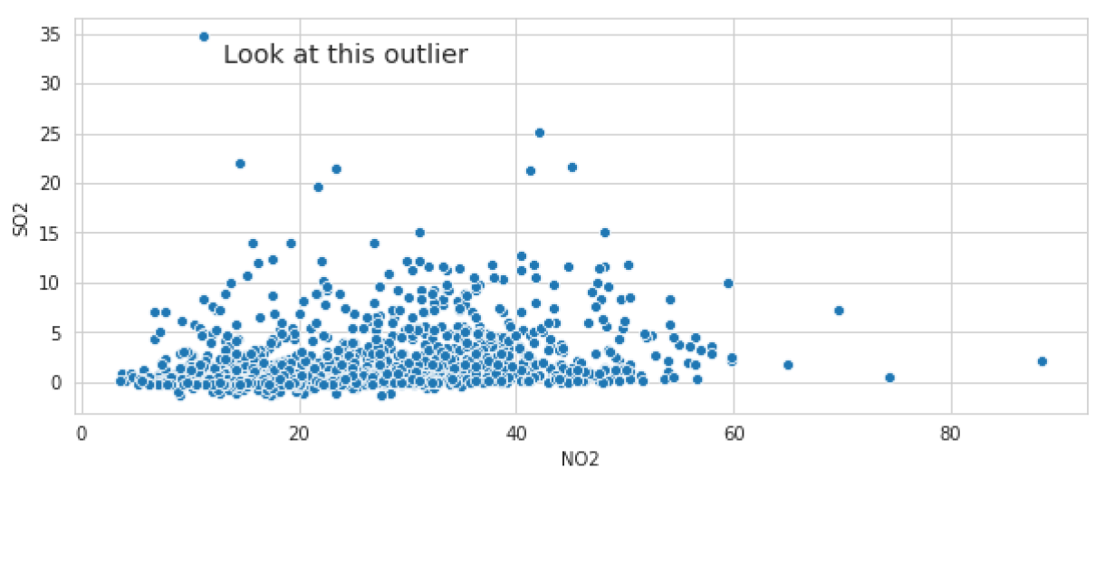
sns.scatterplot(x='NO2', y='SO2', data = houston_pollution)# X and Y location of outlier and text plt.text(13,33,'Look at this outlier', # Text properties for alignment and size. fontdict = {'ha': 'left', 'size': 'x-large'})
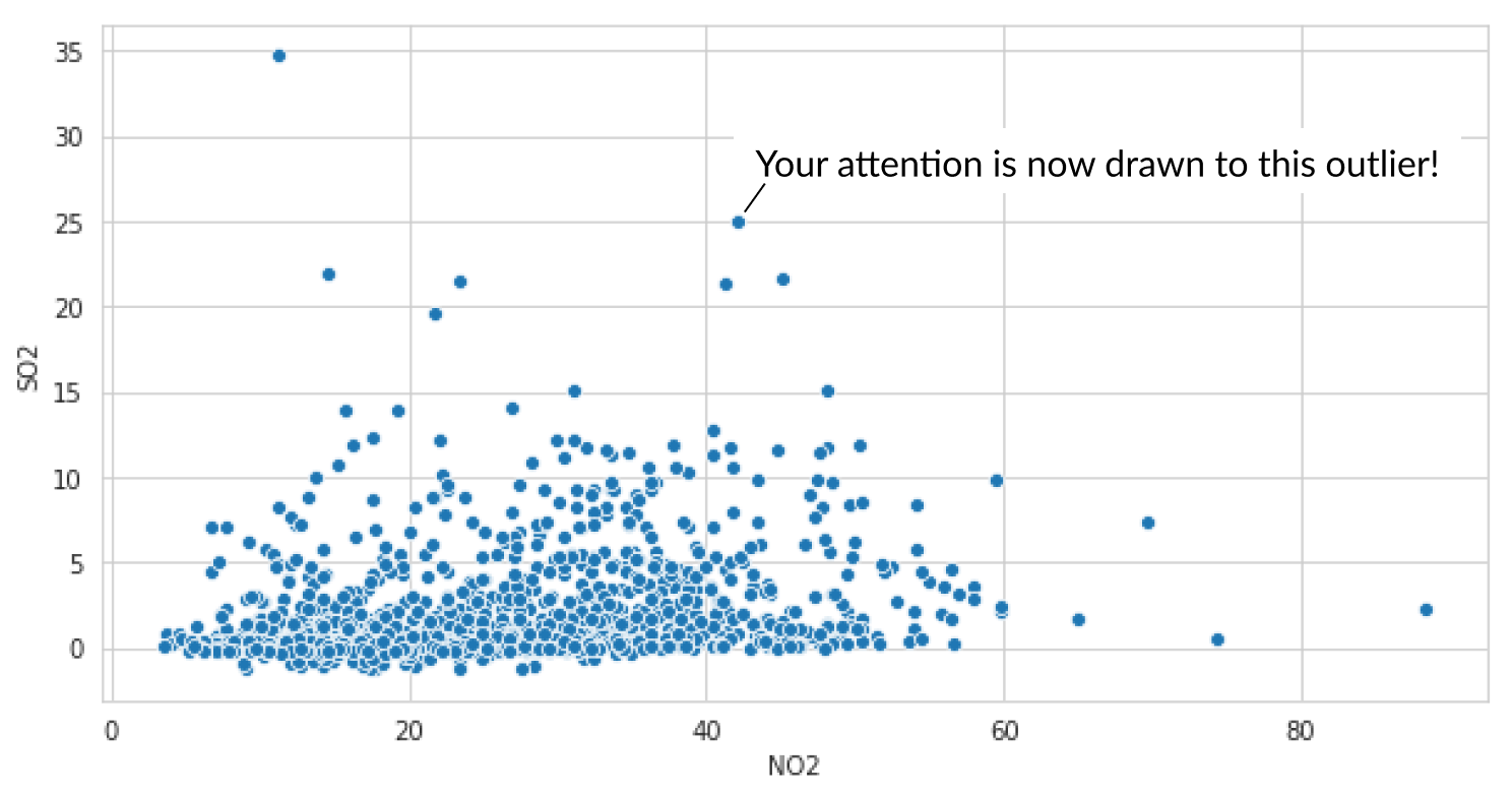
sns.scatterplot(x='NO2', y='SO2', data = houston_pollution)# Arrow start and annotation location plt.annotate('A buried point to look at', xy=(45.5,11.8), xytext=(60,22), # Arrow configuration and background box arrowprops={'facecolor':'grey', 'width': 3}, backgroundcolor = 'white' )
![]()

