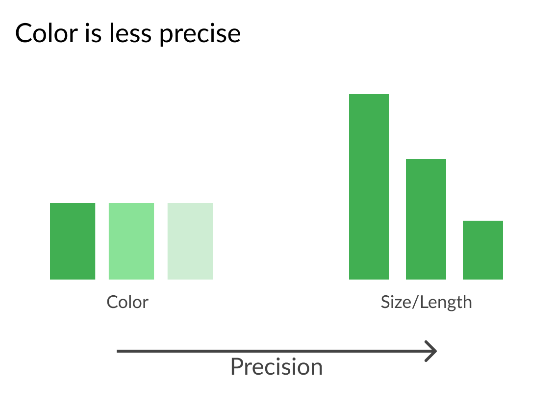
Continuous color palettes
Improving Your Data Visualizations in Python

Nick Strayer
Instructor
blue_scale = sns.light_palette("steelblue")
sns.palplot(blue_scale)
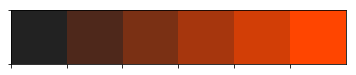
red_scale = sns.dark_palette("orangered")
sns.palplot(red_scale)
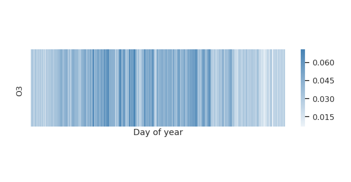
Keep it simple
indy_oct = pollution.query("year == 2015 & city == 'Indianapolis'")
blue_scale = sns.light_palette("steelblue", as_cmap = True)
sns.heatmap(indy_oct[['O3']], cmap = blue_scale)
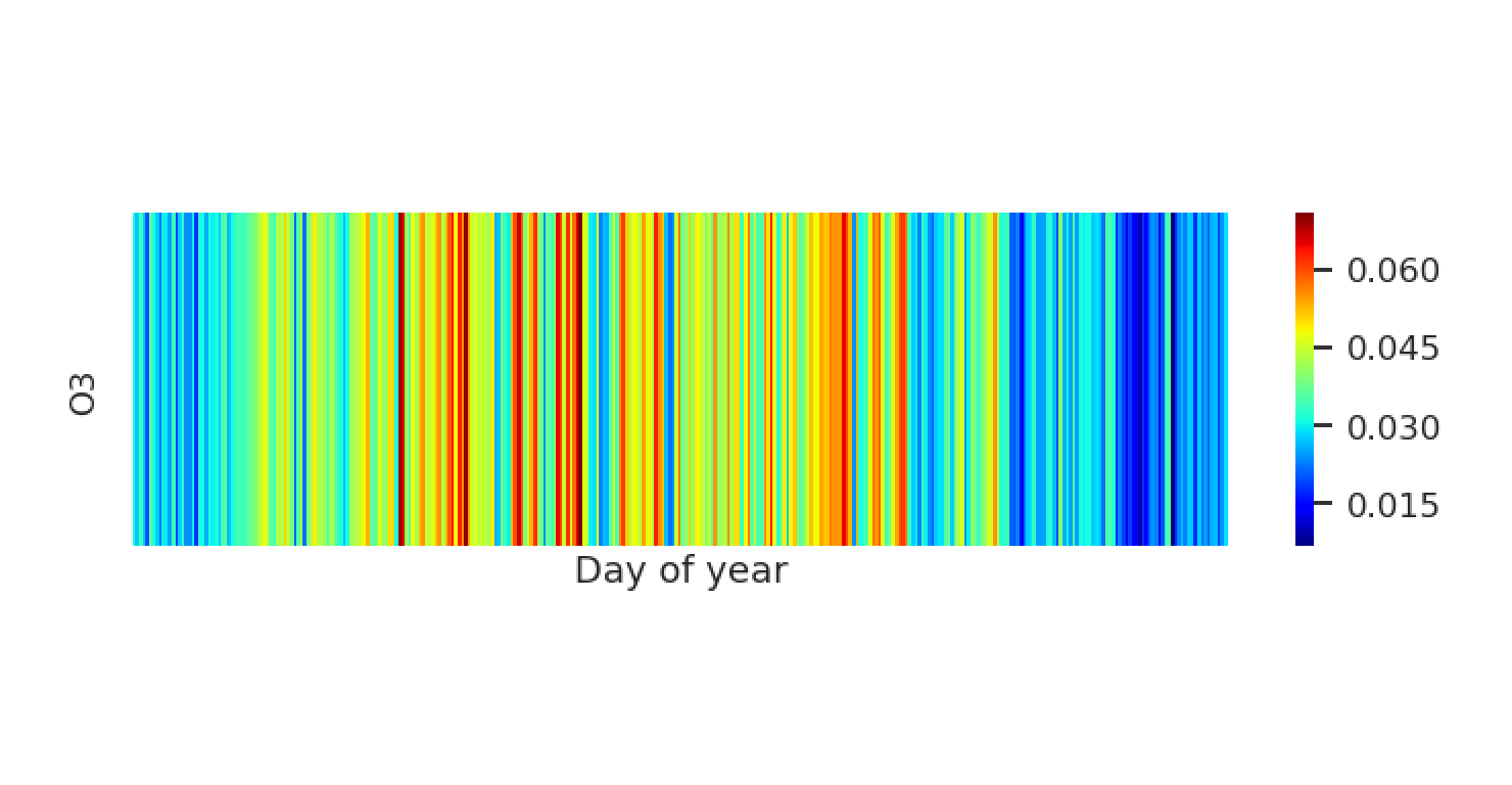
Keep it simple
indy_oct = pollution.query("year == 2015 & city == 'Indianapolis'")
jet_scale = palette = sns.color_palette('jet', as_cmap = True)
sns.heatmap(indy_oct[['O3']], cmap = jet_scale)
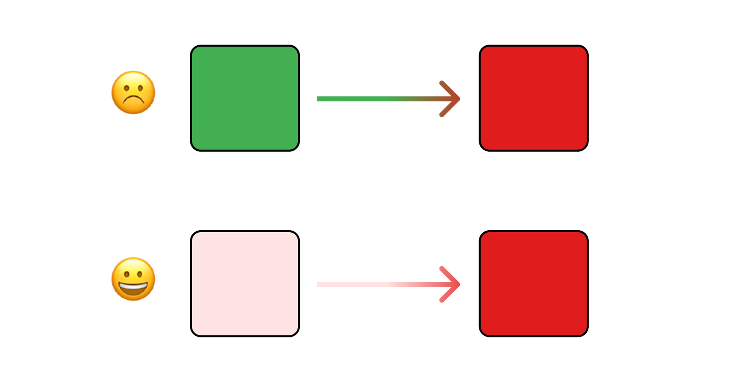
Be aware of color blindness
- Avoid transitions between green and red
- Palettes that use intensity are safer
Encoding neutral values
pal_light = sns.diverging_palette(250, 0)
pal_dark  = sns.diverging_palette(250, 0, center = 'dark')

plt.style.use('seaborn-white')
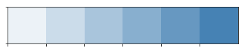
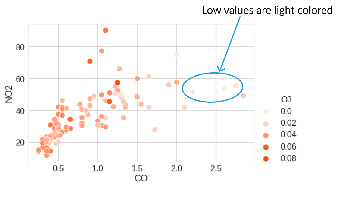
light_palette = sns.light_palette("orangered")
sns.scatterplot(x = 'CO', y = 'NO2', hue = 'O3', data = lb_2012,
palette = light_palette)
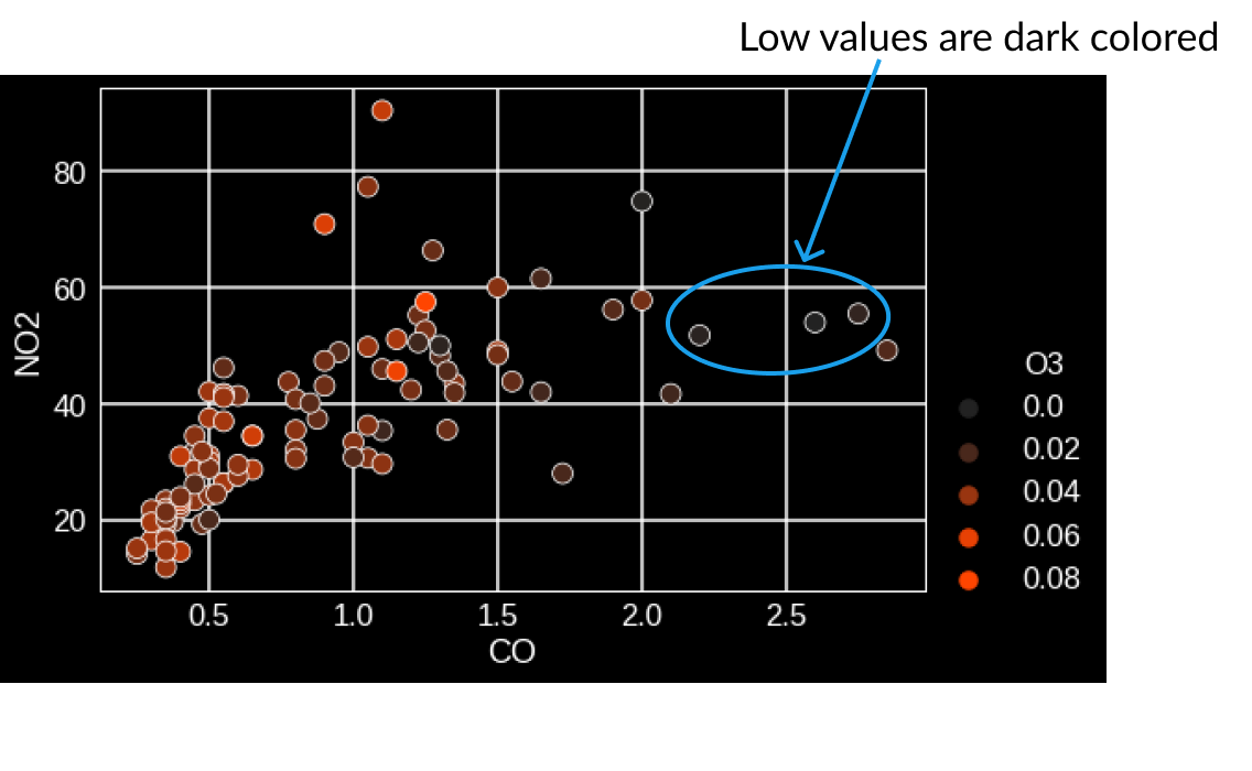
plt.style.use('dark_background')

dark_palette = sns.dark_palette("orangered")
sns.scatterplot(x = 'CO', y = 'NO2', hue = 'O3', data = lb_2012,
                palette = dark_palette)