Wrap-Up

Improving Your Data Visualizations in Python

Nick Strayer

Instructor

Abstract line chart on top with one line red with a scatterplot below with a single red point and an annotation calling out an outlier

Improving Your Data Visualizations in Python

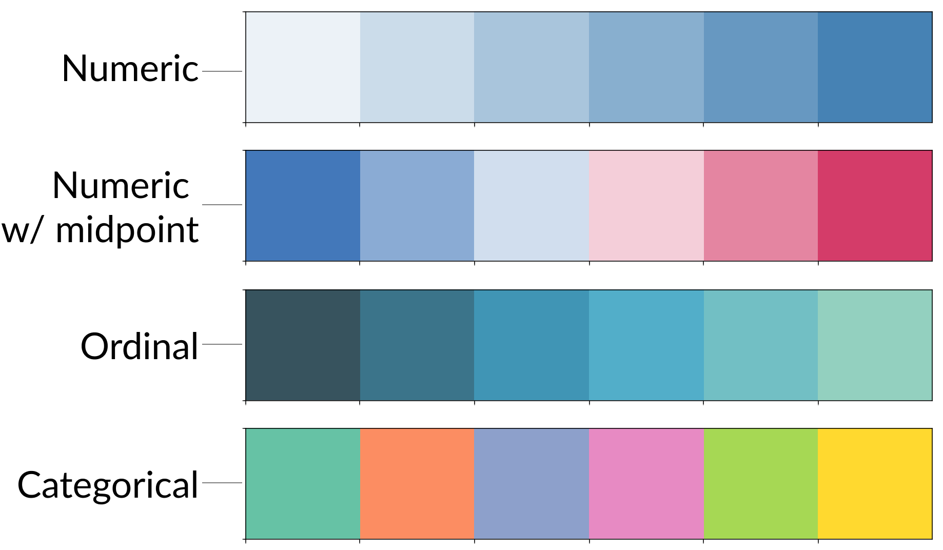
Using color responsibly

Four color palettes on top of each other corresponding to numeric, numeric with midpoint, ordinal, and categorical data respectively

Improving Your Data Visualizations in Python

A multilevel confidence level, a confidence band, and a series of bootstrap regression lines

Improving Your Data Visualizations in Python

A scatter of text, a rearranged series of plots, and a magnifying glass looking at a chart

Improving Your Data Visualizations in Python

Going further

Blogs

Twitter

  • #datavis
    • An ongoing stream of cool projects and inspiration.
Improving Your Data Visualizations in Python

Thank you!

Improving Your Data Visualizations in Python

Preparing Video For Download...