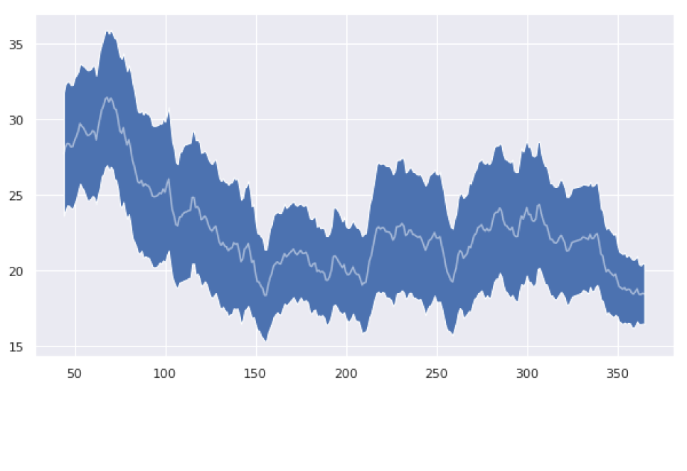
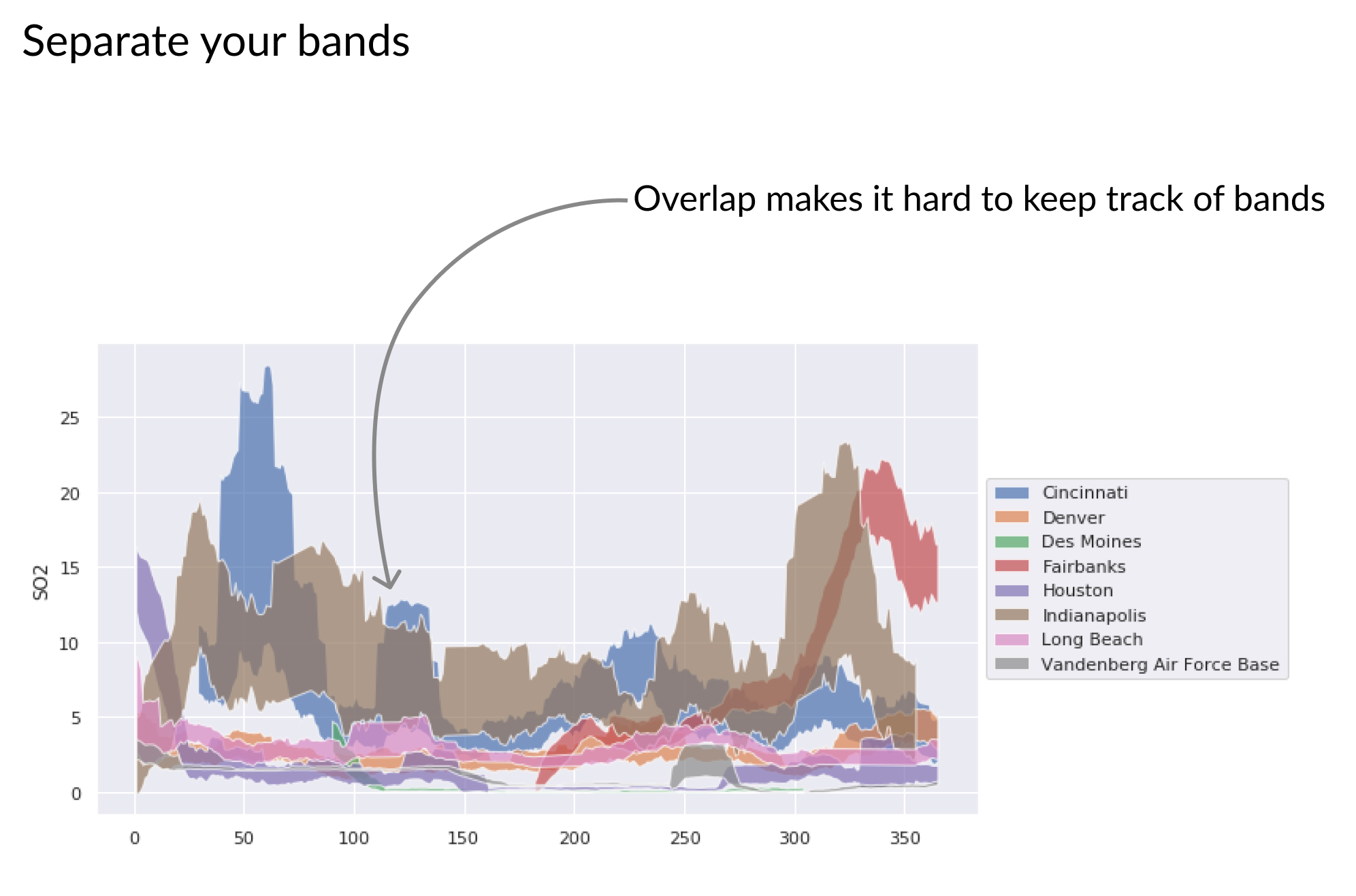
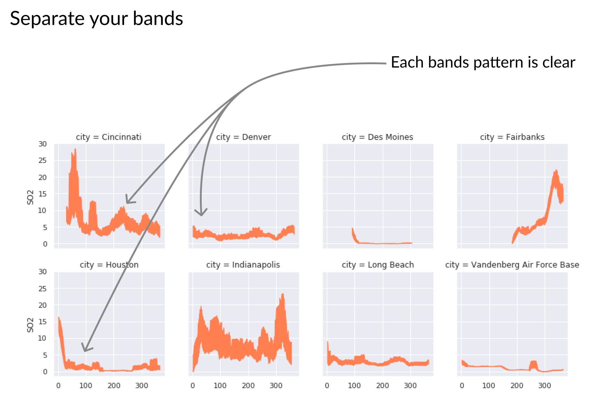
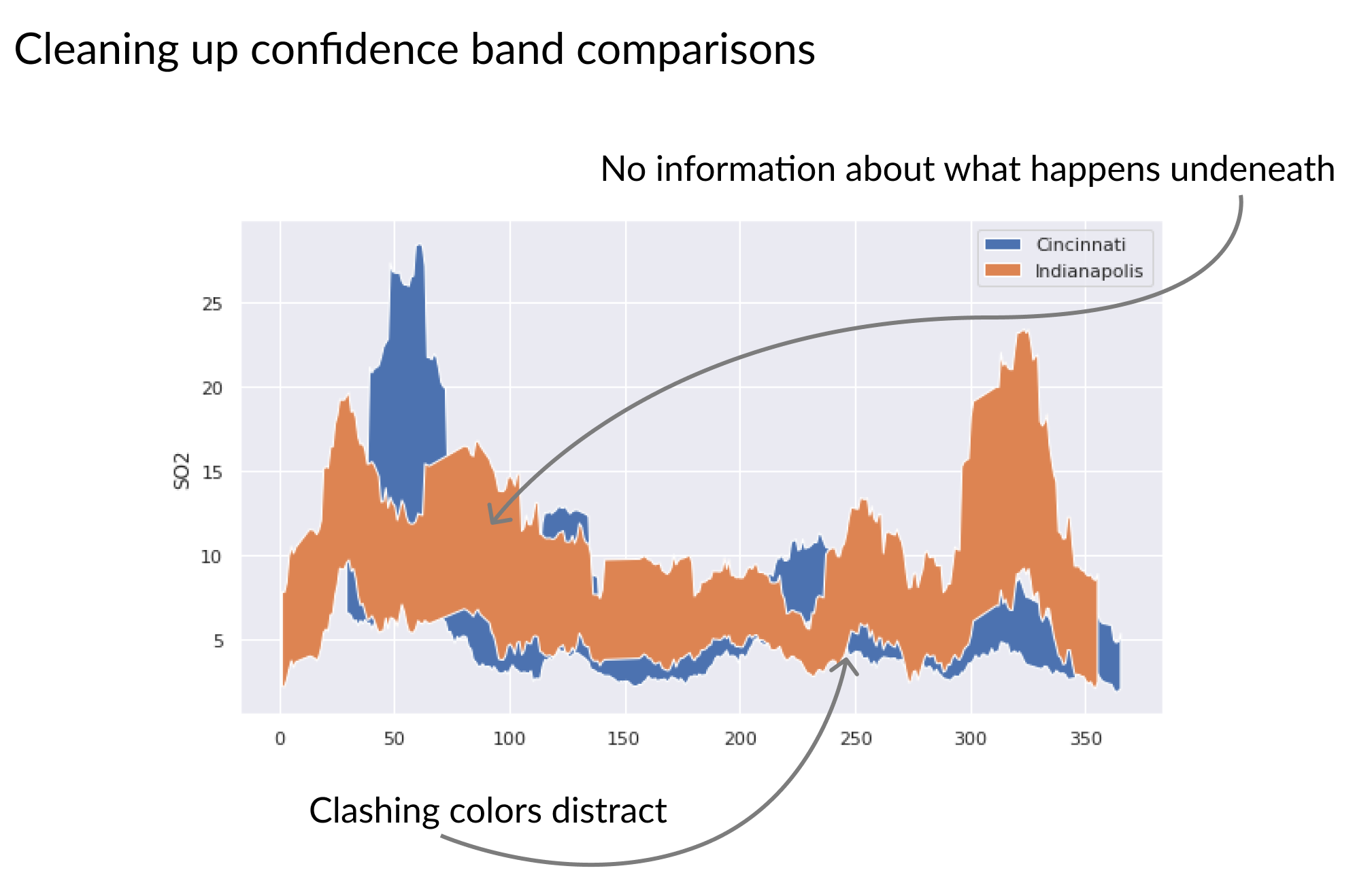
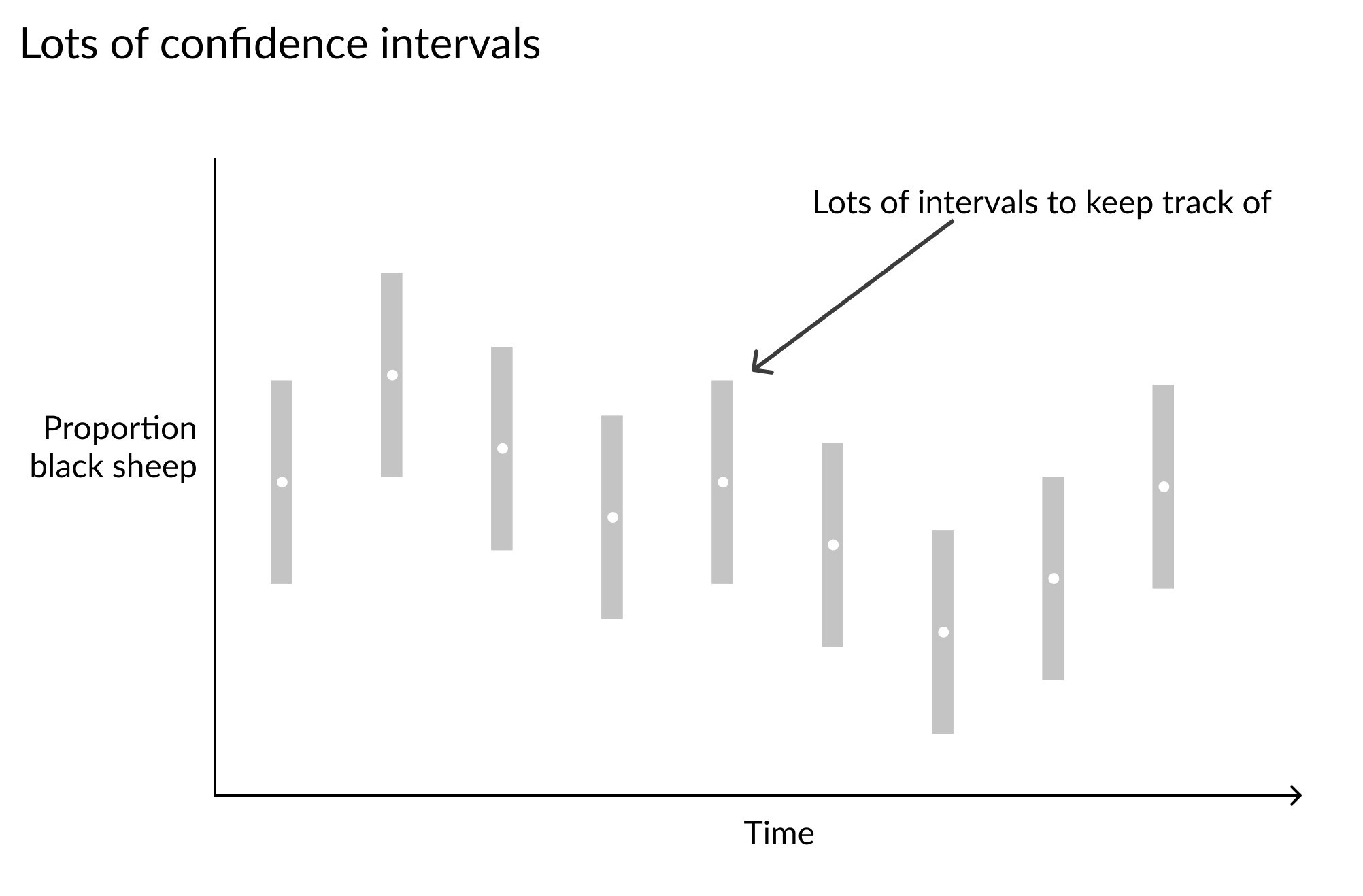
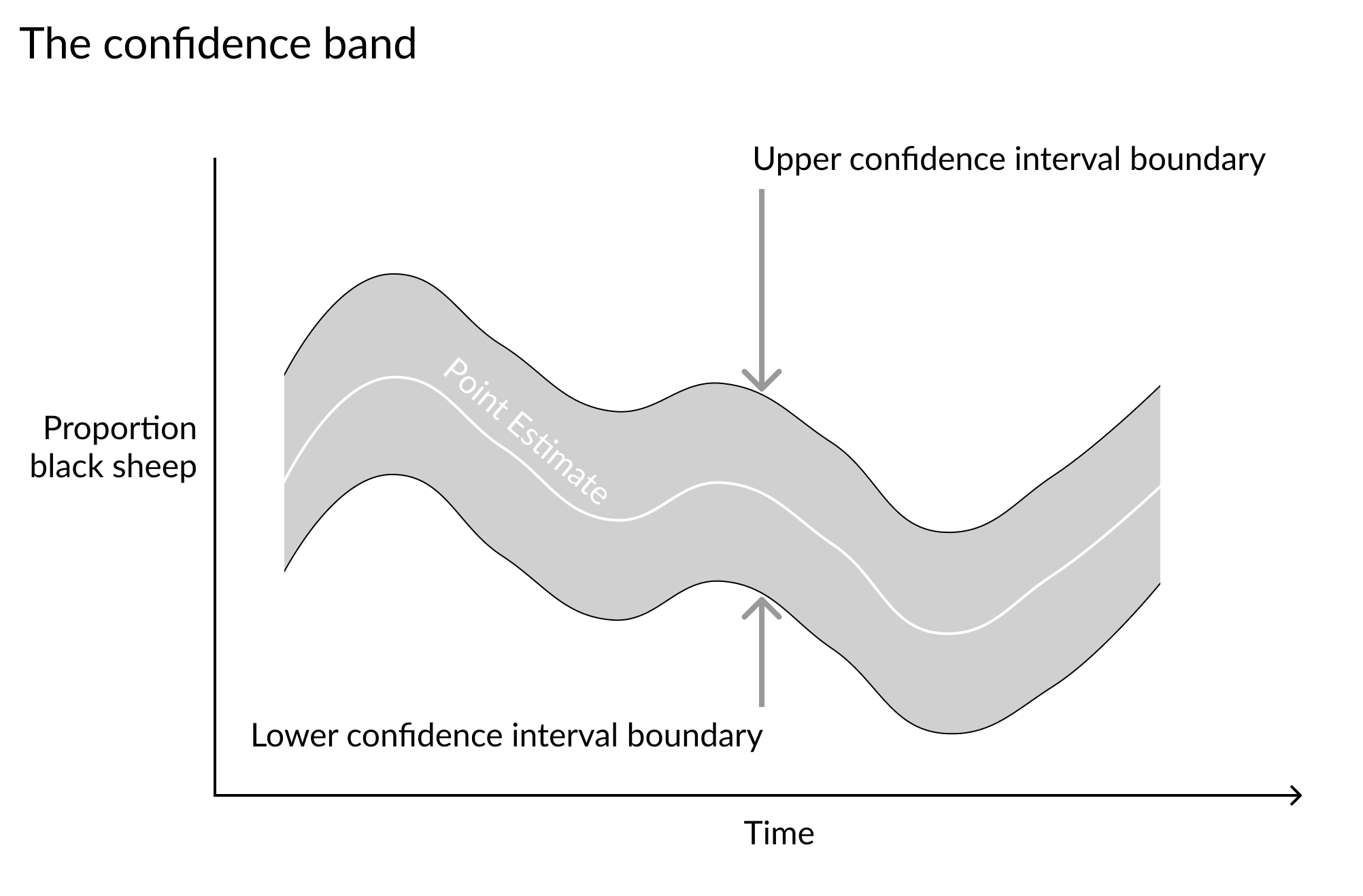
Confidence bands

Improving Your Data Visualizations in Python

Nick Strayer

Instructor

Continuous estimation functions

  • Estimates over a continuous axis
  • Often over time
  • Have uncertainty and should be plotted as such.

sound waves

Improving Your Data Visualizations in Python

A wavey series of repeated grey confidence intervals along a time x-axis

Improving Your Data Visualizations in Python

A continuous ribbon representing confidence intervals along a time x axis

Improving Your Data Visualizations in Python
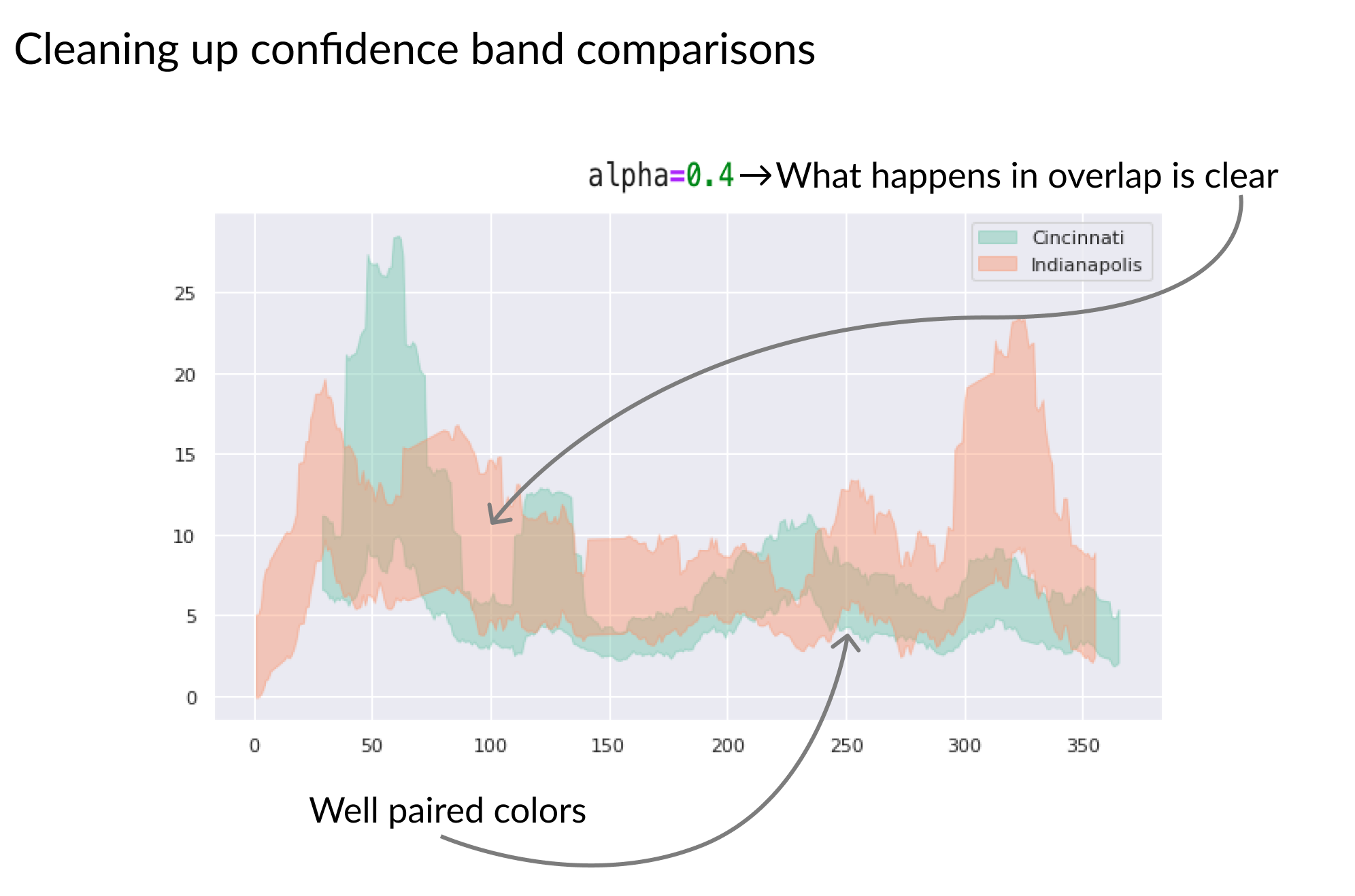
# Set lower and upper bounds of ribbon
plt.fill_between(x='day', y1='lower', y2='upper', data=cinci_so2)

# Add point-estimate reference line plt.plot('day', 'mean', 'w-', alpha=0.5, data=data)

A jagged blue confidence band with a white center line

Improving Your Data Visualizations in Python

A lot of colorful confidence bands overlaid that is difficult to read

Improving Your Data Visualizations in Python

A lot of colorful confidence bands separated into a grid of charts with one band per chart

Improving Your Data Visualizations in Python

Two solid overlaid bands with top band covering up behavior of lower band

Improving Your Data Visualizations in Python

Two semi-transparent overlaid bands with behavior of lower band visible through top band

Improving Your Data Visualizations in Python

Let's draw some bands!

Improving Your Data Visualizations in Python

Preparing Video For Download...