Making your visualizations efficient
Improving Your Data Visualizations in Python

Nick Strayer
Instructor
What is efficient?
- Reduce the effort needed to see story
- Re-organize plots to keep focus
- Improve 'ink' to info ratio
- Don't compromise the message
# Create a subplot w/ one row & two columns. f, (ax1, ax2) = plt.subplots(1, 2)# Pass each axes to respective plot sns.lineplot('month', 'NO2', 'year', ax=ax1, data=pol_by_month)sns.barplot('year', 'count', ax=ax2, data=obs_by_year)
Clear unnecessary legends
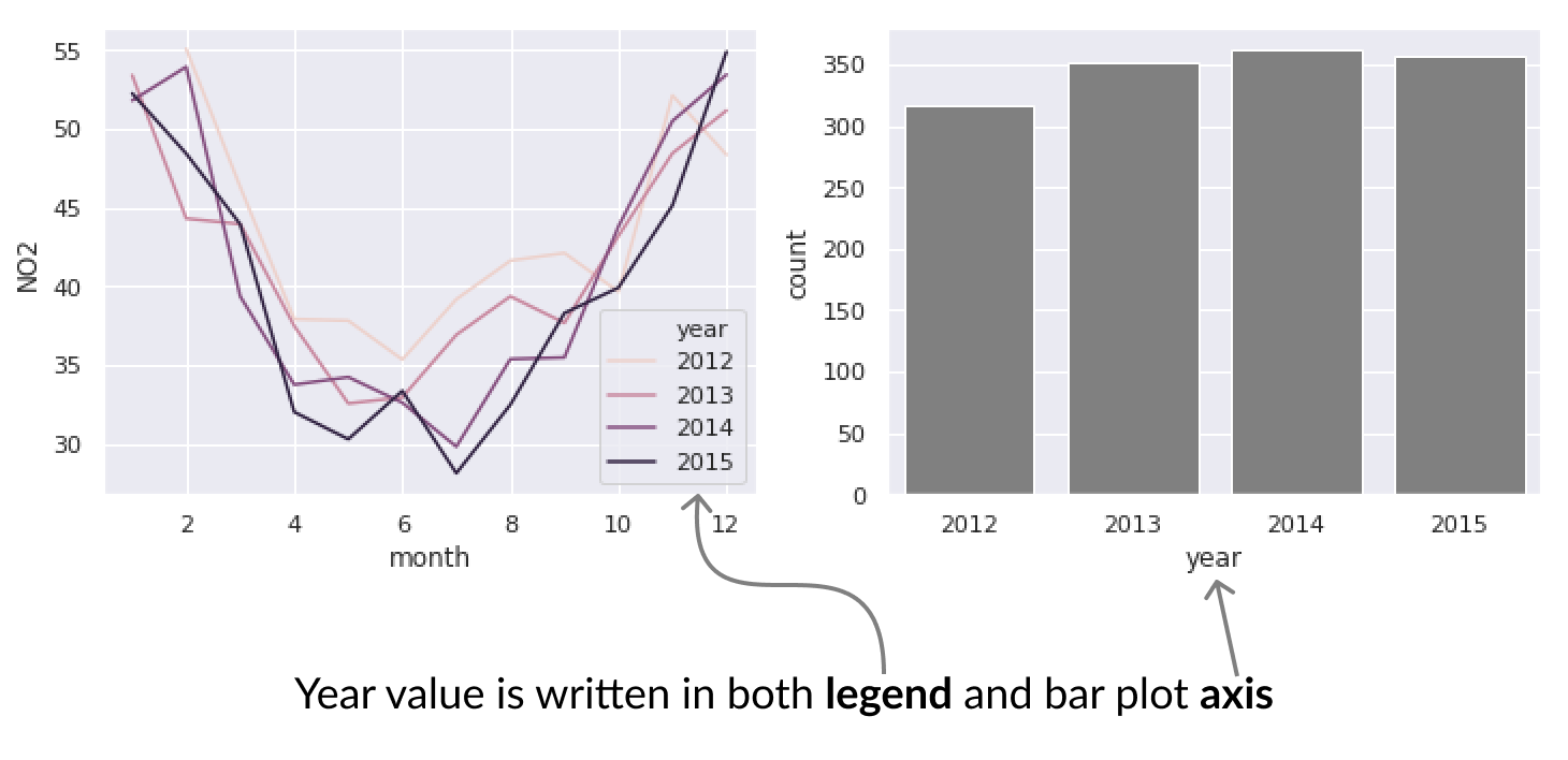
sns.lineplot('month', 'NO2', 'year', ax=ax1, data=pol_by_month, palette='RdBu',)sns.barplot('year', 'count', 'year', ax=ax2, data=obs_by_year, palette='RdBu', dodge=False)# Remove legends for both plots ax1.legend_.remove() ax2.legend_.remove()