Introduction to line plots
Introduction to Data Visualization with Seaborn

Content Team
DataCamp
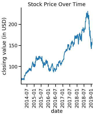
What are line plots?
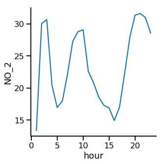
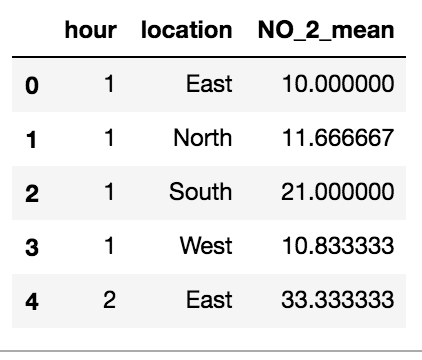
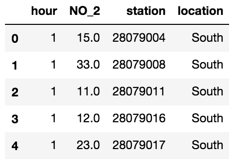
Air pollution data
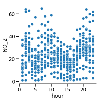
Scatter plot
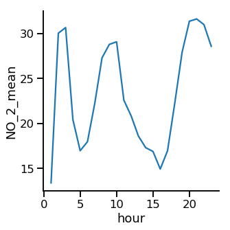
Line plot
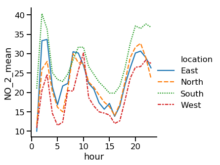
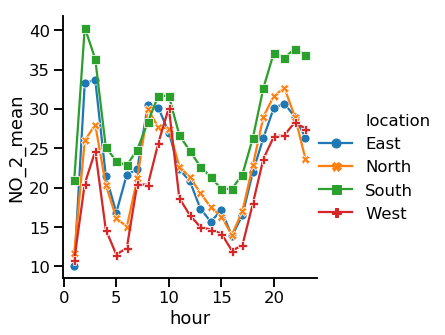
Subgroups by location
Subgroups by location
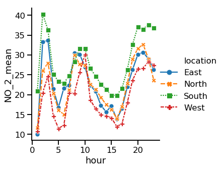
Adding markers
Turning off line style
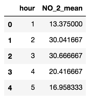
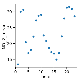
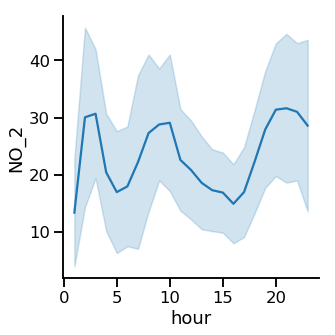
Multiple observations per x-value
Multiple observations per x-value
Multiple observations per x-value
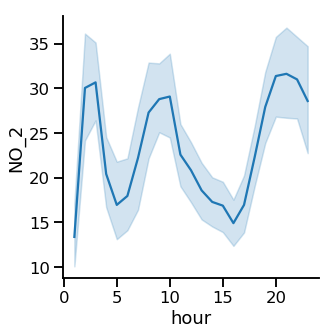
Multiple observations per x-value
Replacing confidence interval with standard deviation
Turning off confidence interval