Point plots
Introduction to Data Visualization with Seaborn

Content Team
DataCamp
What are point plots?
1 Waskom, M. L. (2021). seaborn: statistical data visualization. https://seaborn.pydata.org/
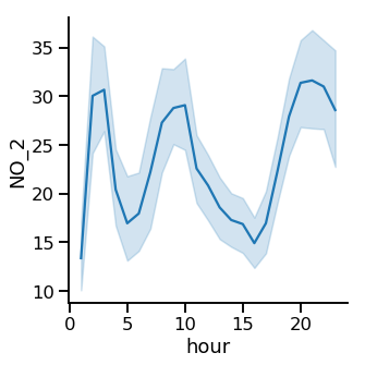
Line plot: average level of nitrogen dioxide over time
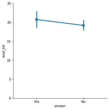
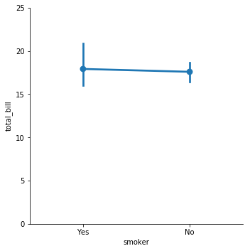
Point plot: average restaurant bill, smokers vs. non-smokers
1 Waskom, M. L. (2021). seaborn: statistical data visualization. https://seaborn.pydata.org/
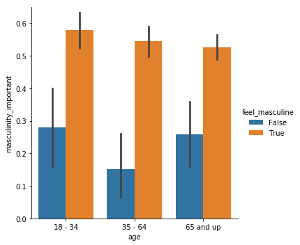
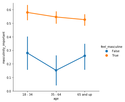
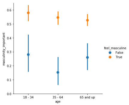
Point plots vs. bar plots
Creating a point plot
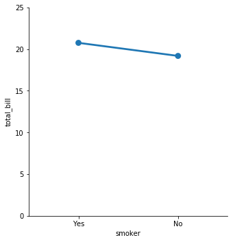
Disconnecting the points
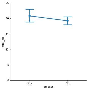
Displaying the median
1 Waskom, M. L. (2021). seaborn: statistical data visualization. https://seaborn.pydata.org/
Displaying the median
1 Waskom, M. L. (2021). seaborn: statistical data visualization. https://seaborn.pydata.org/
Customizing the confidence intervals
1 Waskom, M. L. (2021). seaborn: statistical data visualization. https://seaborn.pydata.org/
Turning off confidence intervals
1 Waskom, M. L. (2021). seaborn: statistical data visualization. https://seaborn.pydata.org/

