Customizing scatter plots
Introduction to Data Visualization with Seaborn

Content Team
DataCamp
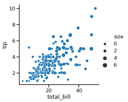
Subgroups with point size
1 Waskom, M. L. (2021). seaborn: statistical data visualization. https://seaborn.pydata.org/
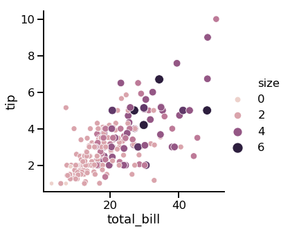
Point size and hue
1 Waskom, M. L. (2021). seaborn: statistical data visualization. https://seaborn.pydata.org/
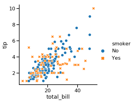
Subgroups with point style
1 Waskom, M. L. (2021). seaborn: statistical data visualization. https://seaborn.pydata.org/
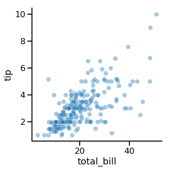
Changing point transparency
1 Waskom, M. L. (2021). seaborn: statistical data visualization. https://seaborn.pydata.org/

