Adding titles and labels: Part 1

Introduction to Data Visualization with Seaborn

Erin Case

Data Scientist

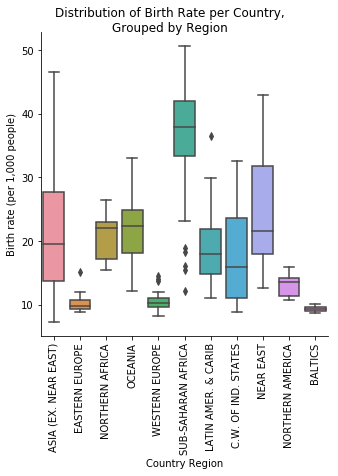
Creating informative visualizations

Box plot of birth rate per region

Box plot of birth rate per region with title and labels

Introduction to Data Visualization with Seaborn

FacetGrid vs. AxesSubplot objects

Seaborn plots create two different types of objects: FacetGrid and AxesSubplot

g = sns.scatterplot(x="height", y="weight", data=df)

type(g)
> matplotlib.axes._subplots.AxesSubplot
Introduction to Data Visualization with Seaborn

An Empty FacetGrid

Empty 4x4 FacetGrid

Introduction to Data Visualization with Seaborn

FacetGrid vs. AxesSubplot objects

Object Type Plot Types Characteristics
FacetGrid relplot(), catplot() Can create subplots
AxesSubplot scatterplot(), countplot(), etc. Only creates a single plot
Introduction to Data Visualization with Seaborn

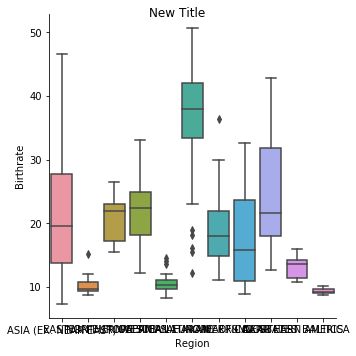
Adding a title to FacetGrid

g = sns.catplot(x="Region", 
                y="Birthrate", 
                data=gdp_data, 
                kind="box")

g.fig.suptitle("New Title")
plt.show()

Birth rate box plot with title added

Introduction to Data Visualization with Seaborn

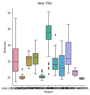
Adjusting height of title in FacetGrid

g = sns.catplot(x="Region", 
                y="Birthrate", 
                data=gdp_data, 
                kind="box")

g.fig.suptitle("New Title", 
               y=1.03)

plt.show()

Birth rate plot with higher title

Introduction to Data Visualization with Seaborn

Let's practice!

Introduction to Data Visualization with Seaborn

Preparing Video For Download...