Introduction to Seaborn
Introduction to Data Visualization with Seaborn

Content Team
DataCamp
What is Seaborn?
- Python data visualization library
- Easily create the most common types of plots
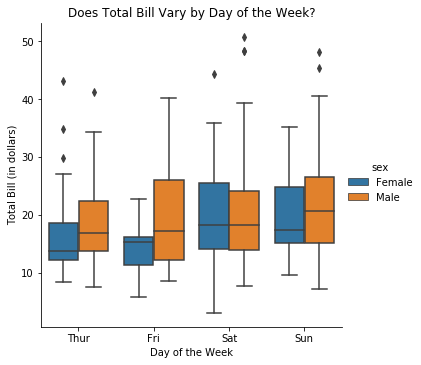
1 Waskom, M. L. (2021). seaborn: statistical data visualization. https://seaborn.pydata.org/
Why is Seaborn useful?

Advantages of Seaborn
- Easy to use
- Works well with
pandasdata structures - Built on top of
matplotlib
Getting started
import seaborn as snsimport matplotlib.pyplot as plt
Samuel Norman Seaborn (sns)
- "The West Wing" television show
Example 1: Scatter plot
import seaborn as sns import matplotlib.pyplot as pltheight = [62, 64, 69, 75, 66, 68, 65, 71, 76, 73] weight = [120, 136, 148, 175, 137, 165, 154, 172, 200, 187]sns.scatterplot(x=height, y=weight)plt.show()
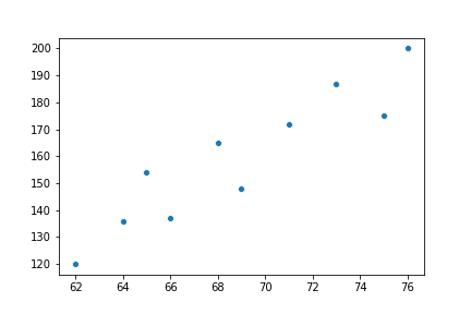
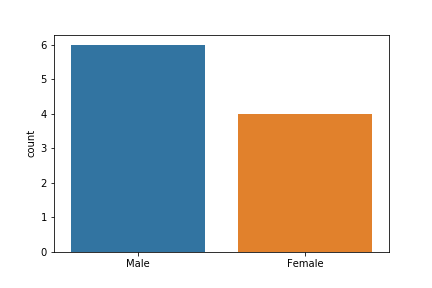
Example 2: Create a count plot
import seaborn as sns import matplotlib.pyplot as pltgender = ["Female", "Female", "Female", "Female", "Male", "Male", "Male", "Male", "Male", "Male"]sns.countplot(x=gender)plt.show()
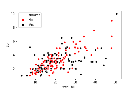
1 Waskom, M. L. (2021). seaborn: statistical data visualization. https://seaborn.pydata.org/
Let's practice!
Introduction to Data Visualization with Seaborn

