Count plots and bar plots
Introduction to Data Visualization with Seaborn

Content Team
DataCamp
Categorical plots
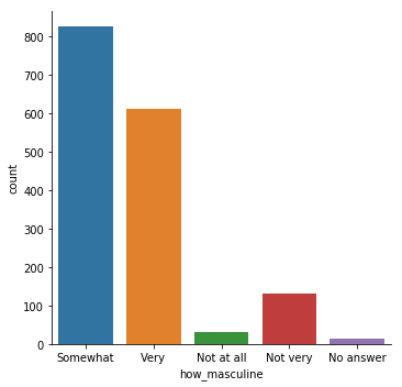
countplot() vs. catplot()
countplot() vs. catplot()
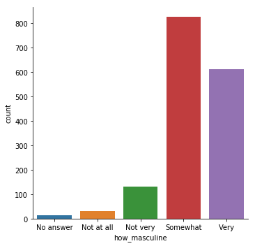
Changing the order
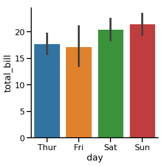
Bar plots
1 Waskom, M. L. (2021). seaborn: statistical data visualization. https://seaborn.pydata.org/
Confidence intervals
1 Waskom, M. L. (2021). seaborn: statistical data visualization. https://seaborn.pydata.org/
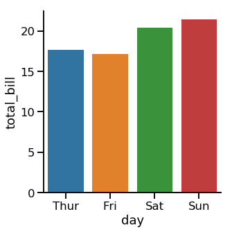
Turning off confidence intervals
1 Waskom, M. L. (2021). seaborn: statistical data visualization. https://seaborn.pydata.org/
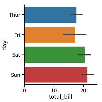
Changing the orientation
1 Waskom, M. L. (2021). seaborn: statistical data visualization. https://seaborn.pydata.org/

