Putting it all together
Introduction to Data Visualization with Seaborn

Content Team
DataCamp
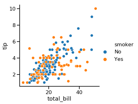
Adding a third variable (hue)
1 Waskom, M. L. (2021). seaborn: statistical data visualization. https://seaborn.pydata.org/
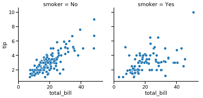
Adding a third variable (row/col)
1 Waskom, M. L. (2021). seaborn: statistical data visualization. https://seaborn.pydata.org/

