Visualizing ad group performance with column & bar charts
Marketing Analytics in Google Sheets
Luke Pajer
Digital Marketing Specialist
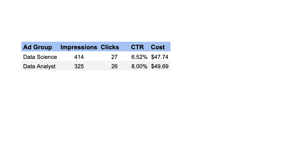
Ad groups data set
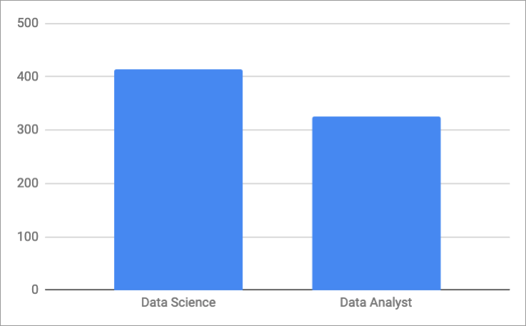
Impressions by ad group
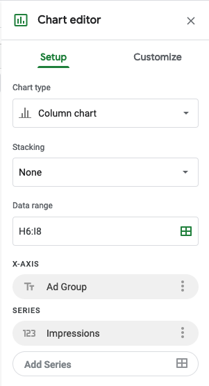
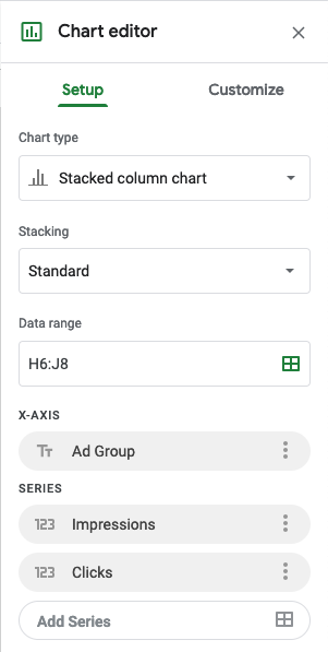
Column Chart
Impressions by ad group
Column Chart
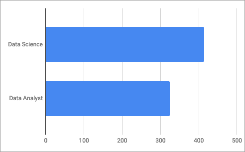
Bar Chart
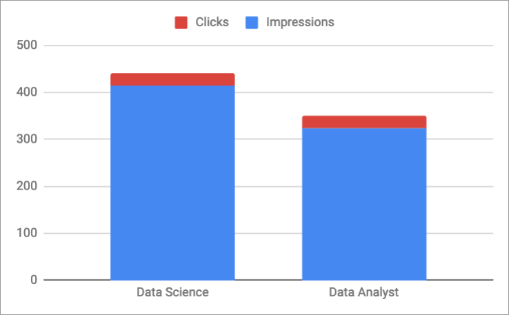
Impressions & click performance by ad group
Stacked column chart
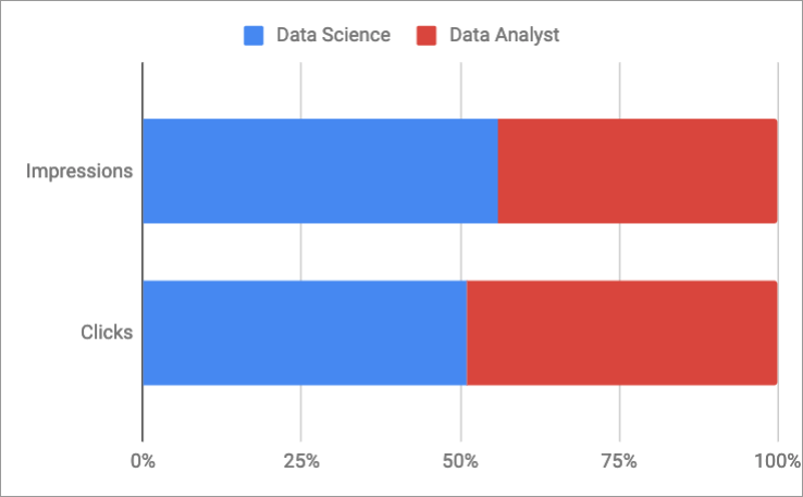
Ad group overall performance
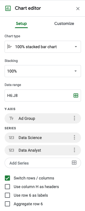
100% stacked bar chart
A brief recap
Column charts and bar charts are very similar
The only difference is the axis in which the labels reside
Normal bar/column charts
Great for visualizing 1 or 2 ad group metrics at a time
Stacked bar/column charts
Effective at showing a few ad group metrics at a time
100% stacked bar/column charts (
with columns/rows switched
)
Provide insight into percent make up of the total for each metric
Let's get to work!
Marketing Analytics in Google Sheets
Preparing Video For Download...