Analyzing paid-search trends with line & area charts
Marketing Analytics in Google Sheets
Luke Pajer
Digital Marketing Specialist
Digital marketing data set
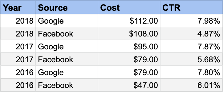
Keep in mind:
- CTR increase is always good
- Ads are performing well
- Cost is more complicated
- Increase cost and CTR is good
- Increase cost and decrease CTR is bad
Visualizing CTR trends
Line chart
- Shows basic trend of each line
- May be the most recognizable of all trend charts
- Great for any number of trends
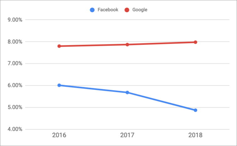
Visualizing CTR trends
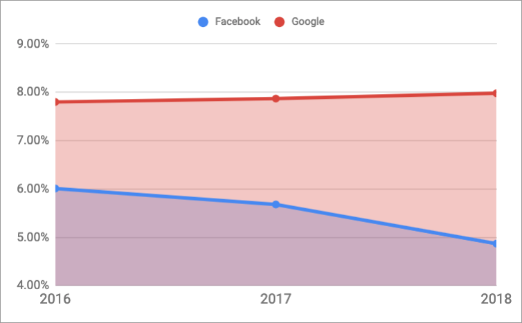
Area chart
- Shaded under the curve
- Great for showing relative differences between trends
- Will get messy if too many trends are plotted on a single area chart
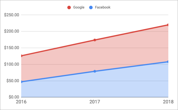
Visualizing cost trends
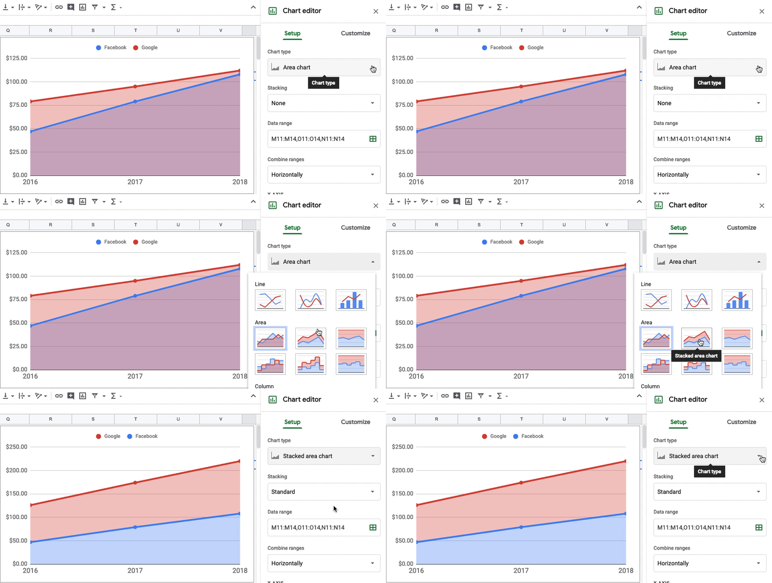
Stacked area chart
- Aggregate of all trends
- Shows contribution by each trend
- CTR does not work with this since it is an average
Compare area charts
Stacked area chart

Area chart

Change chart type
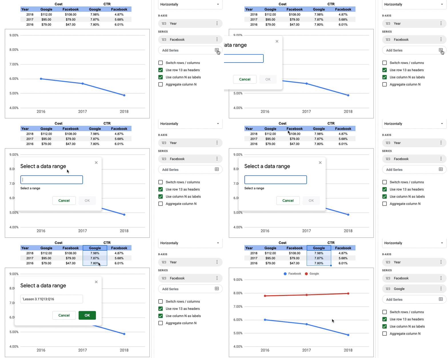
Add a series to a chart
Reformat data set for trend analysis
Original data set

Reformatted data set

Let's get to work!
Marketing Analytics in Google Sheets

