Network visualization
Introduction to Network Analysis in Python

Eric Ma
Data Carpentry instructor and author of nxviz package
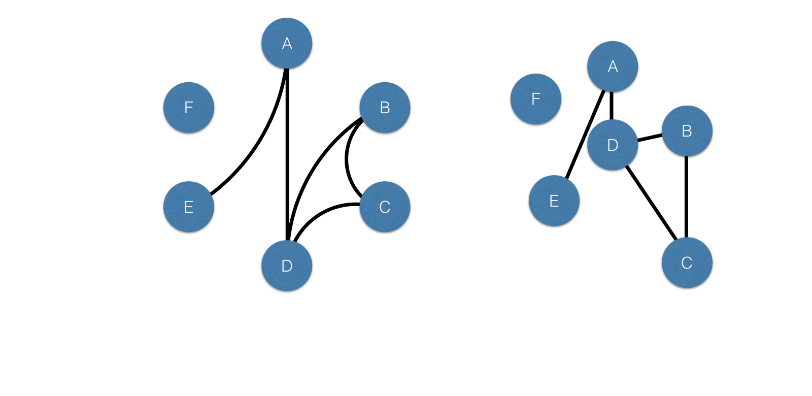
Irrational vs. Rational visualizations
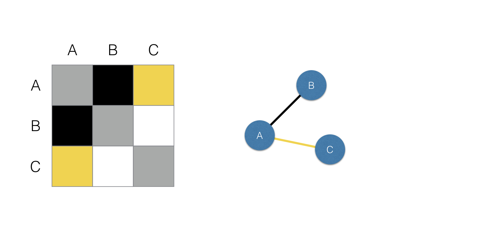
Matrix plot
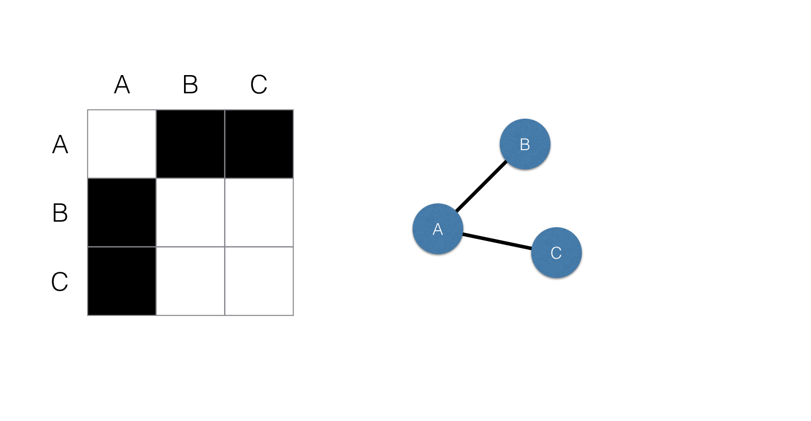
Matrix plot
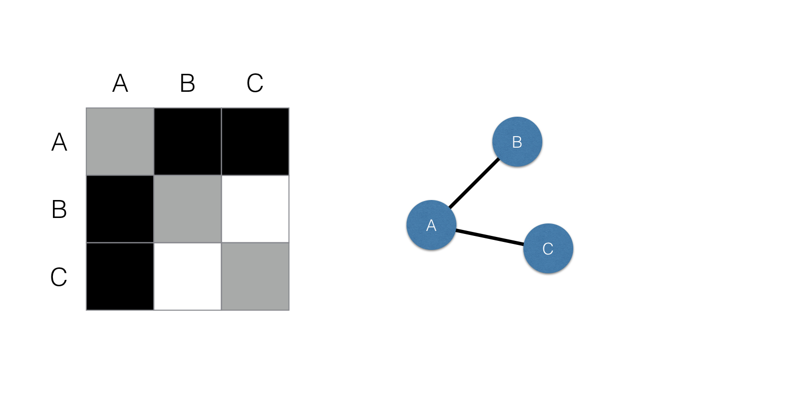
Matrix plot
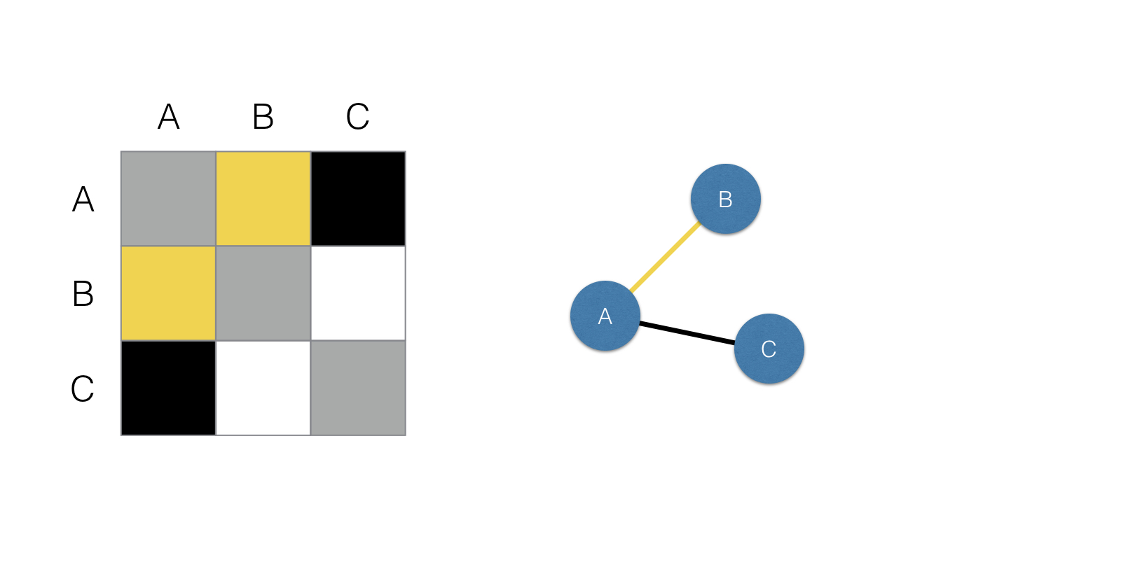
Matrix plot
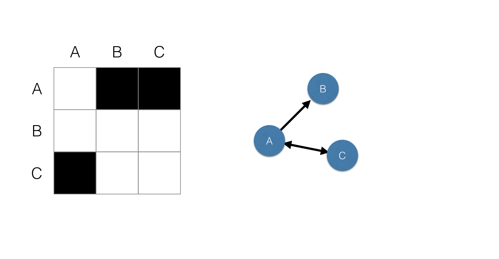
Directed matrices
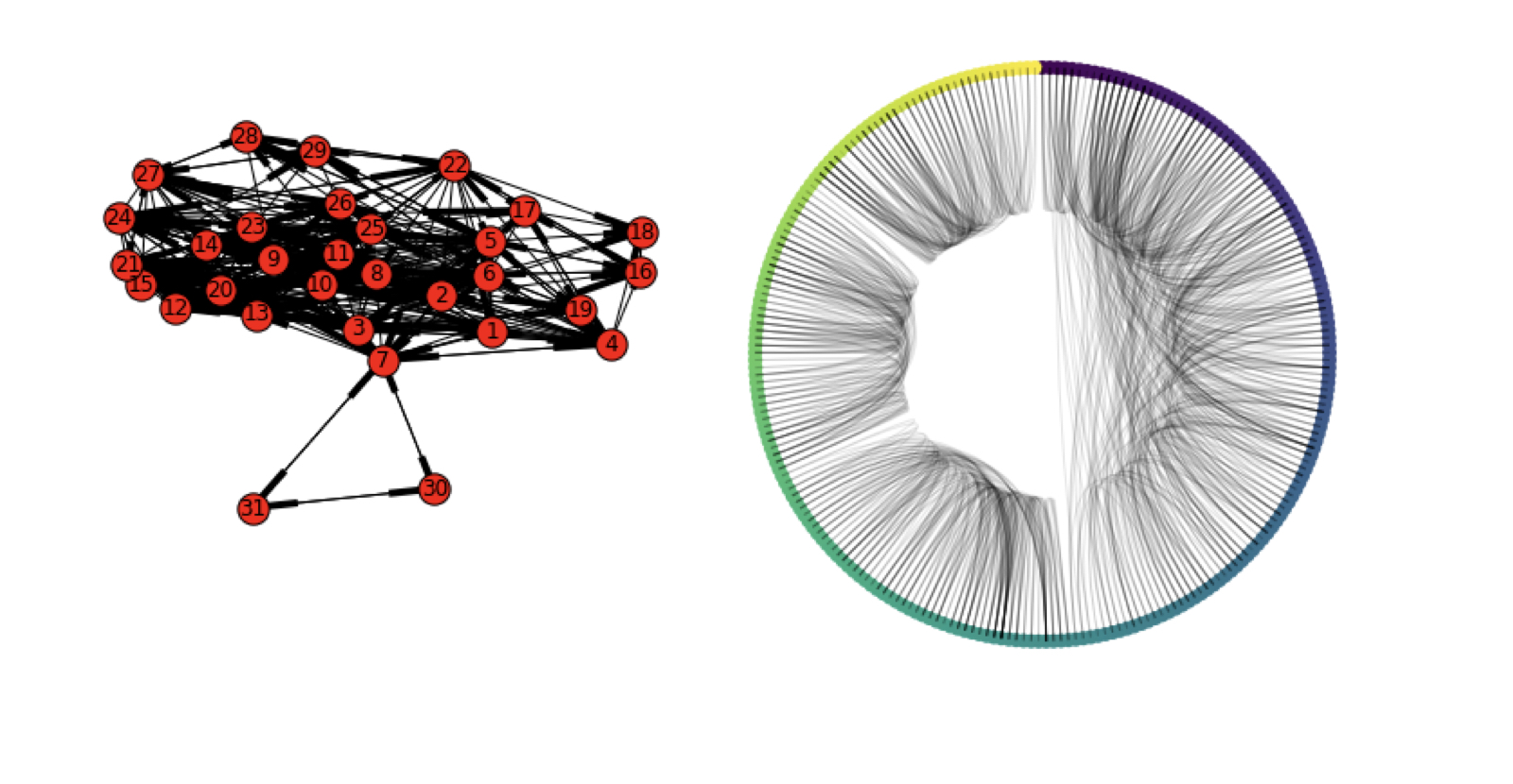
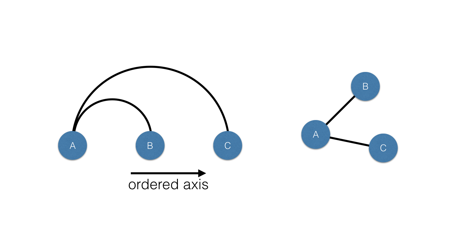
Arc plot
Circos plot
Circos plot