Histograms
Introduction to Data Visualization with ggplot2

Rick Scavetta
Founder, Scavetta Academy
Common plot types
| Plot type | Possible Geoms |
|---|---|
| Scatter plots | points, jitter, abline, smooth, count |
| Bar plots | histogram, bar, col, errorbar |
| Line plots | line, path |
Histograms
ggplot(iris, aes(x = Sepal.Width)) +
  geom_histogram()
- A plot of binned values
- i.e. a statistical function
`stat_bin()` using `bins = 30`.
Pick better value with `binwidth`.
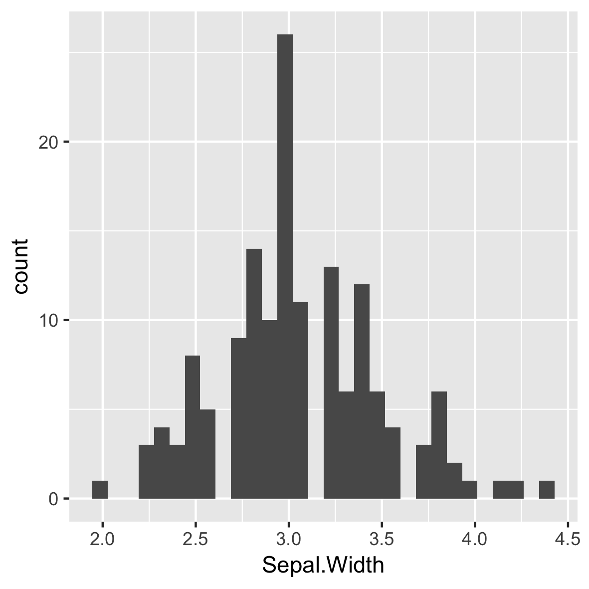
Default of 30 even bins
ggplot(iris, aes(x = Sepal.Width)) +
  geom_histogram()
- A plot of binned values
- i.e. a statistical function
# Default bin width:
diff(range(iris$Sepal.Width))/30
[1] 0.08

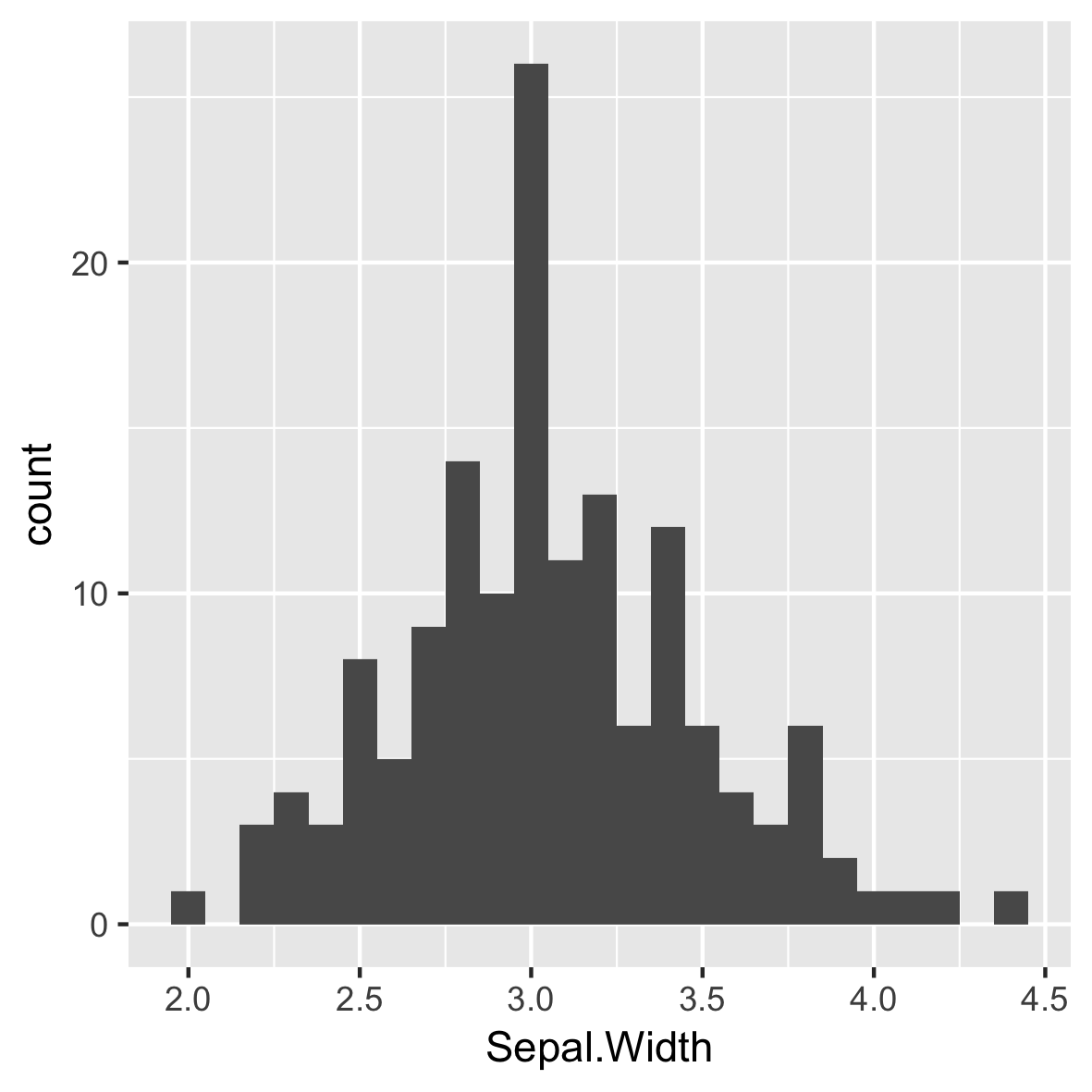
Intuitive and meaningful bin widths
ggplot(iris, aes(x = Sepal.Width)) +
  geom_histogram(binwidth = 0.1)
Always set a meaningful bin widths for your data.
No spaces between bars.
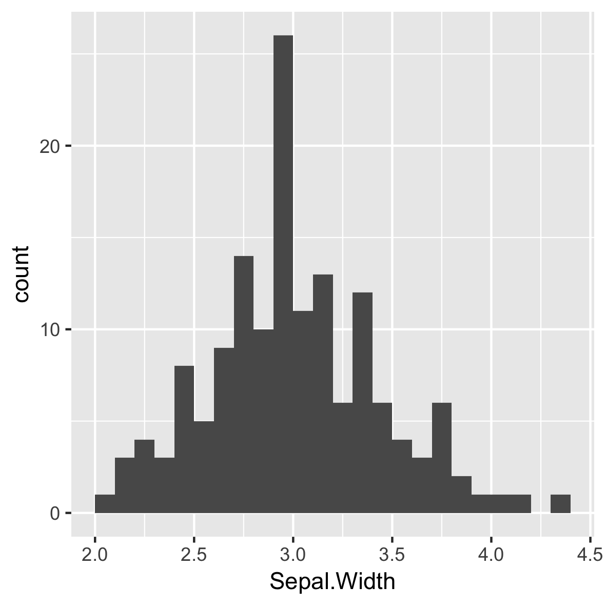
Re-position tick marks
ggplot(iris, aes(x = Sepal.Width)) +
  geom_histogram(binwidth = 0.1,
                 center = 0.05)
Always set a meaningful bin widths for your data.
No spaces between bars.
X axis labels are between bars.
Different Species
ggplot(iris, aes(x = Sepal.Width,
                 fill = Species)) +
  geom_histogram(binwidth = .1,
                 center = 0.05)
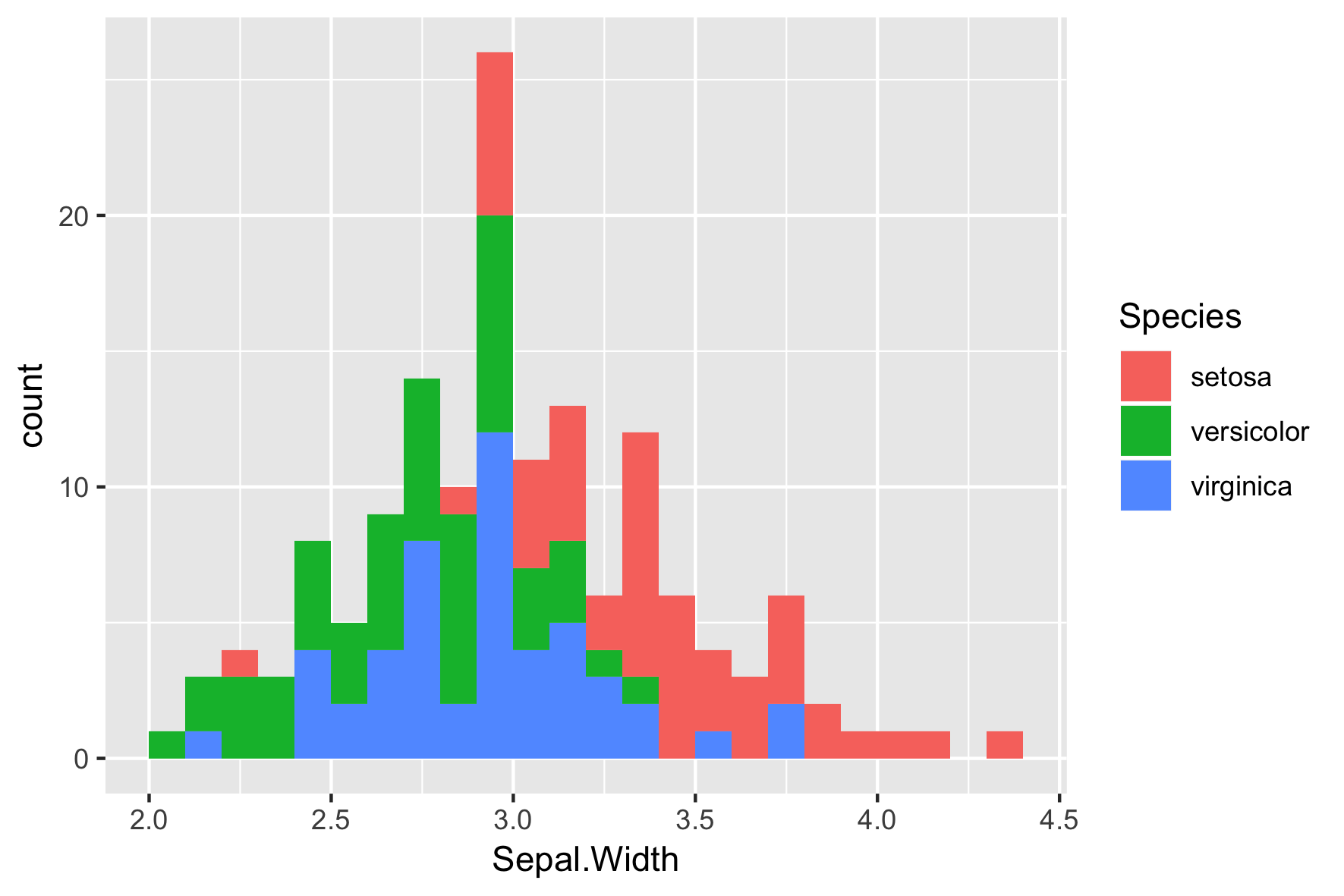
Default position is "stack"
ggplot(iris, aes(x = Sepal.Width,
                 fill = Species)) +
  geom_histogram(binwidth = .1,
                 center = 0.05,
                 position = "stack")

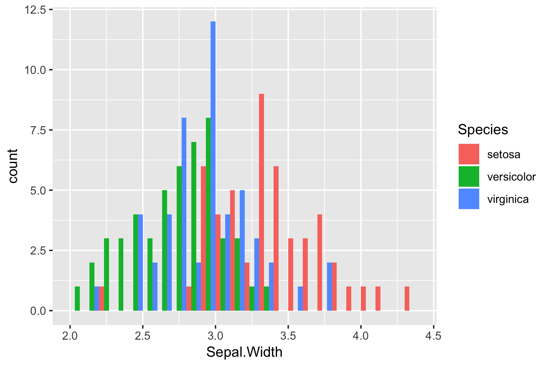
position = "dodge"
ggplot(iris, aes(x = Sepal.Width,
                 fill = Species)) +
  geom_histogram(binwidth = .1,
                 center = 0.05,
                 position = "dodge")
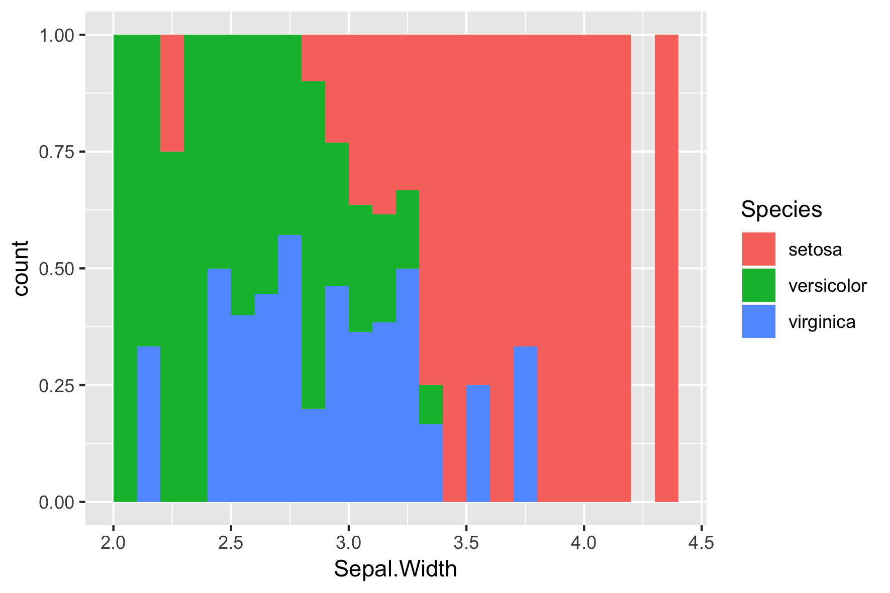
position = "fill"
ggplot(iris, aes(x = Sepal.Width,
                 fill = Species)) +
  geom_histogram(binwidth = .1,
                 center = 0.05,
                 position = "fill")
Final Slide
Introduction to Data Visualization with ggplot2

