Visualizing Time Series Data in R
Arnaud Amsellem
Quantitative Trader and creator of the R Trader blog
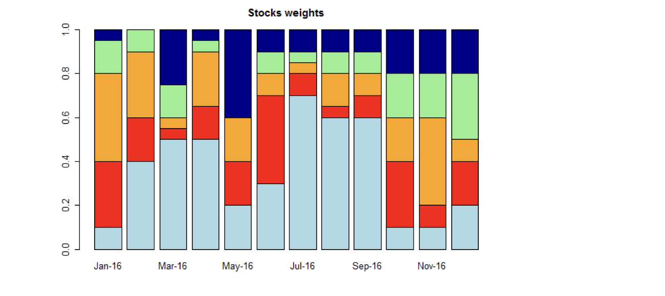
head(my_stocks)
Stock A Stock B Stock C Stock D Stock E
1 -0.0320 -0.0092 -0.0286 -0.0314 -0.0209
2 -0.0358 -0.0148 0.0001 -0.0162 0.0016
3 0.0092 0.0126 0.0139 -0.0016 -0.0127
4 0.0149 0.0290 0.0377 0.0246 0.0332
5 -0.0226 -0.0084 0.0011 -0.0016 -0.0102
6 -0.0079 -0.0126 -0.0249 -0.0059 -0.0187
head(stock_weights)
Stock A Stock B Stock C Stock D Stock E
Jan-16 0.1 0.30 0.40 0.15 0.05
Feb-16 0.4 0.20 0.30 0.10 0.00
Mar-16 0.5 0.05 0.05 0.15 0.25
Apr-16 0.5 0.15 0.25 0.05 0.05
May-16 0.2 0.20 0.20 0.00 0.40
Jun-16 0.3 0.40 0.10 0.10 0.10
# stacked chart of the weights of 5 stocks in a portfolio
barplot(stock_weights,
col = c("lightblue", "red", "orange", "lightgreen", "darkblue"),
main = "Stocks weights")
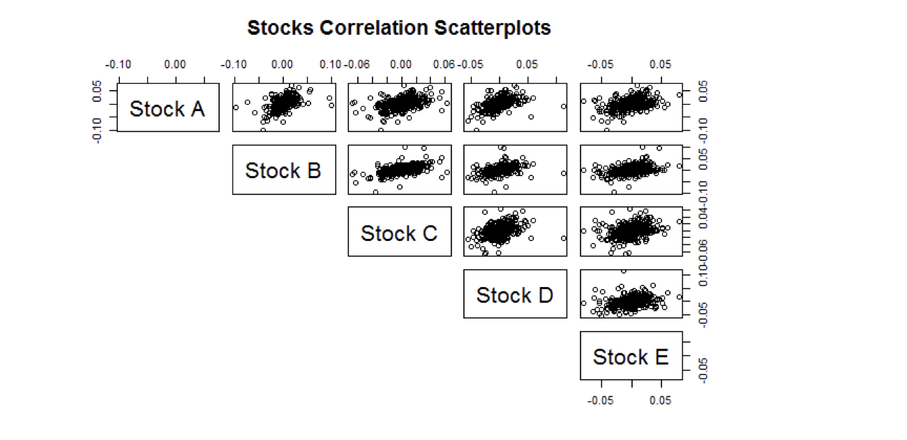
round(cor(my_stocks), digit = 4)
Stock A Stock B Stock C Stock D Stock E
Stock A 1.0000 0.4841 0.4292 0.5085 0.4029
Stock B 0.4841 1.0000 0.5133 0.3955 0.4329
Stock C 0.4292 0.5133 1.0000 0.3628 0.3414
Stock D 0.5085 0.3955 0.3628 1.0000 0.2939
Stock E 0.4029 0.4329 0.3414 0.2939 1.0000
pairs(my_stocks,
lower.panel = NULL,
main = "Stocks Correlation Scatterplots")
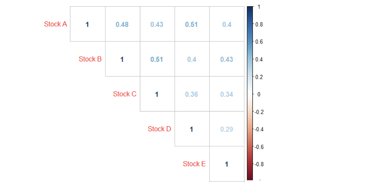
corrplot(my_stocks,
method = "number",
type = "upper")
Visualizing Time Series Data in R