Scatter plots
Understanding Data Visualization

Richie Cotton
Data Evangelist at DataCamp
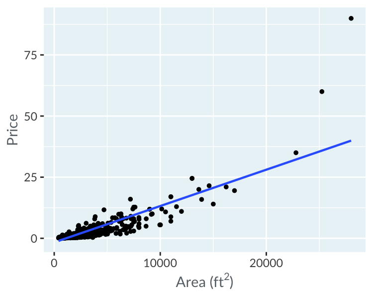
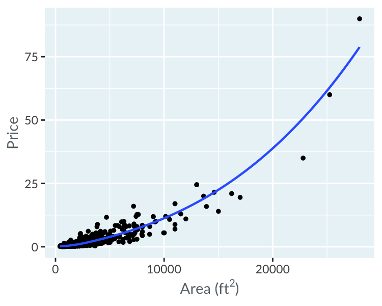
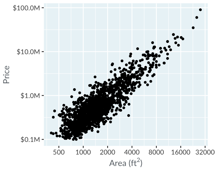
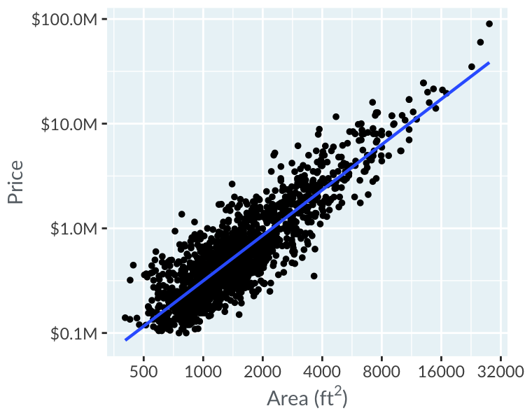
Prices vs. area
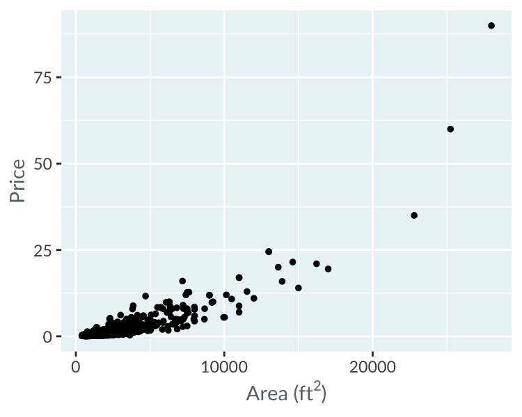
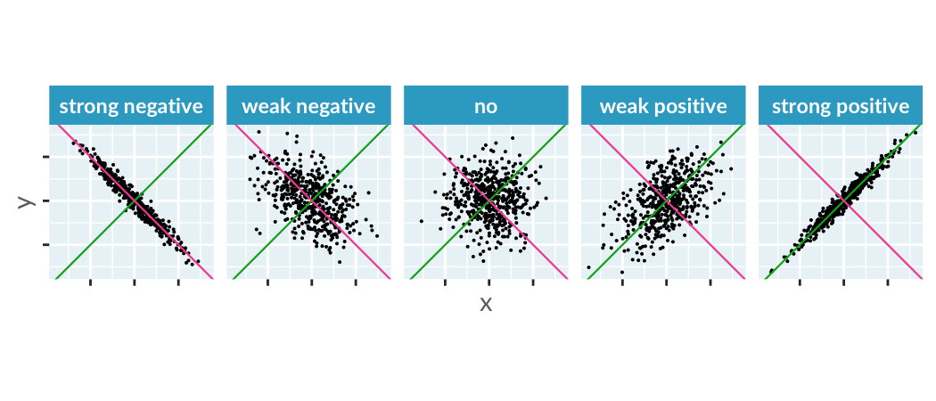
Correlation
How close are you to being able to fit a straight line through the points?
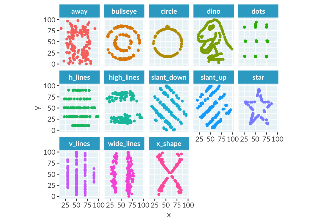
Sometimes correlation isn't helpful
Adding trend lines
Adding smooth trend lines