Higher dimensions
Understanding Data Visualization

Richie Cotton
Data Evangelist at DataCamp
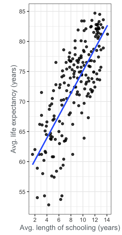
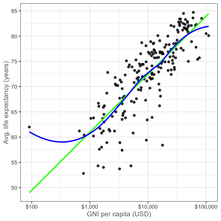
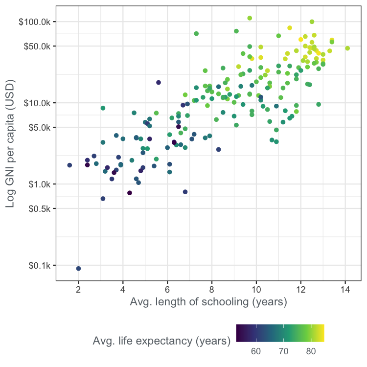
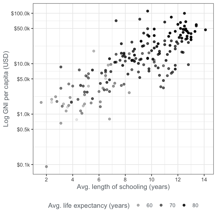
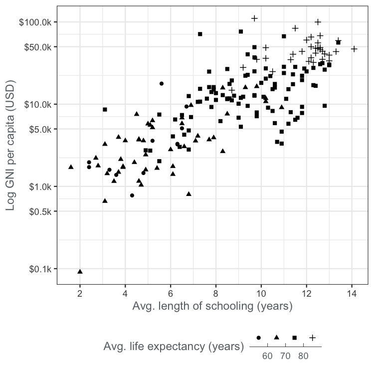
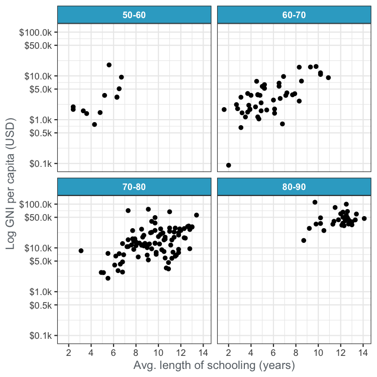
The UN life expectancy scatter plots
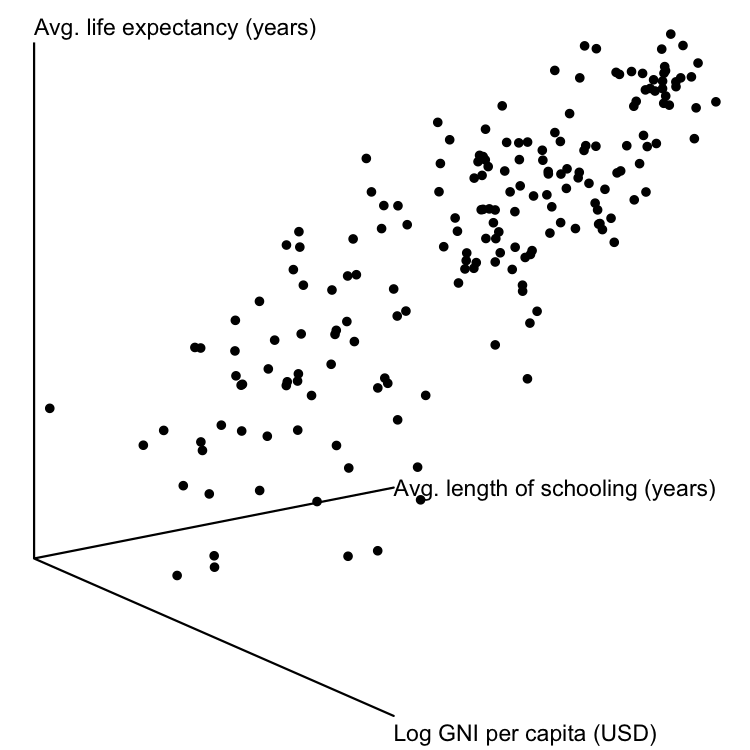
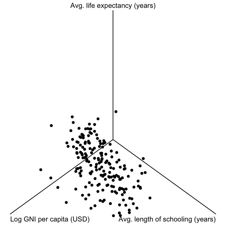
3D scatter plots
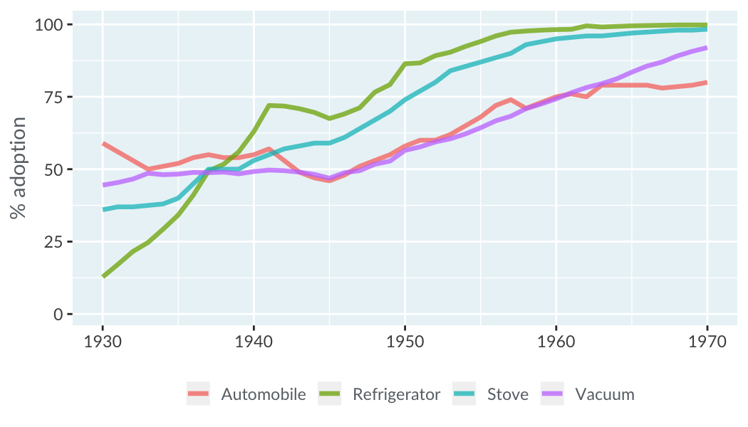
Color
Size

Transparency
Shape
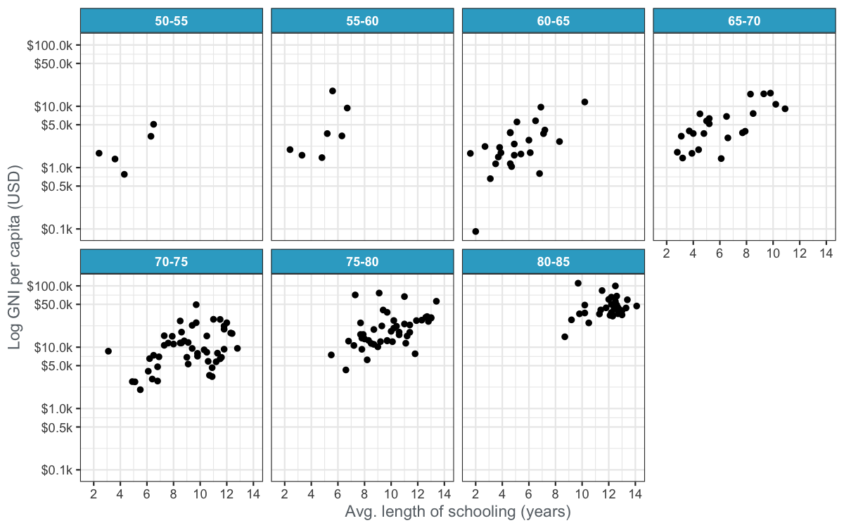
Lots of panels
Even more panels
Color
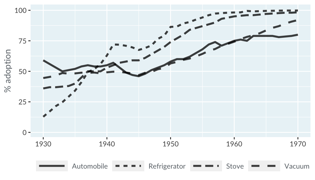
Linetype
Understanding Data Visualization
Richie Cotton
Data Evangelist at DataCamp

