Dot plots
Understanding Data Visualization
Richie Cotton
Data Evangelist at DataCamp
When should you use a dot plot?
You have a categorical variable.
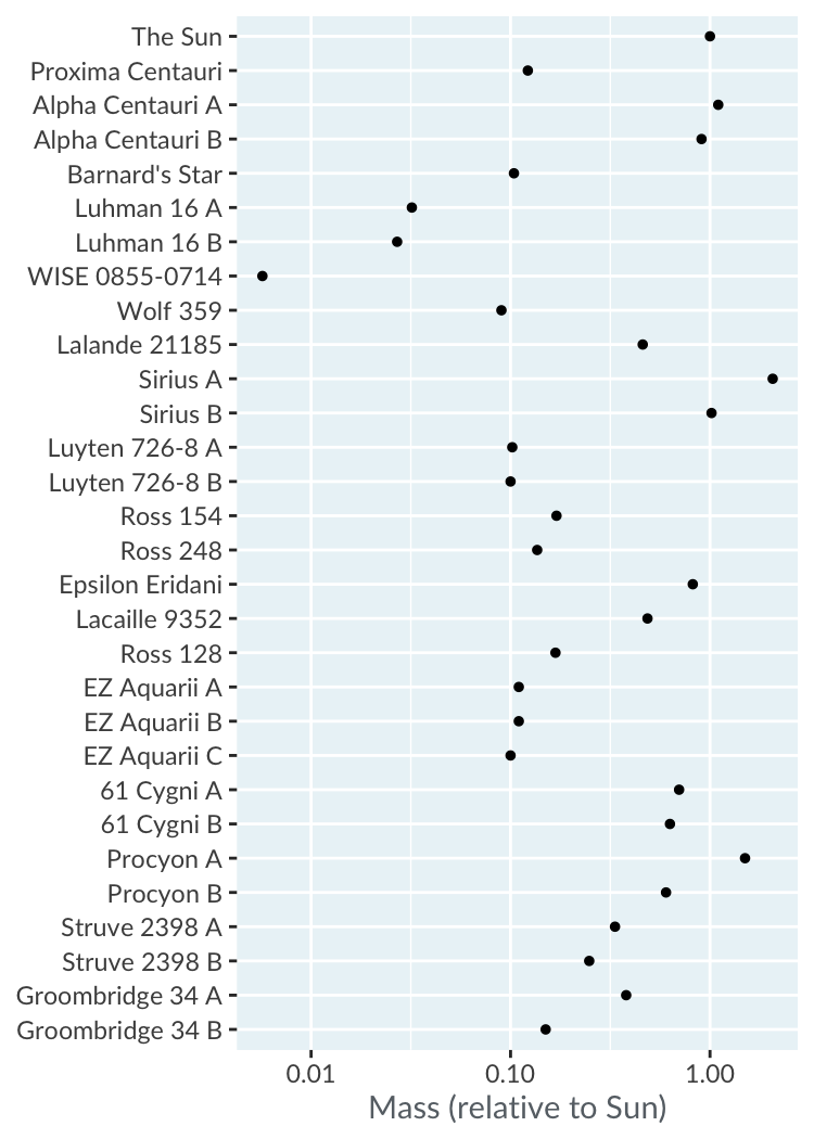
You want to display numeric scores for each category on a log scale, or
You want to display multiple numeric scores for each category.
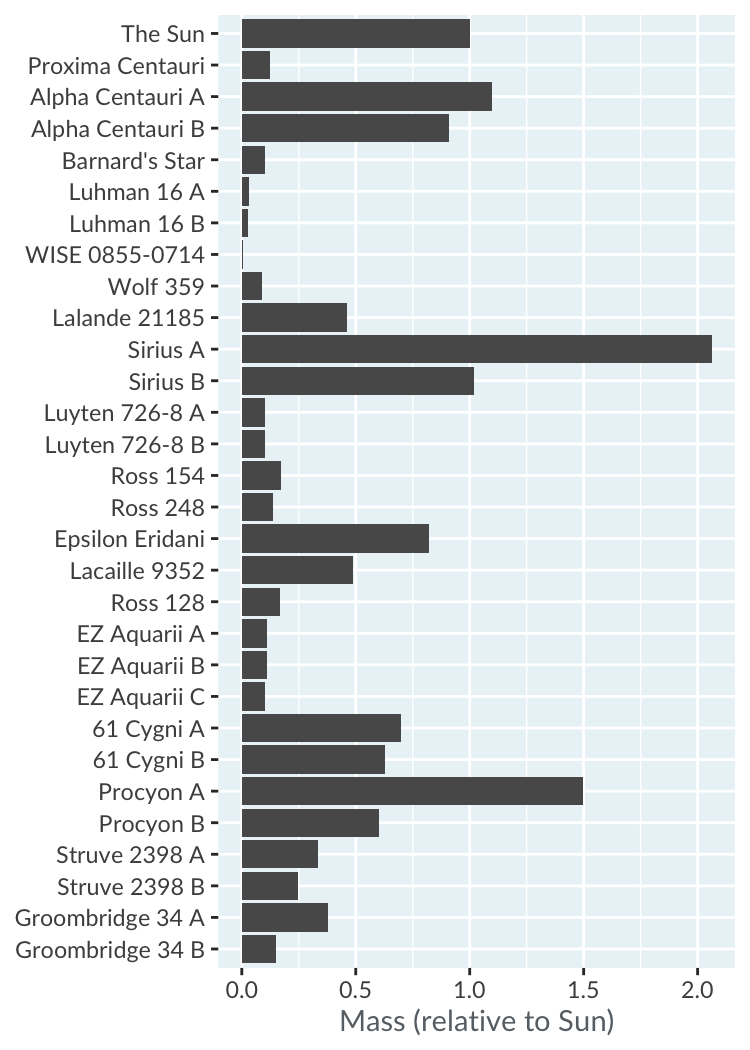
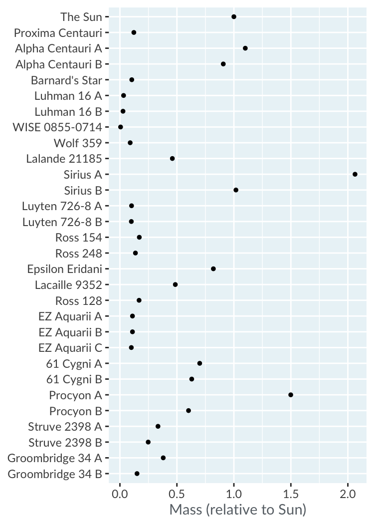
Nearby stars and brown dwarfs
star
distance_ly
mass_sm
The Sun
0.0000158
1.0000
Proxima Centauri
4.2441000
0.1221
Alpha Centauri A
4.3650000
1.1000
Alpha Centauri B
4.3650000
0.9070
Barnard's Star
5.9577000
0.1040
Luhman 16 A
6.5029000
0.0320
...
...
...
Bar plot vs. dot plot
Log scales
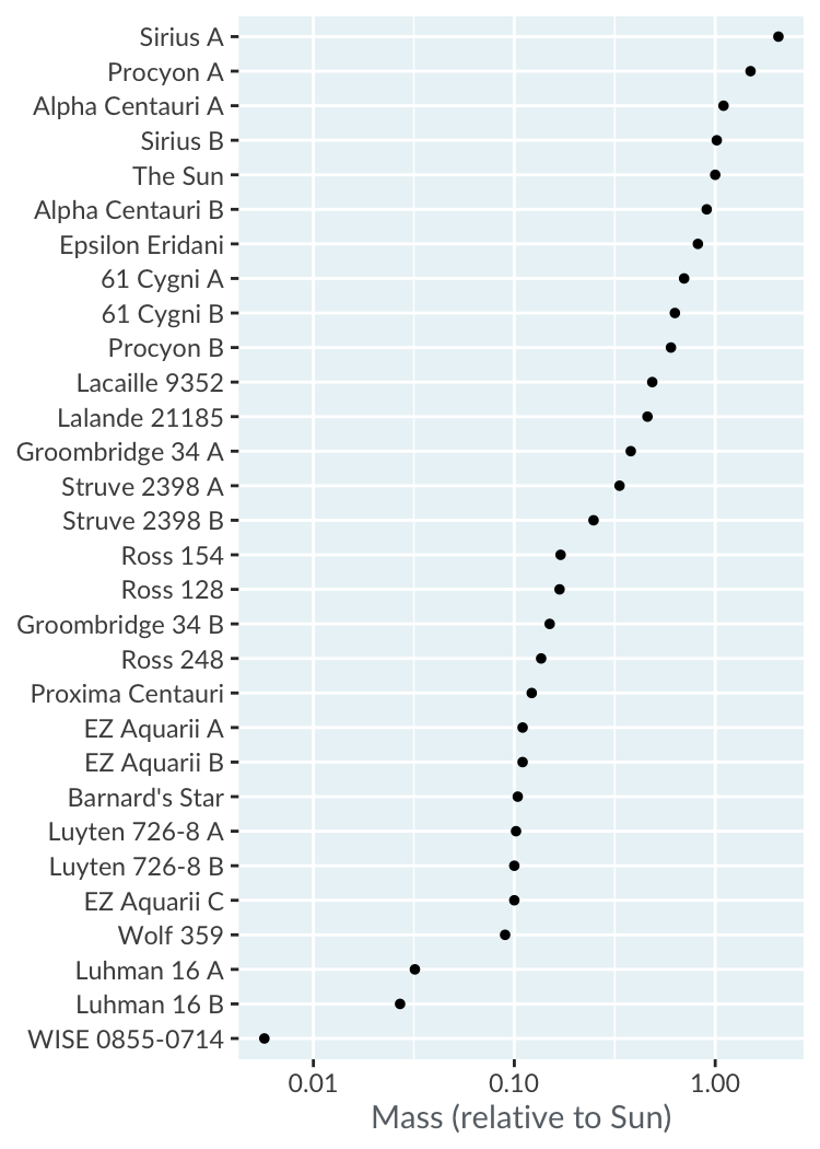
Sorting rows
Let's practice!
Understanding Data Visualization
Preparing Video For Download...