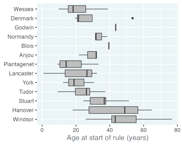
Box plots
Understanding Data Visualization

Richie Cotton
Data Evangelist at DataCamp
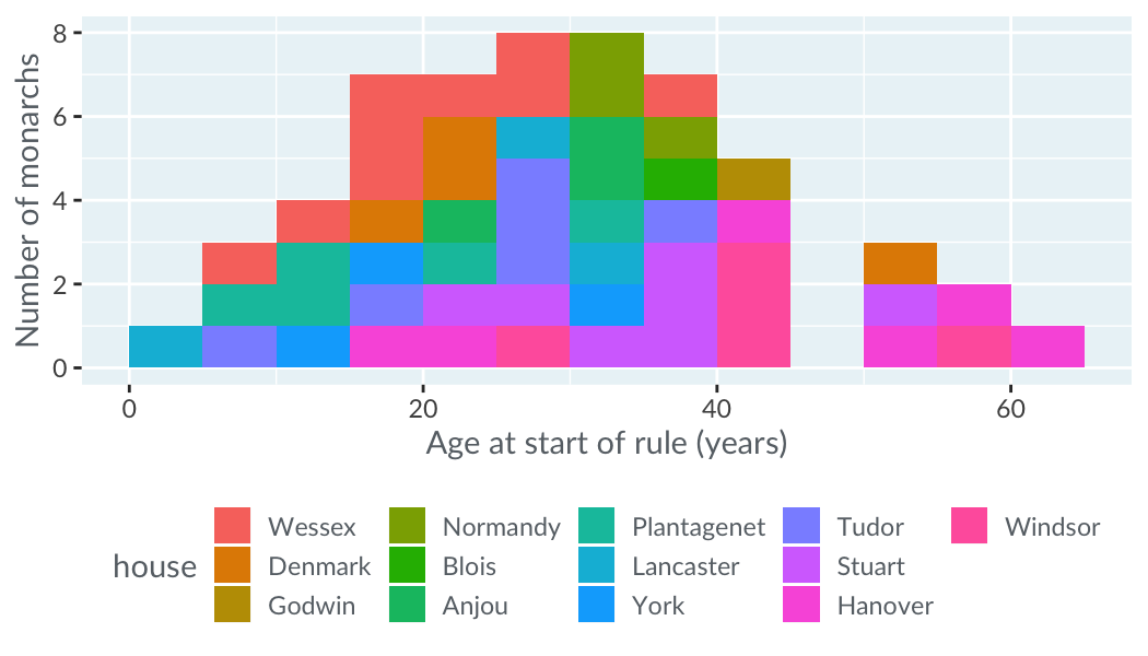
You can't just color in histograms
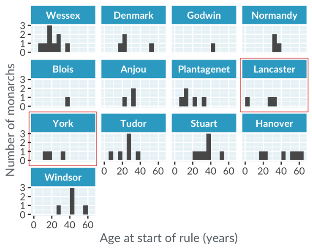
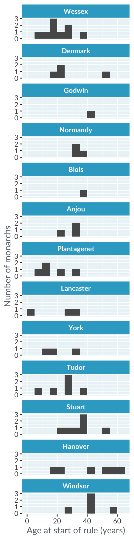
Draw each histogram in its own panel

Draw each histogram in its own panel
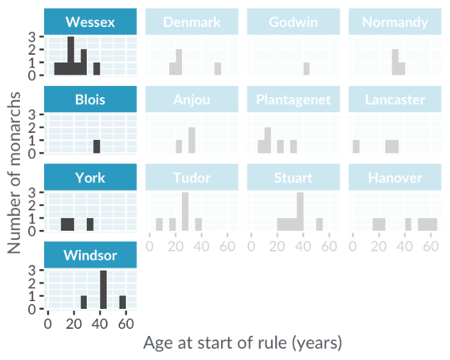
Draw each histogram in its own panel
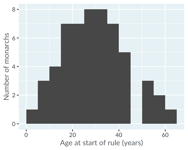
Histogram vs. box plot
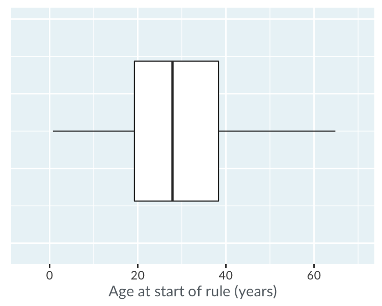
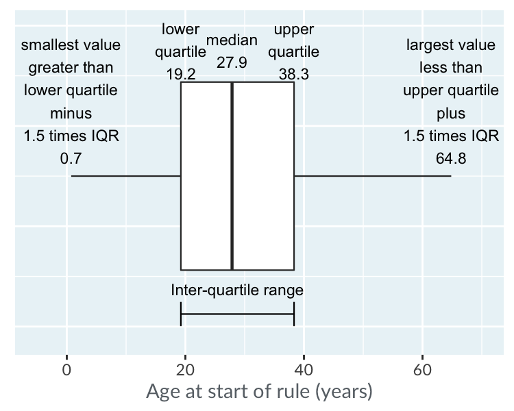
Histogram vs. box plot: mid-line
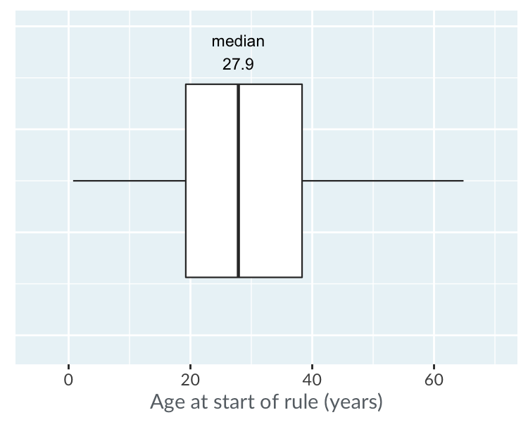
Histograms vs. box plot: the box
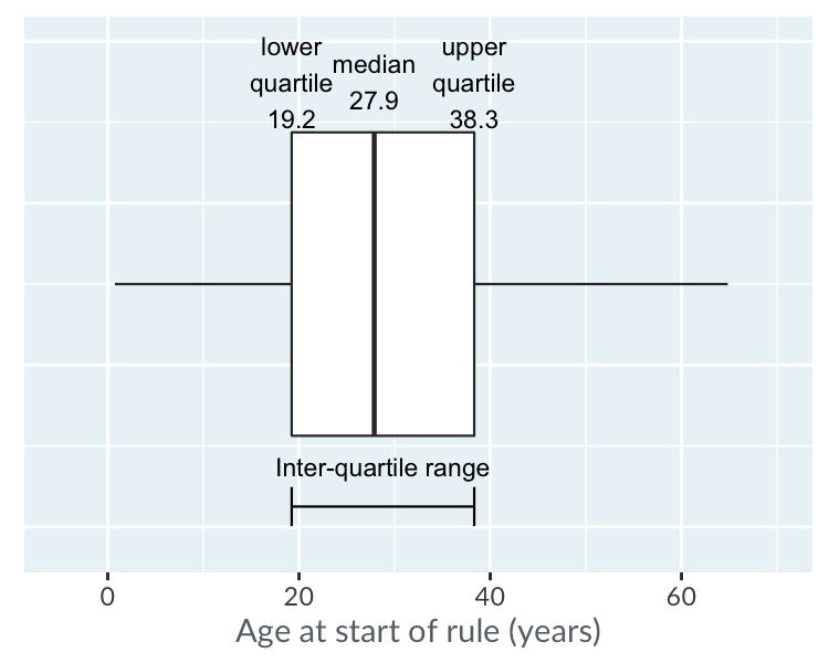
Histograms vs. box plots: the whiskers
Monarchs by house