Congratulations
Understanding Data Visualization

Richie Cotton
Data Evangelist at DataCamp
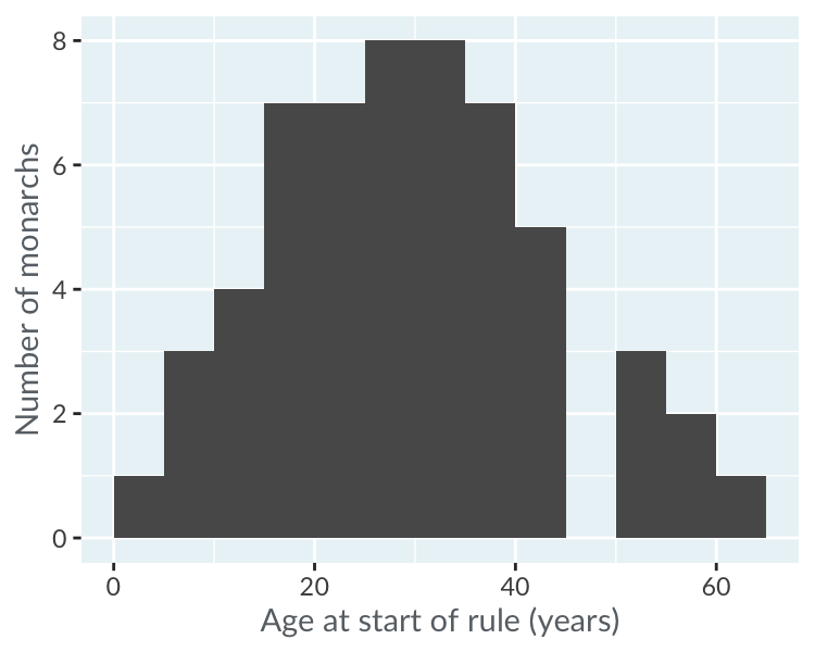
Histograms: show a distribution
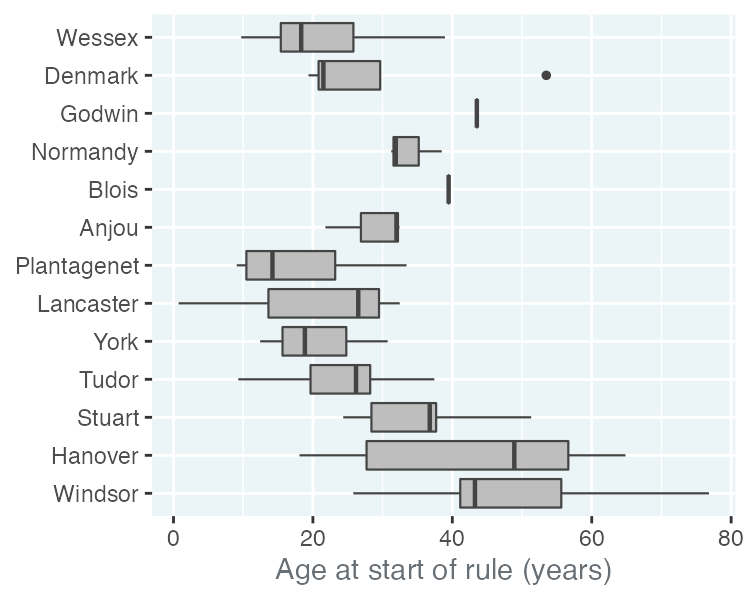
Box plots: show lots of distributions
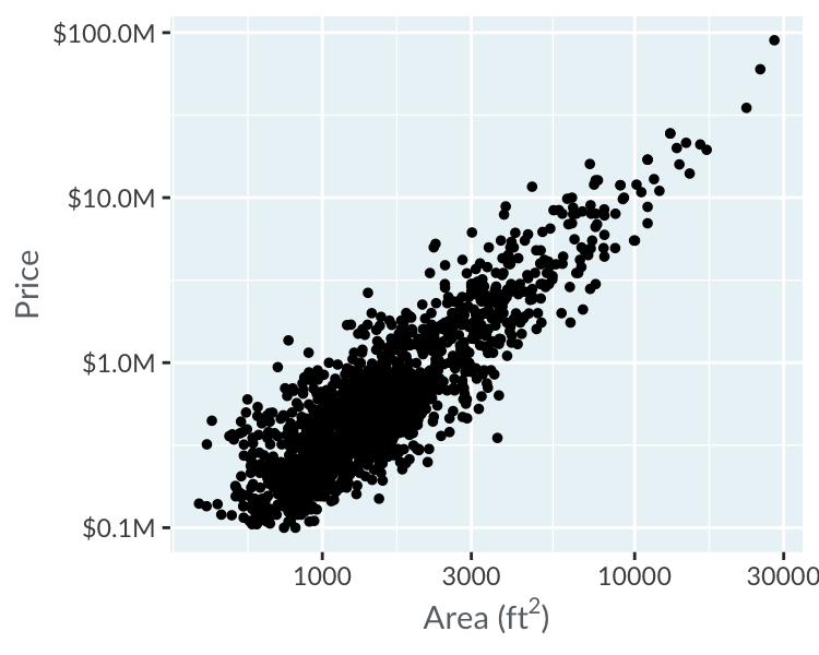
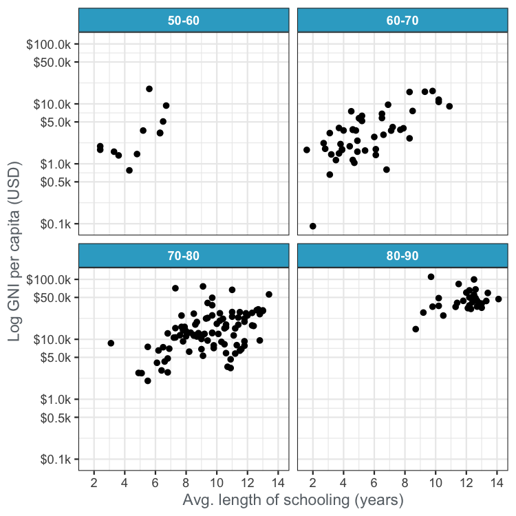
Scatter plots: compare two numeric variables
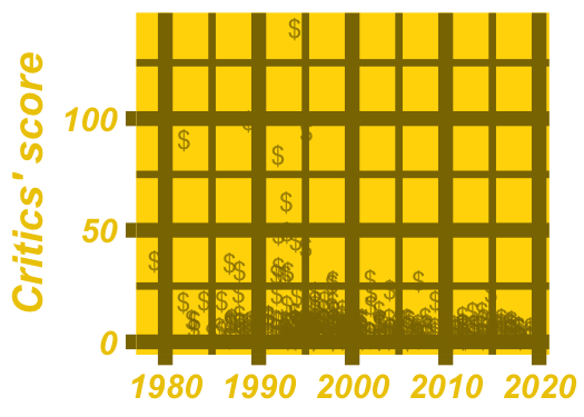
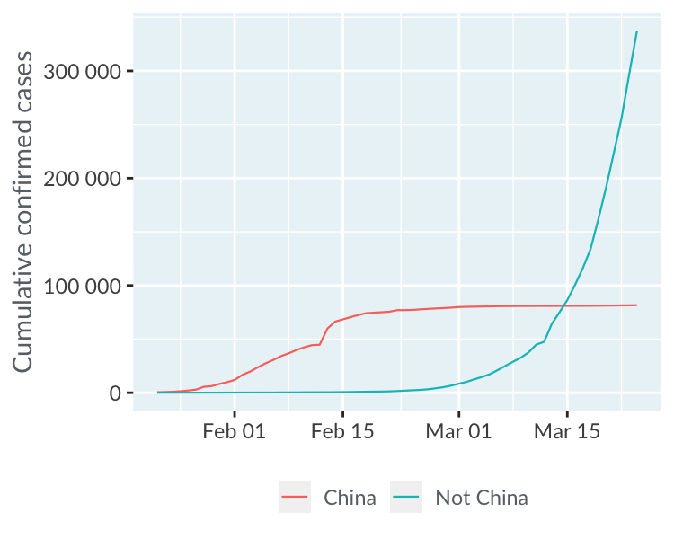
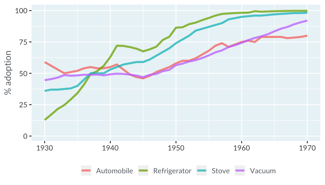
Line plots: show trends over time
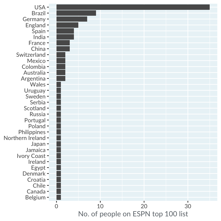
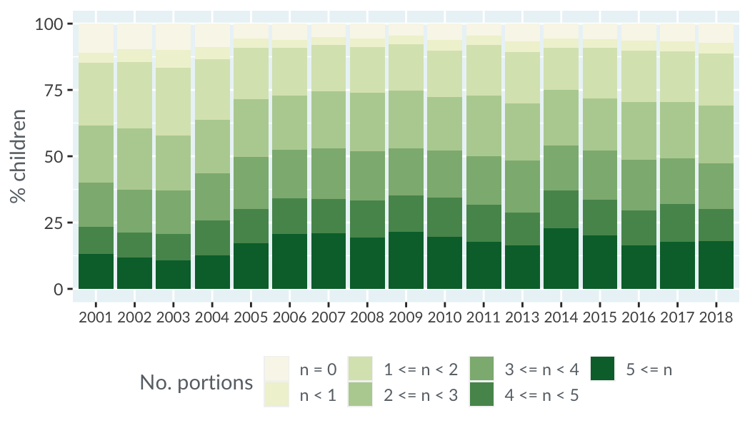
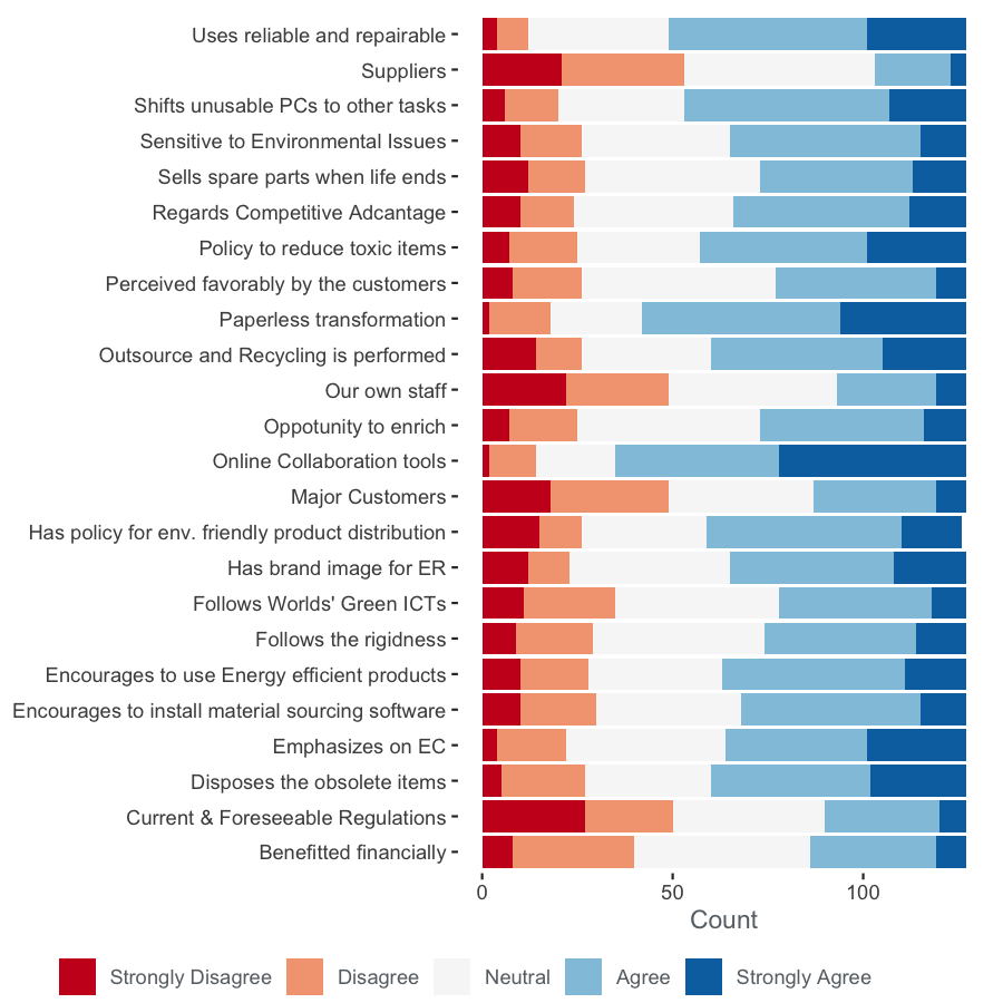
Bar plots: show counts by category
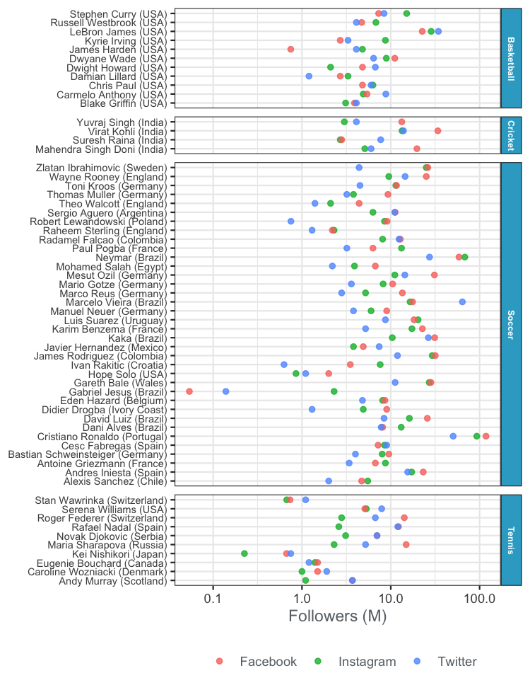
Dot plots: show log scale metrics by category
Extra dimensions
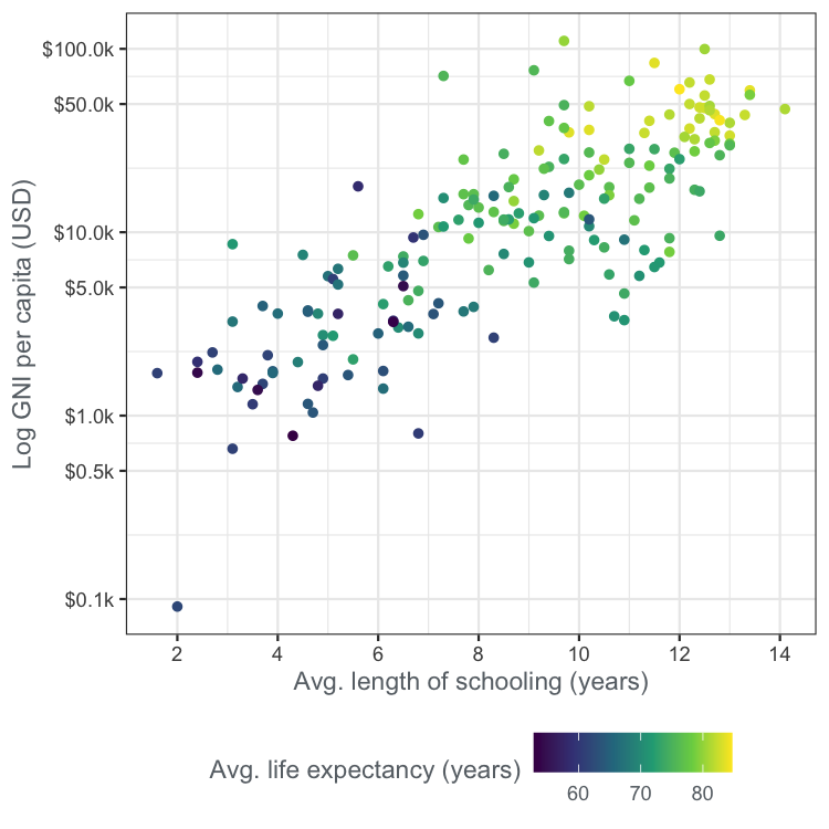
3 types of color scale
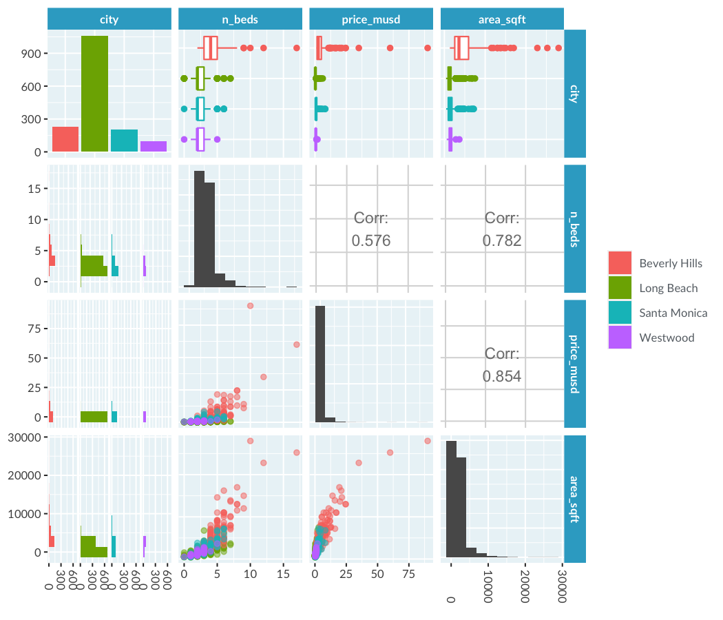
Pair plot: compare many variables
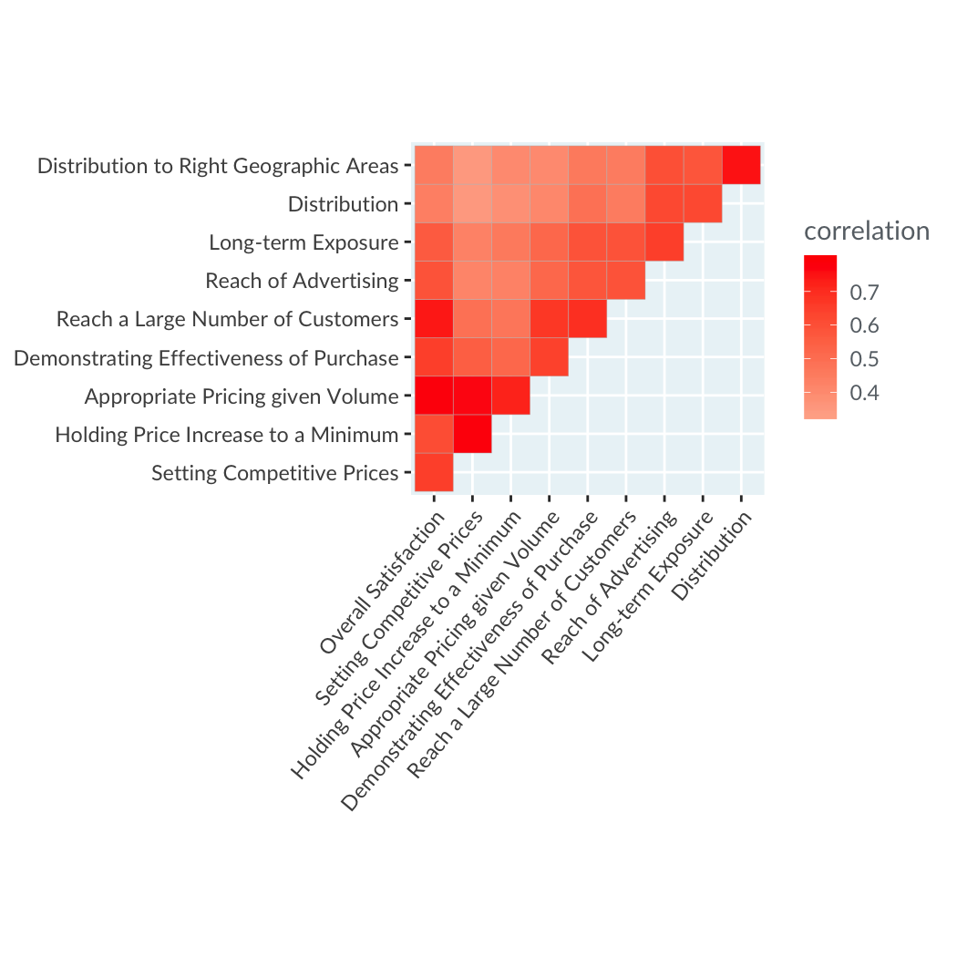
Correlation heatmap: show related variables
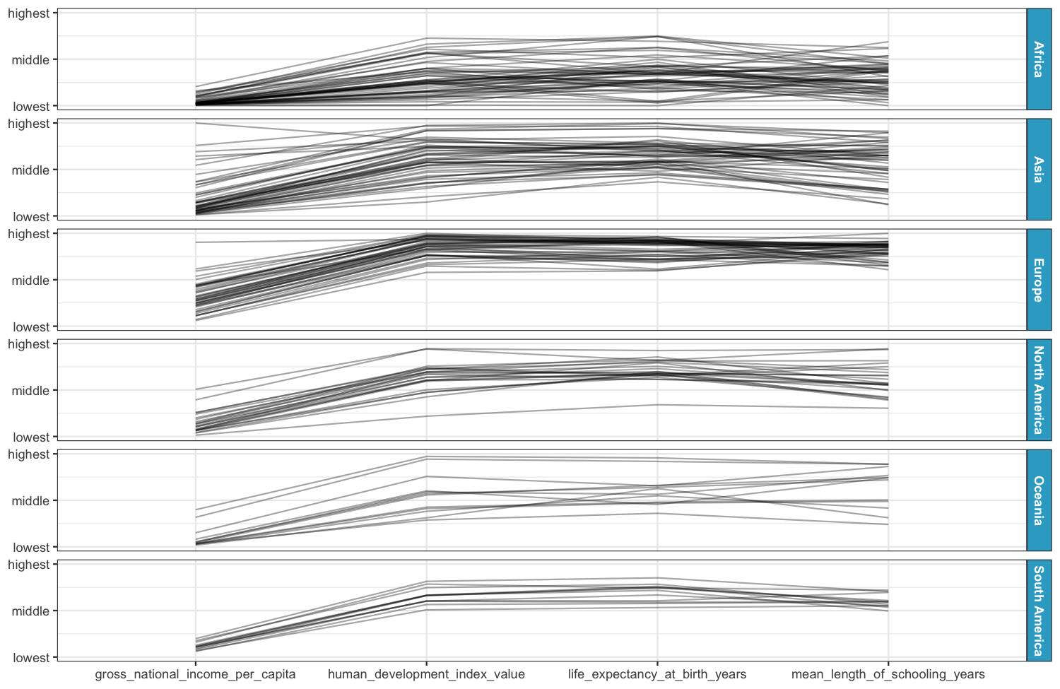
Parallel coordinates plot: find patterns across variables
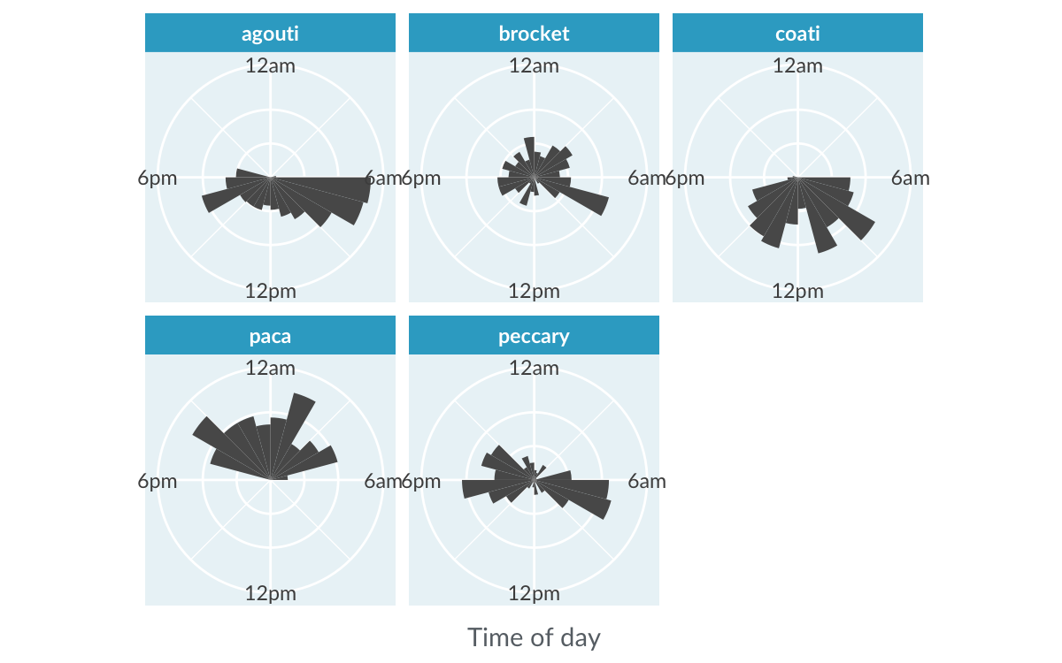
Rose plot: show a cyclical distribution
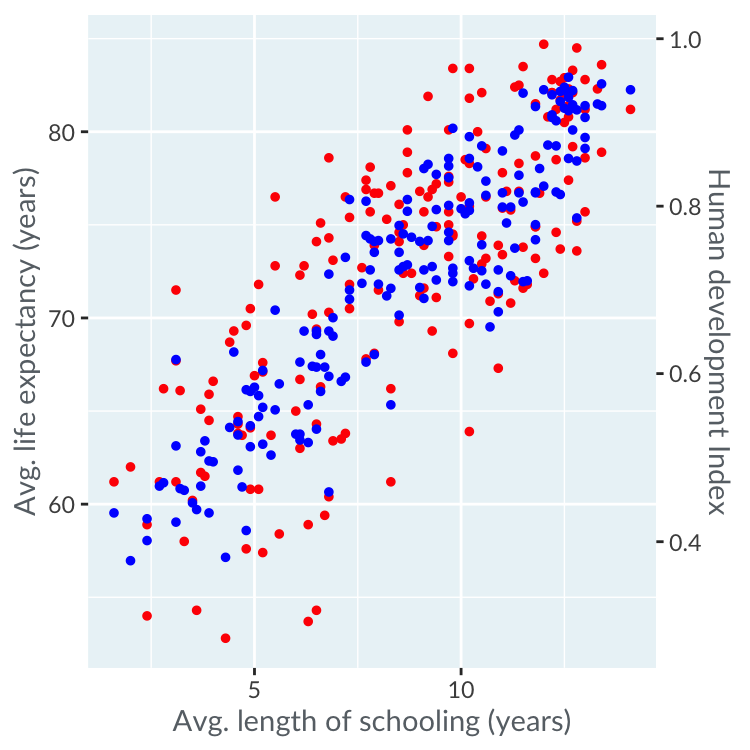
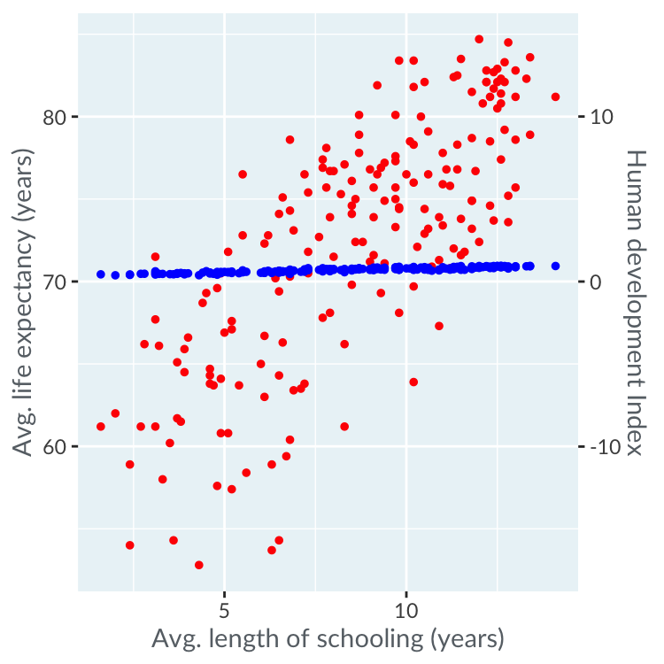
Dual axes are bad
Eliminate chartjunk