Using color
Understanding Data Visualization

Richie Cotton
Data Evangelist at DataCamp
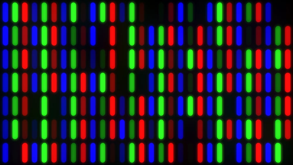
Colorspaces: Red-Green-Blue
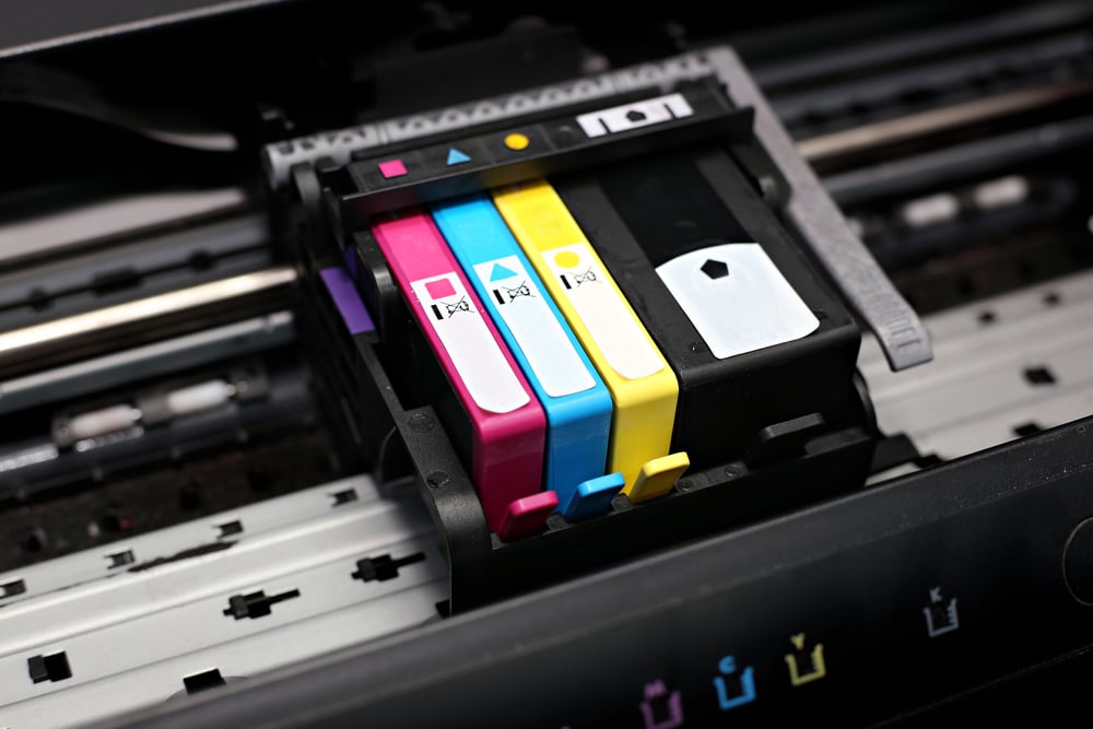
Colorspaces: Cyan-Magenta-Yellow-blacK
Choosing a plotting palette
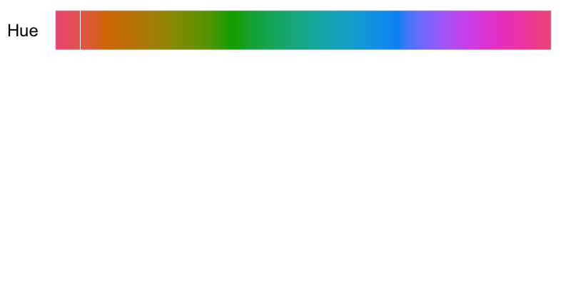
Colorspaces: Hue-Chroma-Luminance
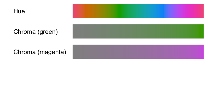
Colorspaces: Hue-Chroma-Luminance
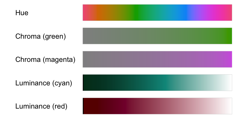
Colorspaces: Hue-Chroma-Luminance
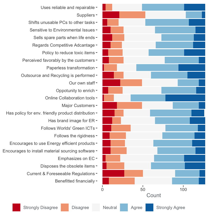
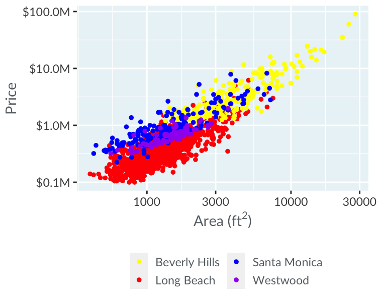
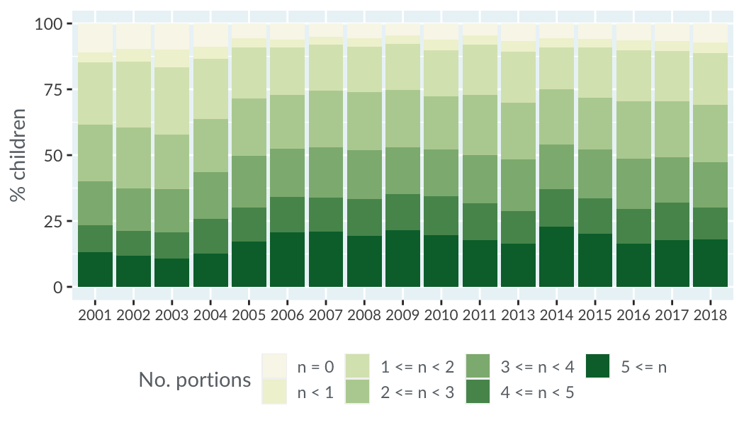
Three types of color scale: qualitative

Qualitative palette example
Three types of color scale: sequential

Sequential palette example
Another sequential palette example
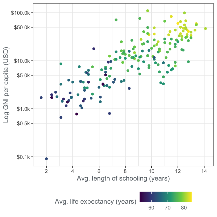
1 Viridis color scale: https://bids.github.io/colormap
Three types of color scale: diverging

Diverging palette example