Bar plots
Understanding Data Visualization

Richie Cotton
Data Evangelist at DataCamp

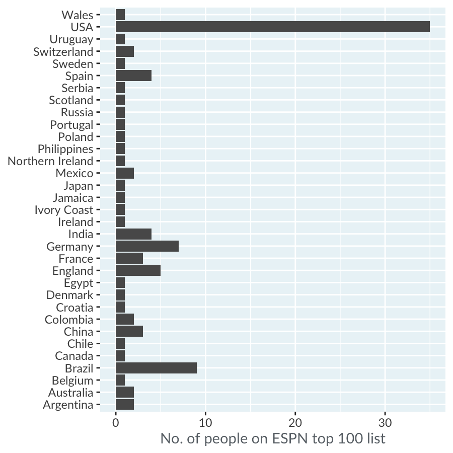
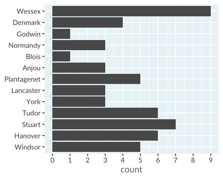
Bar plot of counts by country
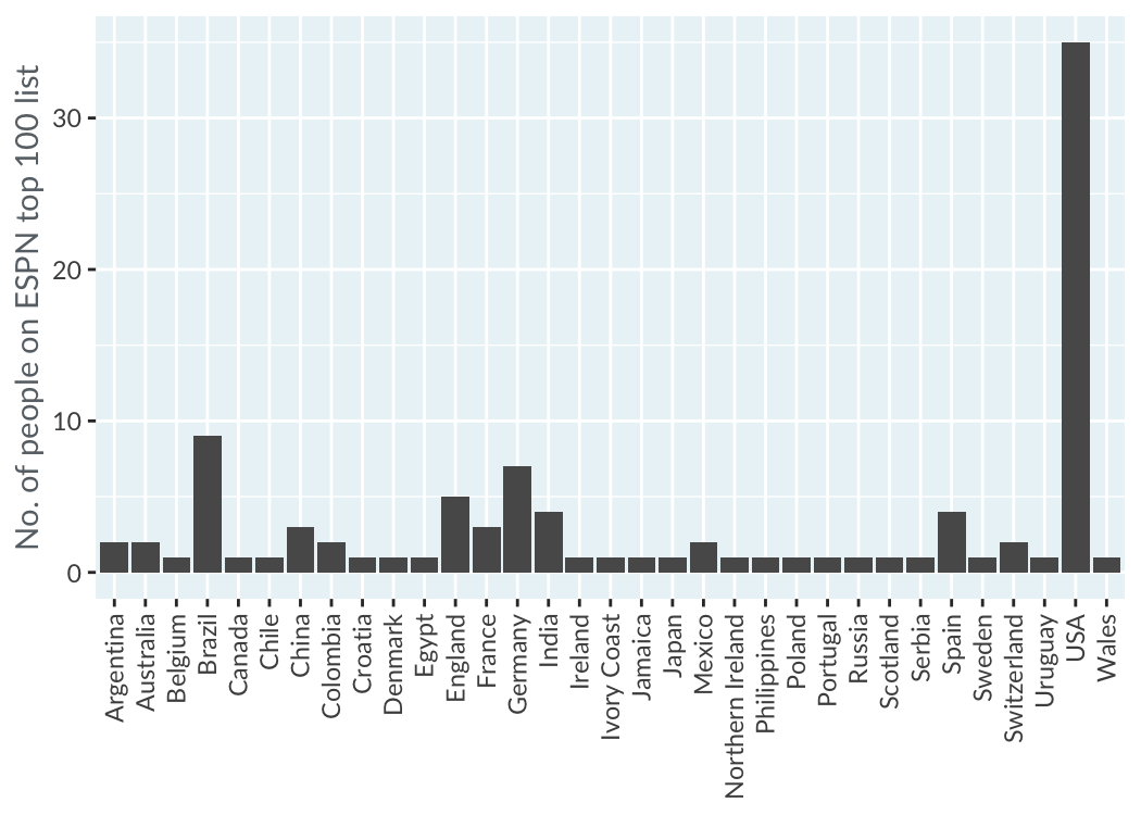
Vertical bars
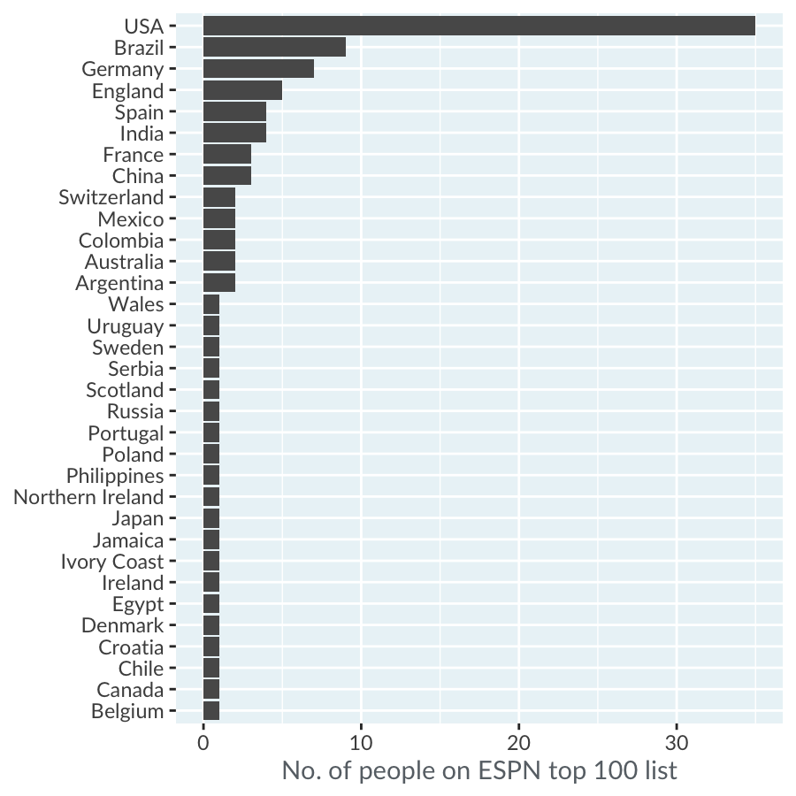
Sorting by count
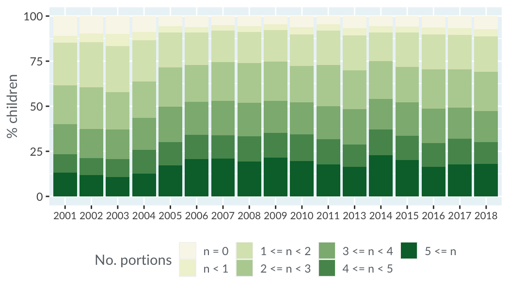
Stacking bars
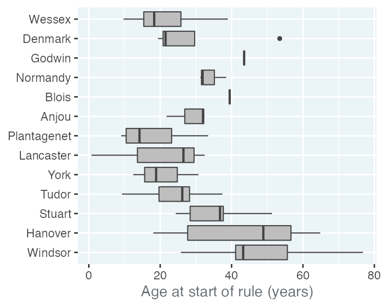
Bar plots vs. box plots
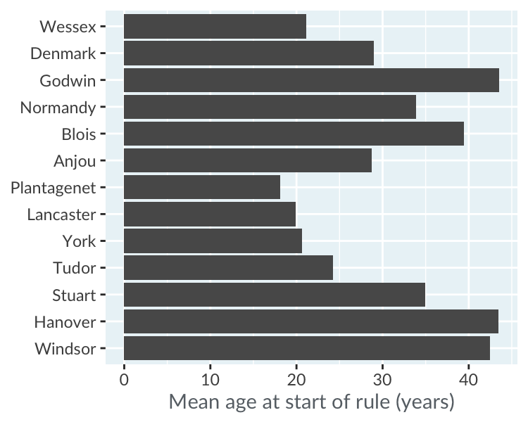
Other metrics than counts
Understanding Data Visualization
Richie Cotton
Data Evangelist at DataCamp

