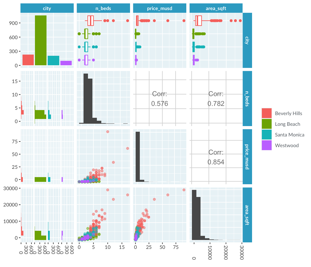
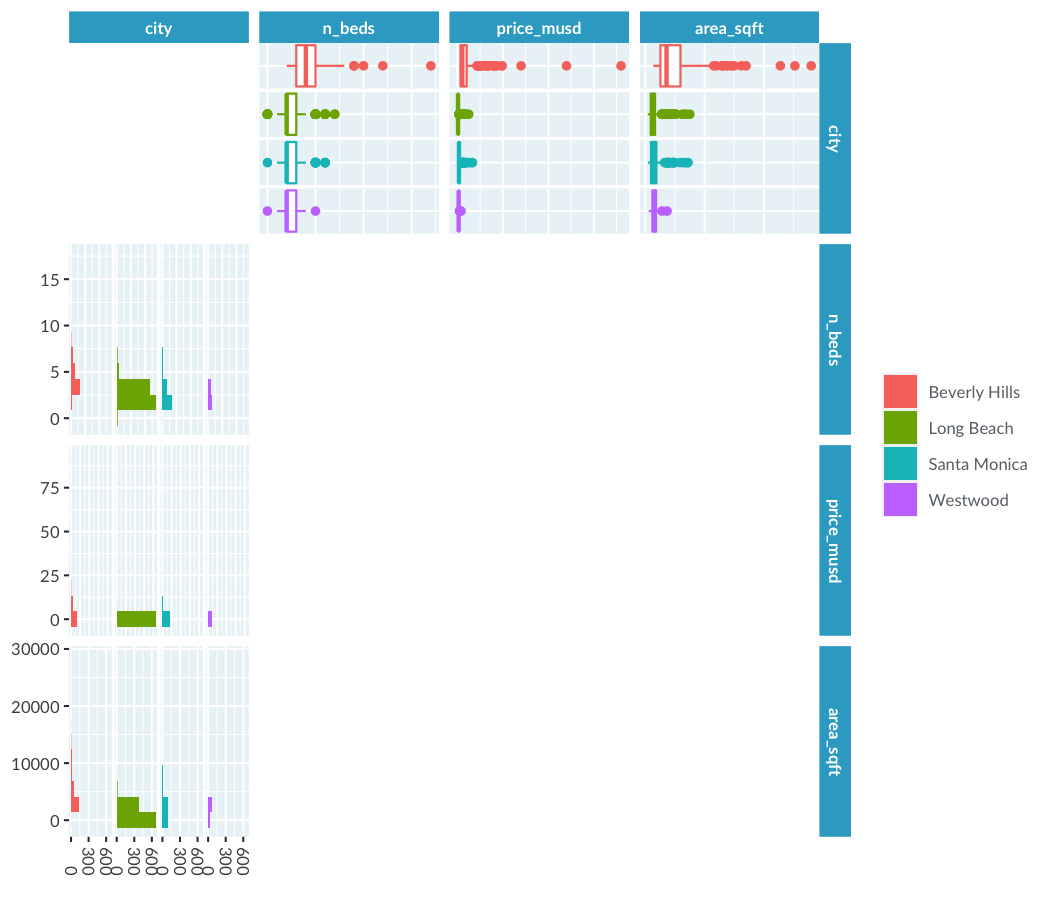
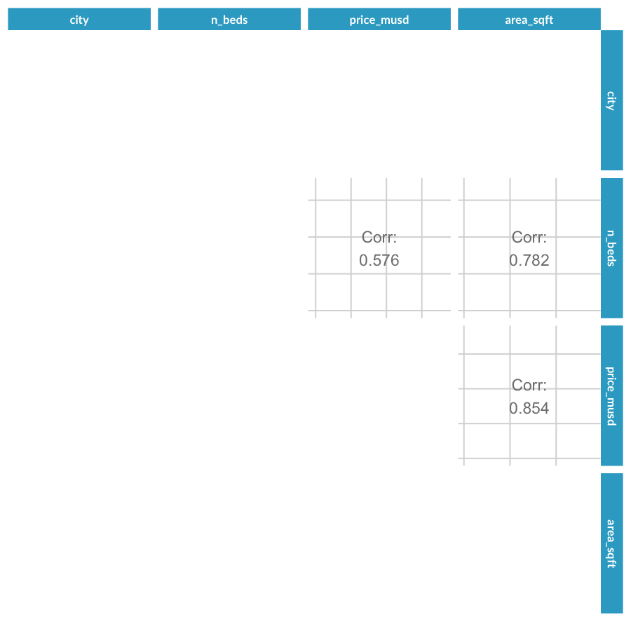
Plotting many variables at once
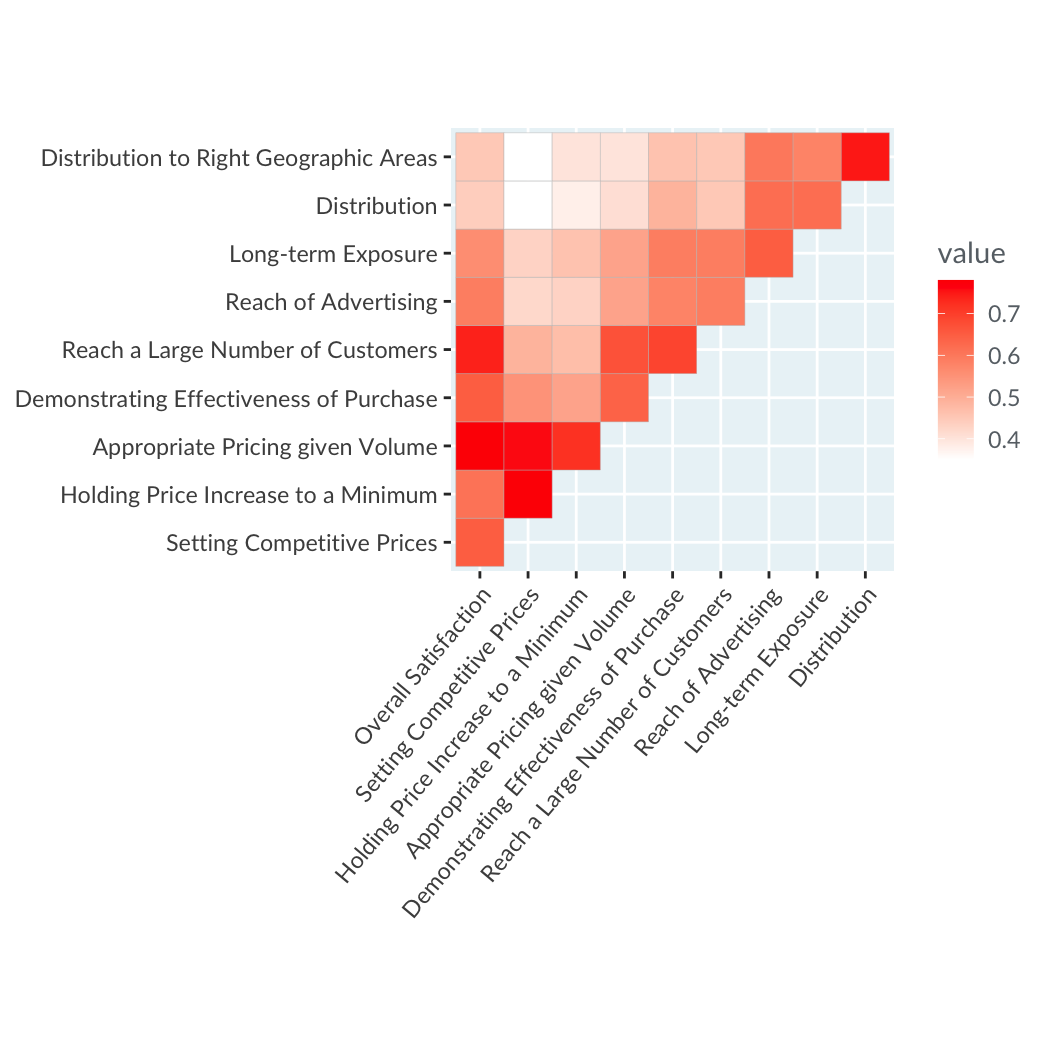
Understanding Data Visualization

Richie Cotton
Data Evangelist
1 Rossi, Allenby, and McCulloch (2005). Bayesian Statistics & Marketing
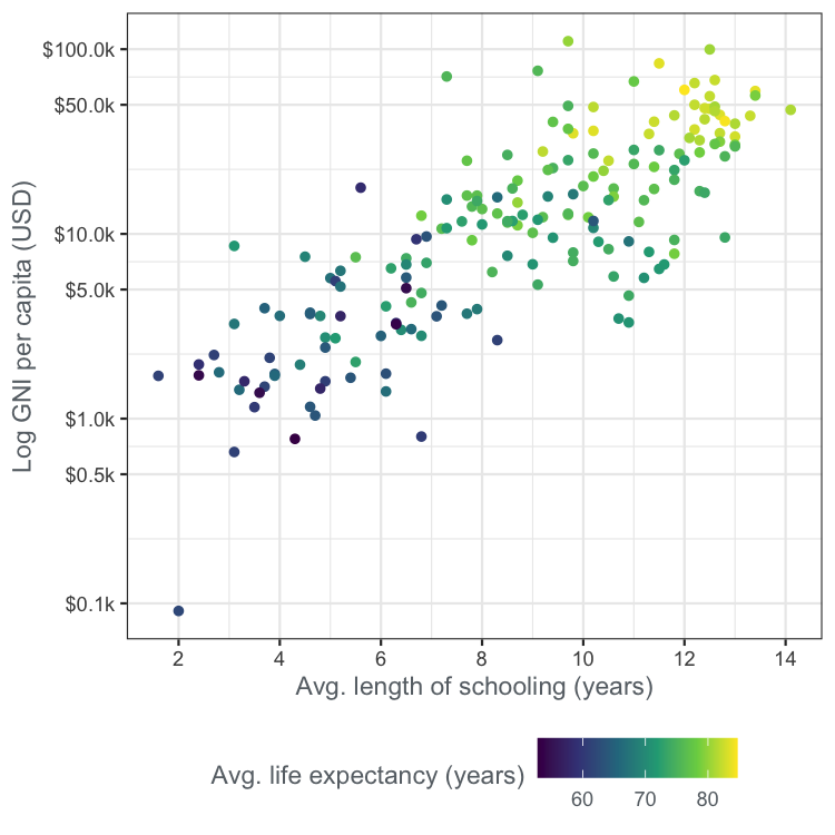
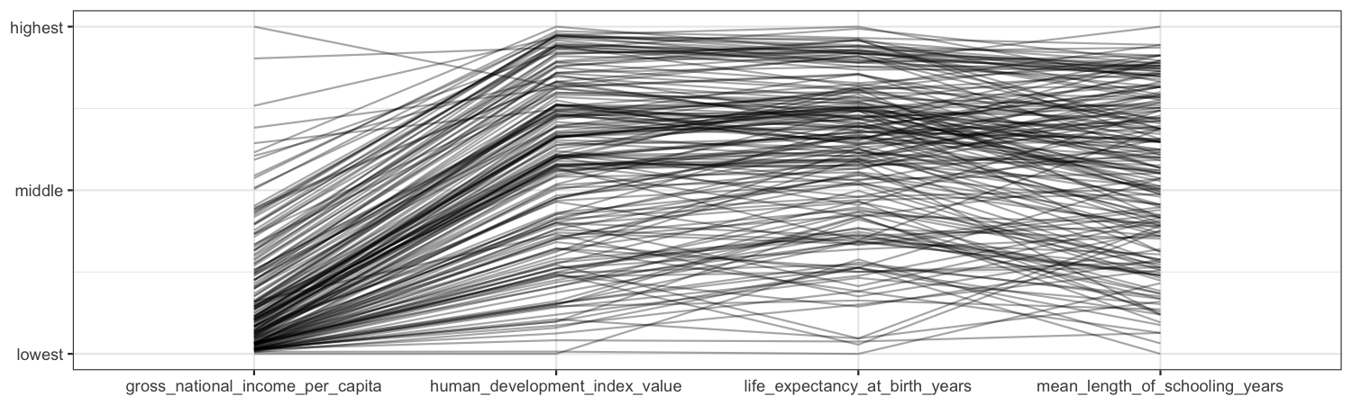
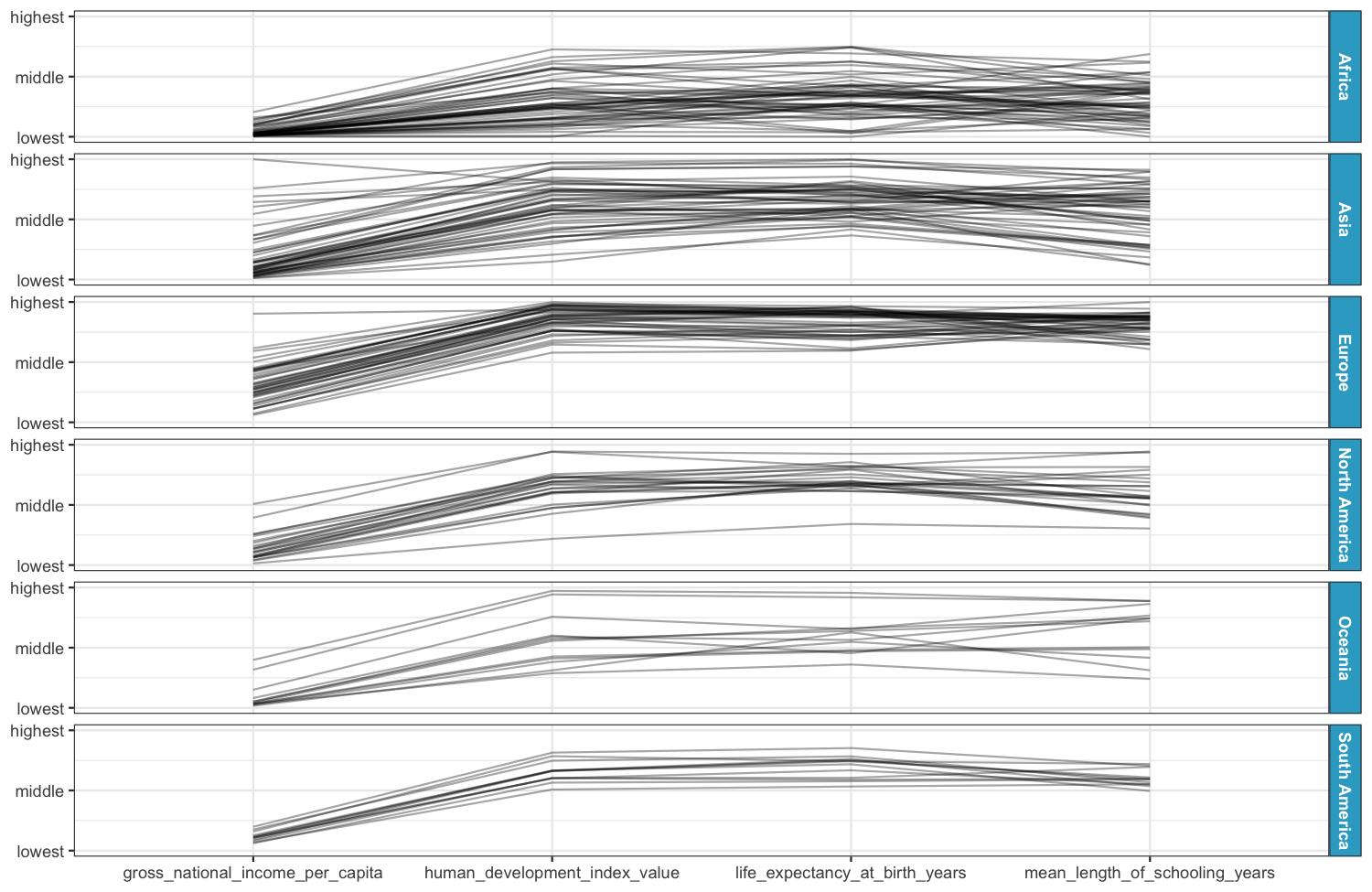
The United Nations dataset again
A parallel coordinates plot
Understanding Data Visualization
Richie Cotton
Data Evangelist

