Histograms
Understanding Data Visualization

Richie Cotton
Data Evangelist at DataCamp
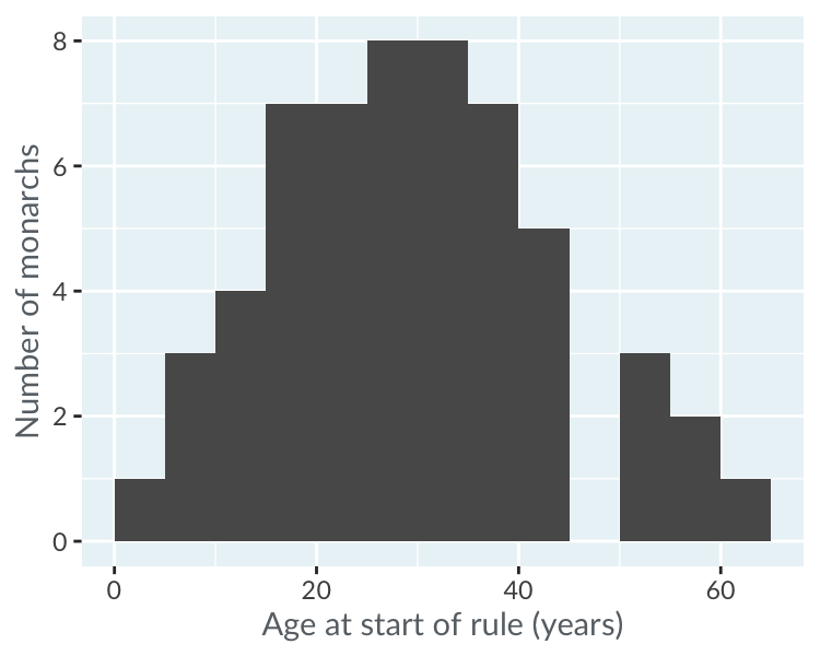
Histogram of age at start of rule
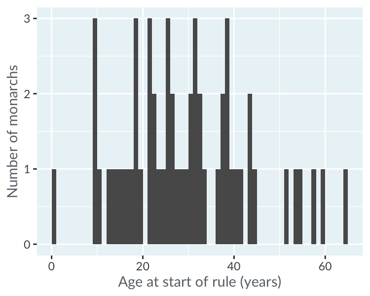
Choosing binwidth: 1 year
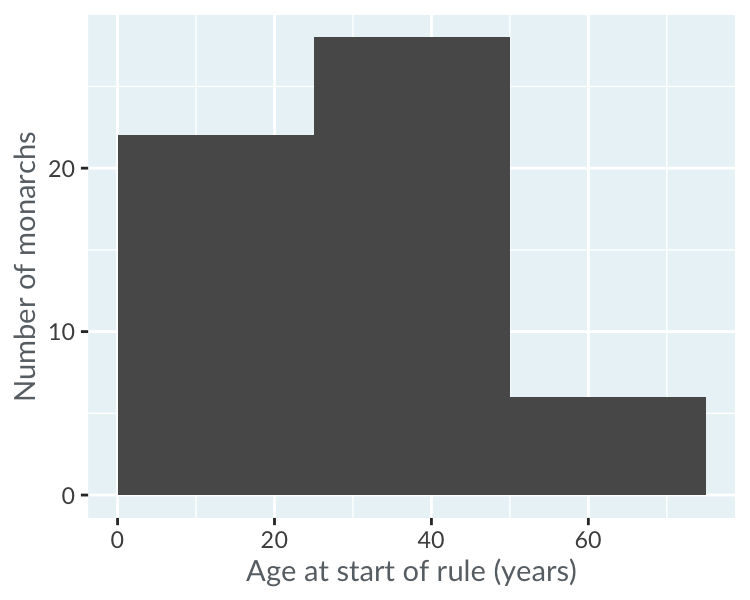
Choosing binwidth: 25 years
Modality: how many peaks?
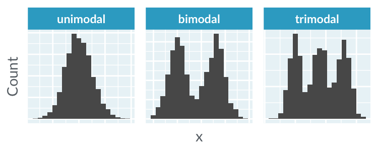
Modality: how many peaks?
Skewness: is it symmetric?
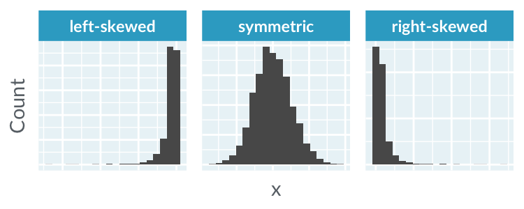
Skewness: is it symmetric?
Kurtosis: how many extreme values?
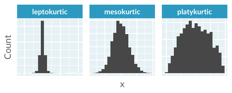
Kurtosis: how many extreme values?

