Sensory overload

Understanding Data Visualization

Richie Cotton

Data Evangelist at DataCamp

Measures of a good visualization

  • How many interesting insights can your reader get from the plot?
  • How quickly can they get those insights?
Understanding Data Visualization

Chartjunk

Any element of the plot that distracts from the reader getting insight

  • Pictures
  • Skueomorphism: reflections, shadows, etc.
  • Extra dimensions
  • Ostentatious colors or lines
Understanding Data Visualization

Pictures

Bar plot of average male height with chartjunk

Bar plot of average male height without chartjunk

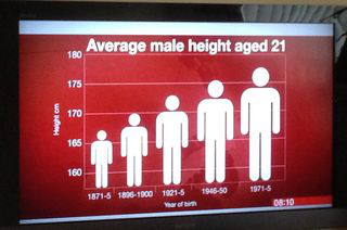
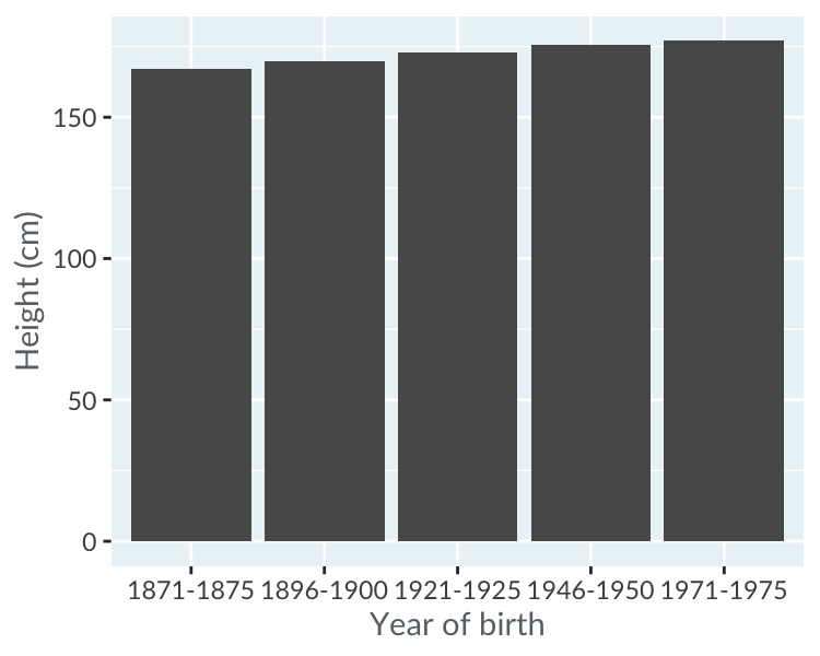
1 https://junkcharts.typepad.com/junk_charts/2013/09/the-incredibly-expanding-male.html
Understanding Data Visualization

Skeuomorphism

Bar plot of US border apprehensions with chartjunk

Bar plot of US border apprehensions without chartjunk

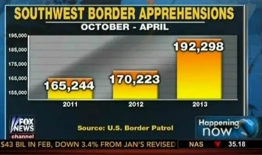
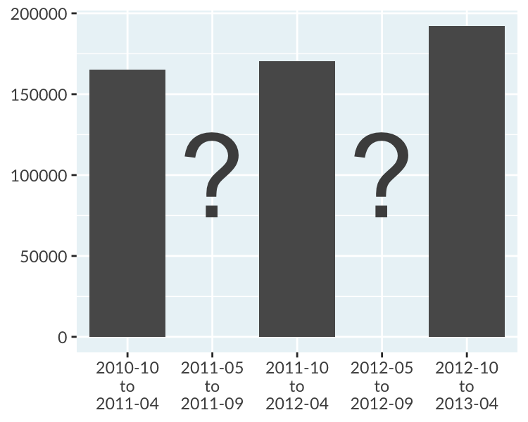
1 https://www.mediamatters.org/fox-news/fox-news-newest-dishonest-chart-immigration-enforcement
Understanding Data Visualization

Extra dimensions

Bar plot of theoretical orientation with chartjunk

Bar plot of theoretical orientation without chartjunk

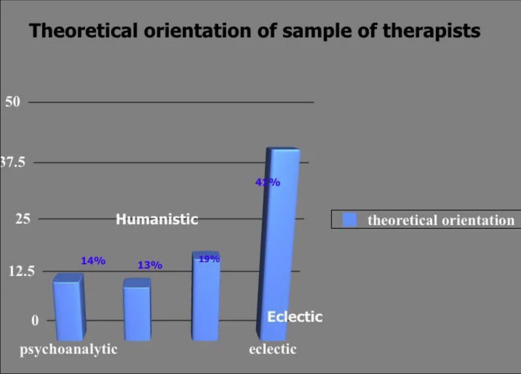
1 https://www.reddit.com/r/dataisugly/comments/dh6yra/an_actual_graph_presented_in_my_psychology
Understanding Data Visualization

Ostentatious colors and lines

Map plot showing seats in the German Federal Council with chartjunk

Map plot showing seats in the German Federal Council without chartjunk

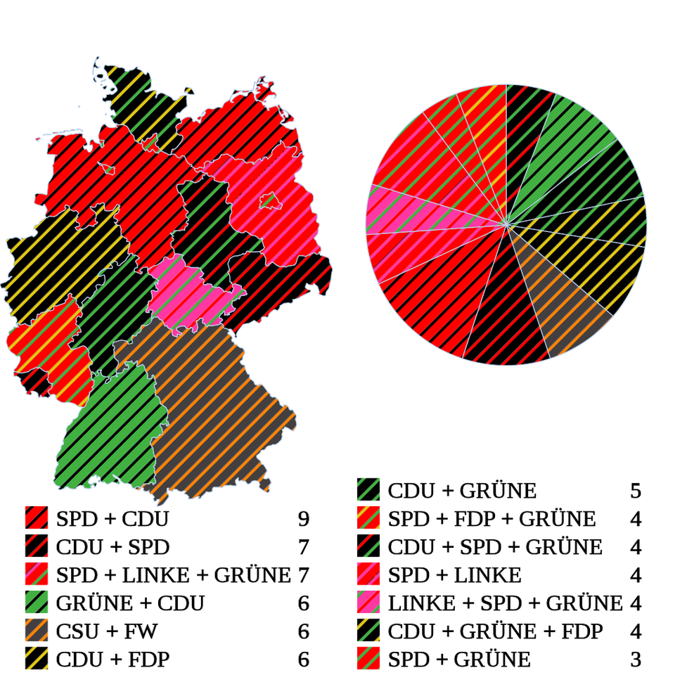
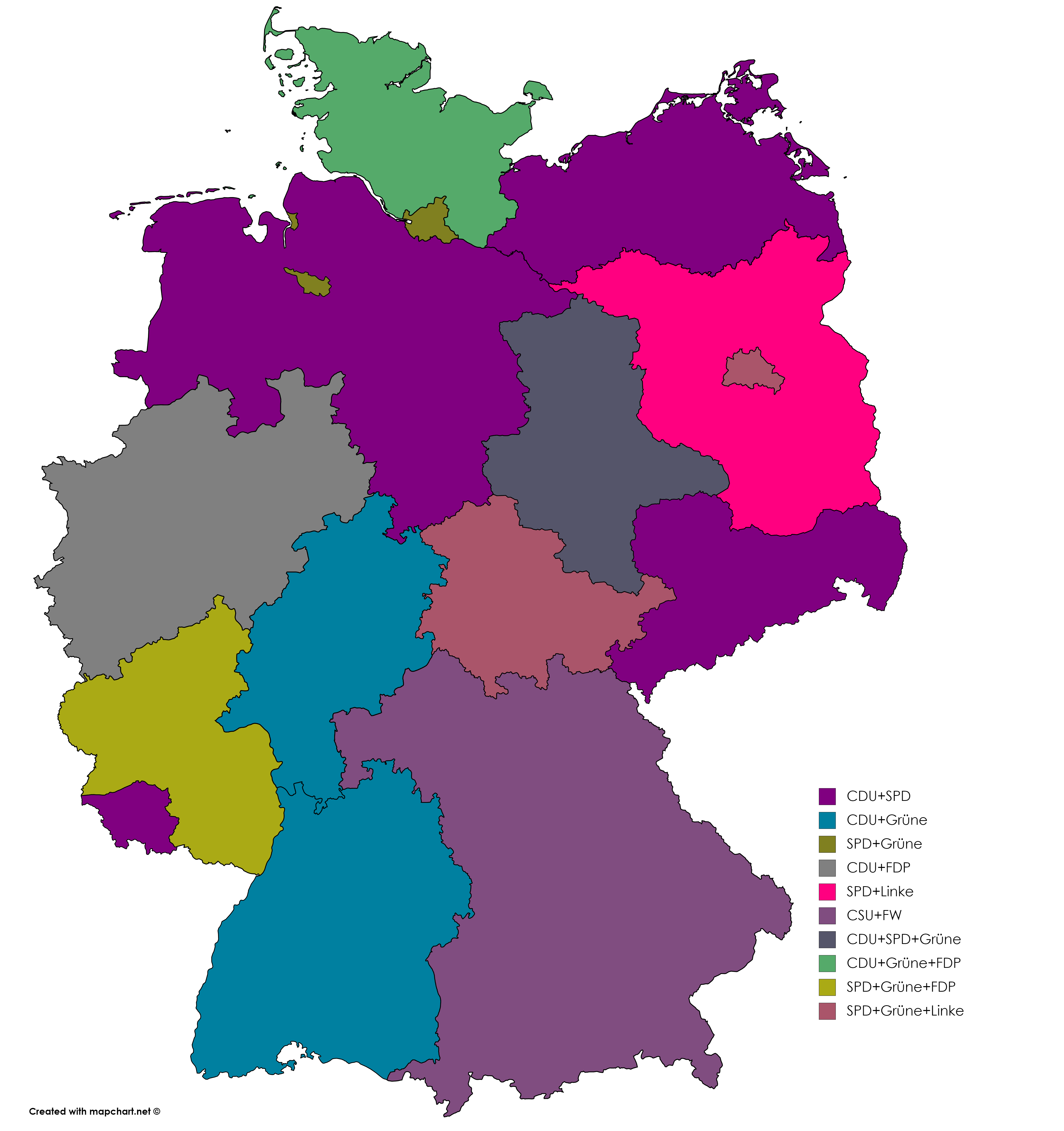
1 https://www.reddit.com/r/dataisugly/comments/cyhle4/wikipedias_image_of_the_distribution_of_seats_in 2 https://imgur.com/y27mRLj
Understanding Data Visualization

Let's practice!

Understanding Data Visualization

Preparing Video For Download...