Editing plot axes
Introduction to Data Visualization with Plotly in Python

Alex Scriven
Data Scientist
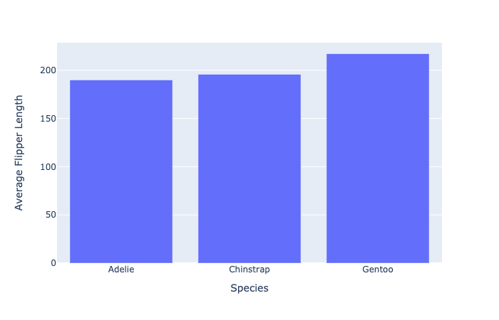
The default axis titles

Cleaning up our plot
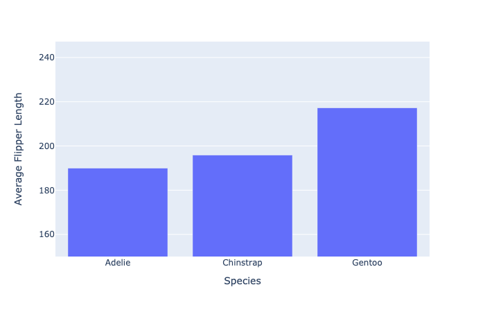
Editing axes ranges
- Setting the y-axis from 150 to the maximum value (with a small buffer)
fig.update_layout(dict(
    yaxis=dict(range=[150, penguin_flippers["av_flip_length"].max() + 30]
    )))
Our new axes ranges
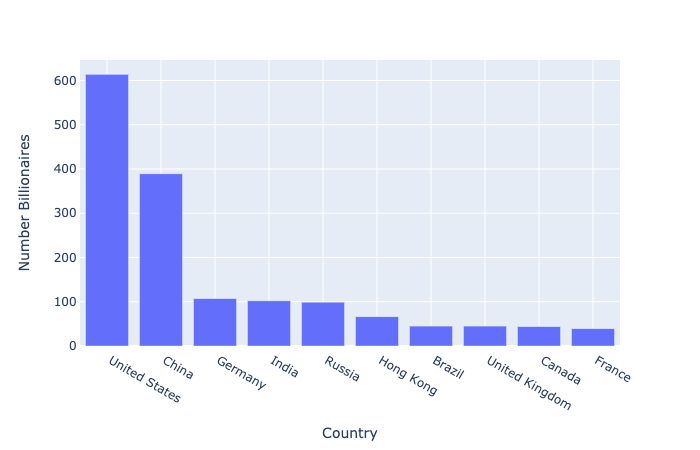
Data scale issues
What happens when some data points are much larger than others?
- Top 10 countries by number of billionaires
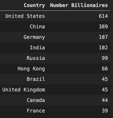
Our scale problem
The log scale
- Used to plot data with large value differences
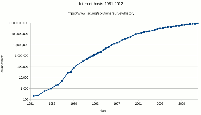
- Each tick is ten times the previous (10, 100, 1000, etc.)
Using log with our data
$$
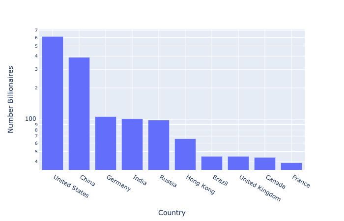
Log scale: a word of warning
💡 Always consider the audience when choosing how to visualize data