Layering multiple plots
Introduction to Data Visualization with Plotly in Python

Alex Scriven
Data Scientist
What is plot layering?
- Overlaying several plots within the same plot
$$
- No separate grid positions
- Use
add_trace()
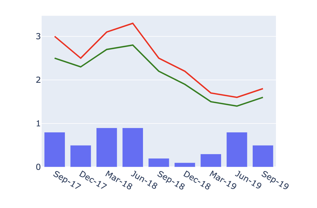
Bar + line layered plot
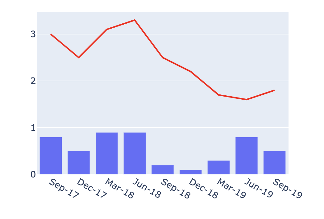
GDP growth layered plot
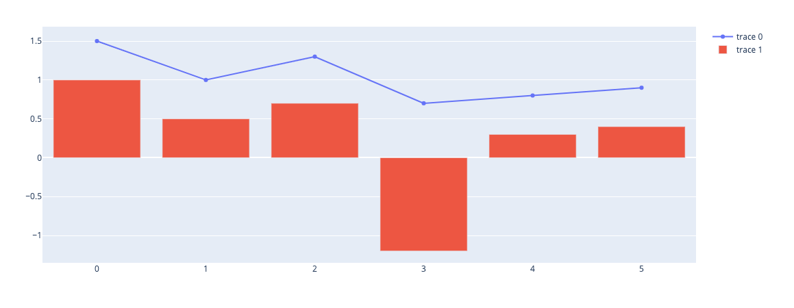
Adding more plots

