Customizing color
Introduction to Data Visualization with Plotly in Python

Alex Scriven
Data Scientist
Customization in general
How to customize plots:
- At plot creation, if an argument exists (like
color) - After plot is created use
update_layout()- Takes a dictionary
fig.update_layout({"title":{"text":"A New Title"}})
Why customize color?
Customizing color can help:
- Make plots look awesome!
- Convey analytical insights
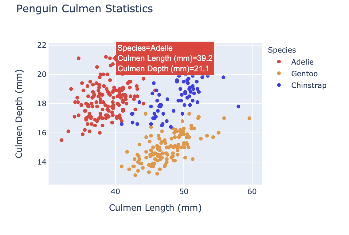
- Color in this scatterplot adds a 3rd dimension.
Some color theory
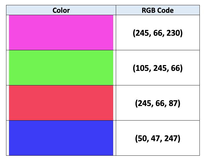
Computers use RGB encoding to specify colors:
- RGB = A 3-digit code (each 0-255) mixing Red, Green, Blue
- (0,0,255) is blue and (255,255,0) is yellow
$$
$$
See more in this article
Specifying colors in plotly.express
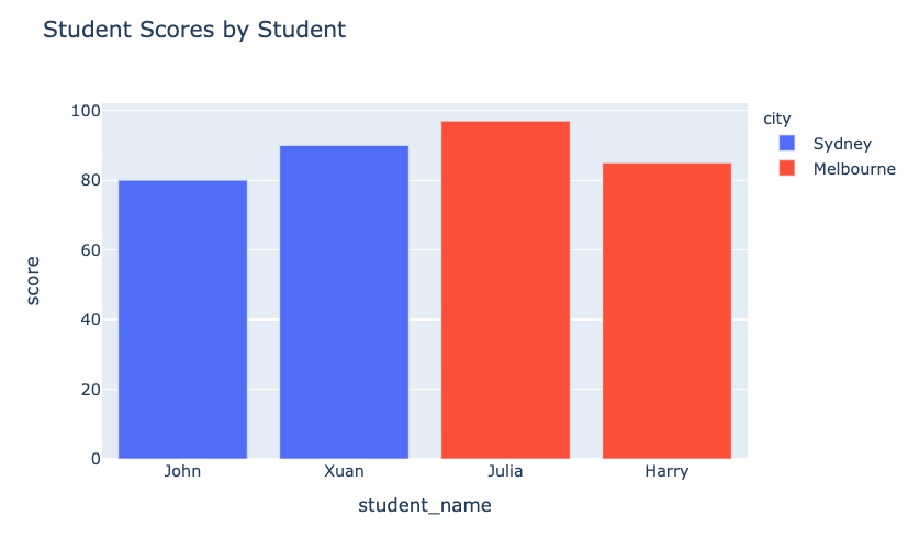
colorargument (DataFrame column)- Each category gets a color (automatically)
- A color scale is used for numerical columns
fig = px.bar(data_frame=student_scores,
      x="student_name",
      y="score",
      title="Student Scores by Student"
      color="city")
fig.show()
Our colors revealed
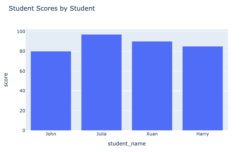
The plot before:
Our plot after:
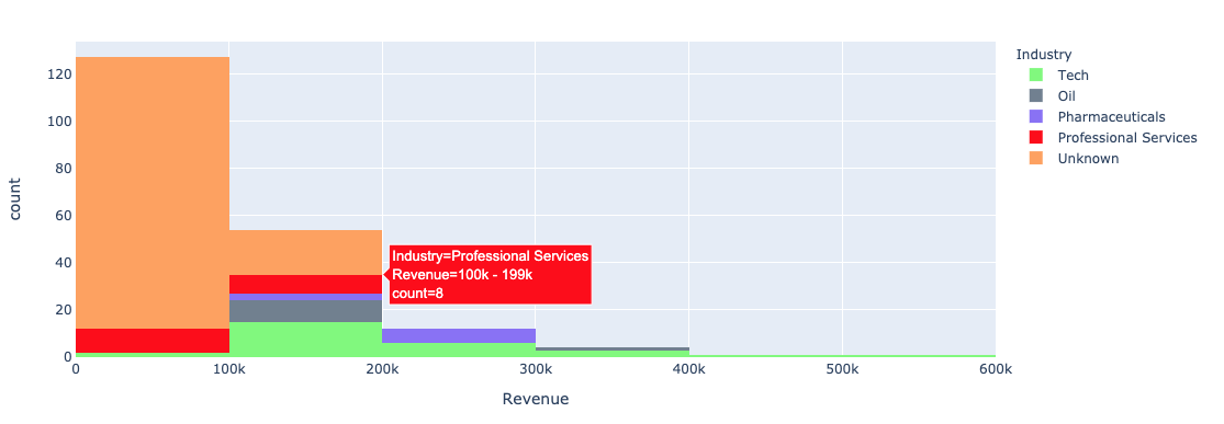
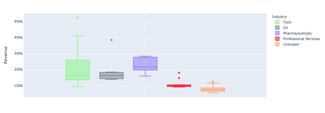
Color with univariate plots
Using plotly.express color argument with univariate (bar, histogram) plots:
- Histograms - stacked bars
- Box plots - produces multiple plots
Specific colors in plotly.express
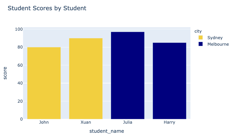
color_discrete_map: A dictionary that maps categorical values to colors- Can also express (basic) colors as strings such as
"red","green"etc.
Our specific colors
$$
fig = px.bar( data_frame=student_scores, x="student_name", y="score", title="Student Scores by Student",color_discrete_map={ "Melbourne": "rgb(0,0,128)", "Sydney": "rgb(235, 207, 52)"},color="city")
Color scales in plotly.express
- Single color scales (light to dark green)

- Blended gradient (green into blue)
$$
color_continuous_scaleargument for color scales.

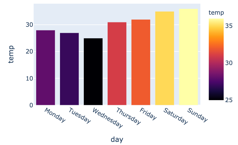
Using built-in color scales
fig = px.bar(data_frame=weekly_temps,
    x="day", y="temp",
    color="temp",
    color_continuous_scale="inferno")
fig.show()
$$
- Many built-in scales available
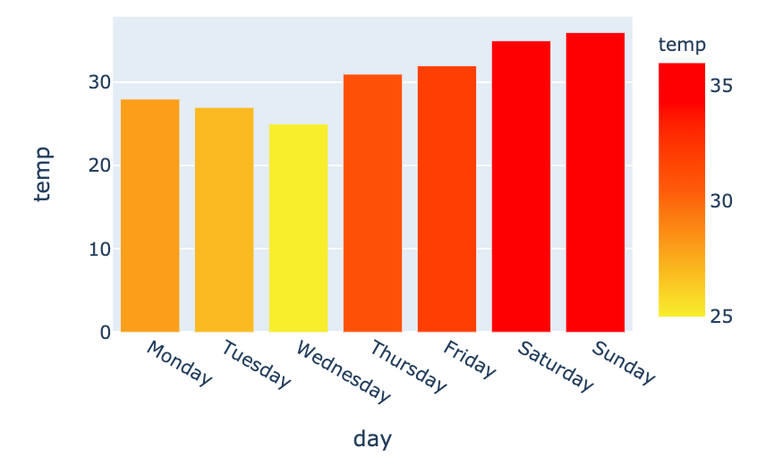
Constructing our own color range
- Custom color scale (yellow - orange - red)
my_scale=[("rgb(242, 238, 10)"), ("rgb(242, 95, 10)"), ("rgb(255,0,0)")]fig = px.bar(data_frame=weekly_temps, x="day", y="temp",color_continuous_scale=my_scale, color="temp")
Let's practice!
Introduction to Data Visualization with Plotly in Python

