Sliders
Introduction to Data Visualization with Plotly in Python

Alex Scriven
Data Scientist
What are sliders?
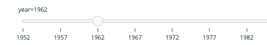
A year slider:
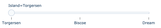
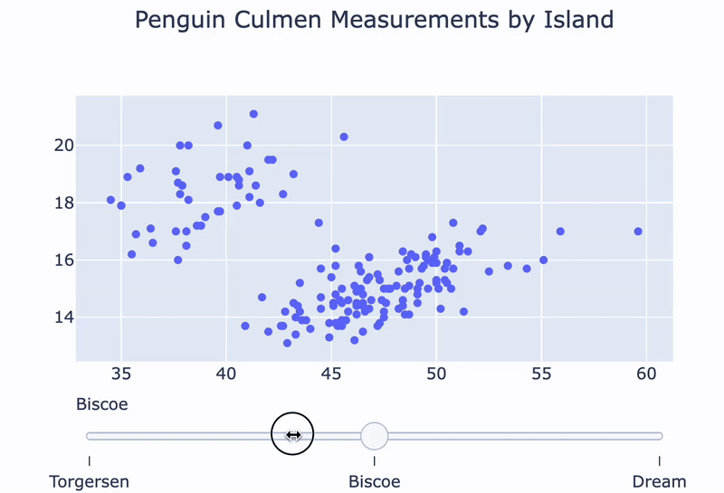
A penguin island slider:
Revenue vs. Employees with slider
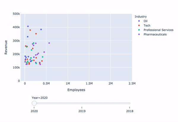
Adding the slider
Introduction to Data Visualization with Plotly in Python
Alex Scriven
Data Scientist
A year slider:
A penguin island slider:

