Time buttons
Introduction to Data Visualization with Plotly in Python

Alex Scriven
Data Scientist
What are time buttons?
Adding the time buttons
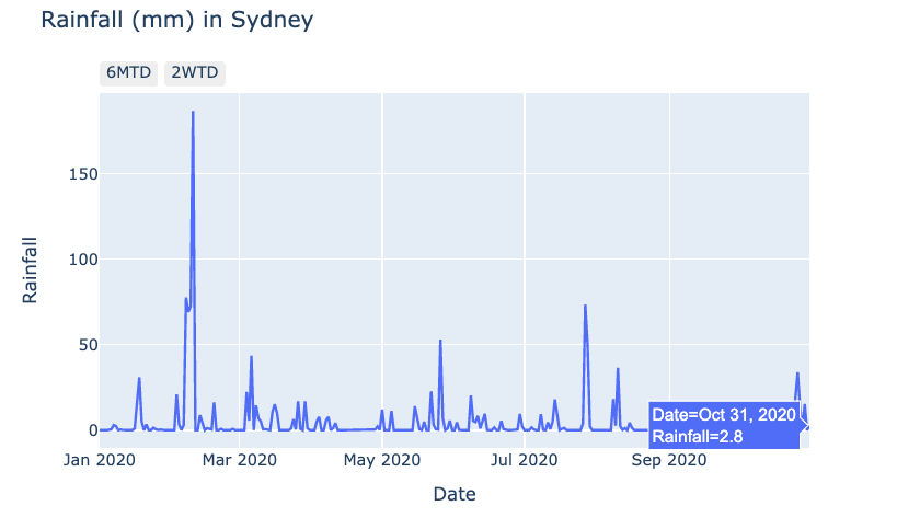
Clicking our time buttons
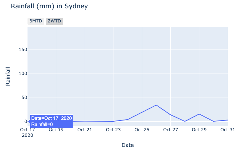
Clicking the 2WTD button:
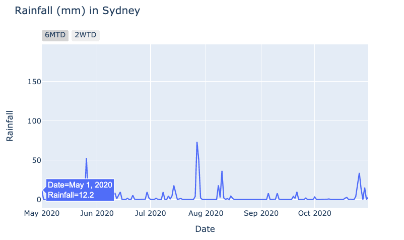
Clicking the 6MTD button:
Introduction to Data Visualization with Plotly in Python
Alex Scriven
Data Scientist
Clicking the 2WTD button:
Clicking the 6MTD button:

