Plotly and the Plotly Figure
Introduction to Data Visualization with Plotly in Python

Alex Scriven
Data Scientist
What is Plotly?
- A JavaScript graphing library
- Don't worry - no need to know JavaScript!
- Plotly has a Python wrapper

Our Figure revealed
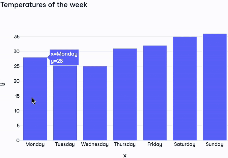
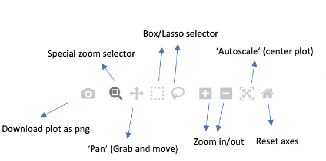
Plotly's instant interactivity
$$
- Hover over data points
- Extra interactive buttons