Introduction to Data Visualization with Plotly in Python
Alex Scriven
Data Scientist
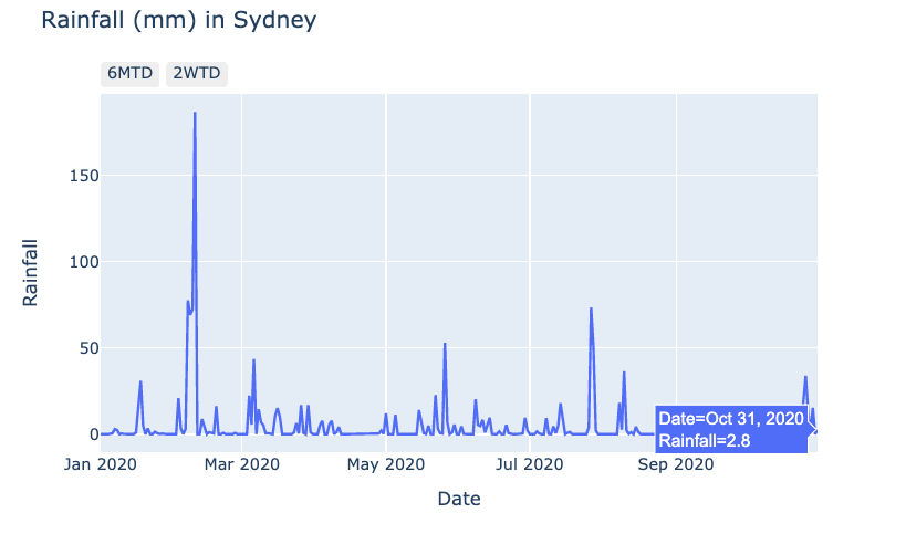
Using interactive elements:
$$
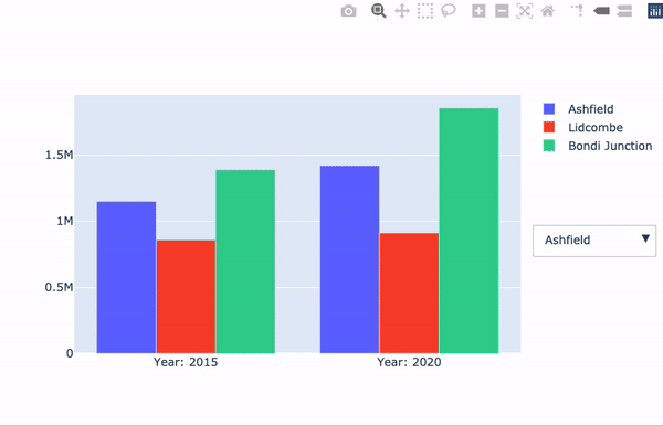
Building Dashboards with Dash and Plotly