Univariate visualizations
Introduction to Data Visualization with Plotly in Python

Alex Scriven
Data Scientist
Histograms
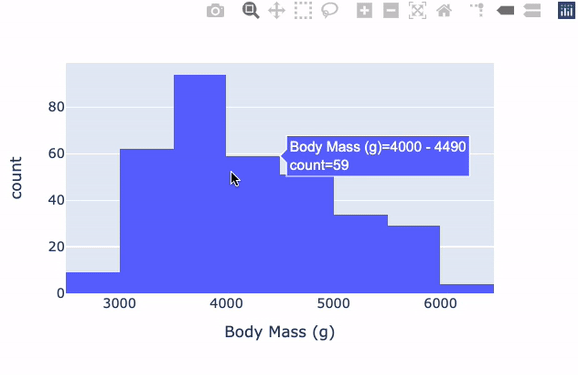
Our dataset
The dataset collected by scientific researchers on Penguins:
- Contains various body measurements like beak size, weight, etc.
- Contains different species, genders, and ages of penguins
![]()
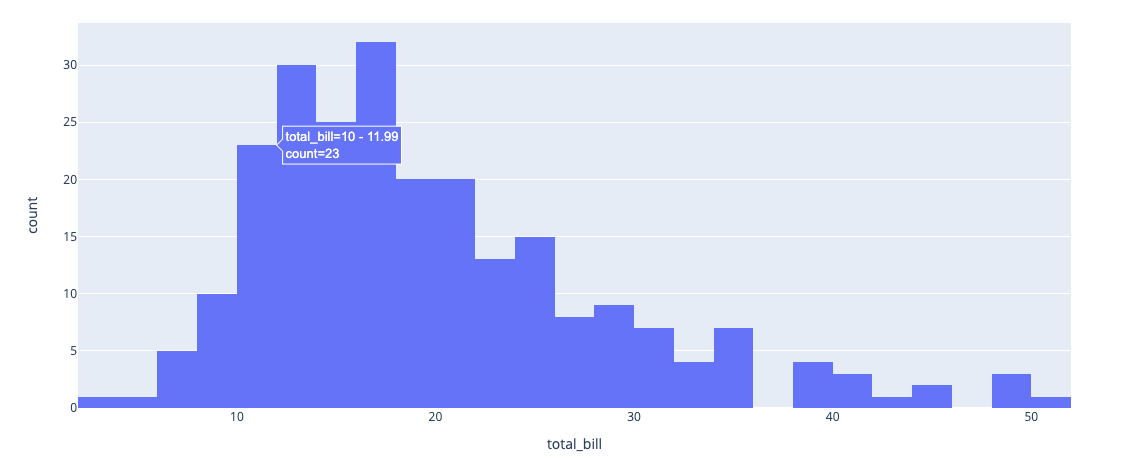
Histograms with plotly.express
Box (and whisker) plots
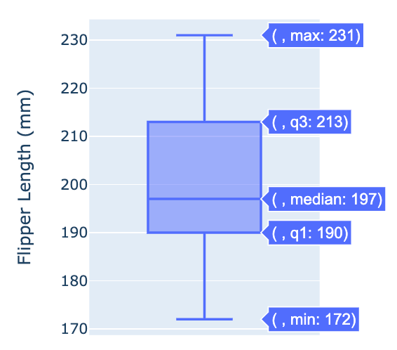
- Outlying dots are outliers
Box plots with plotly.express

