Subplots
Introduction to Data Visualization with Plotly in Python

Alex Scriven
Data Scientist
What are subplots?
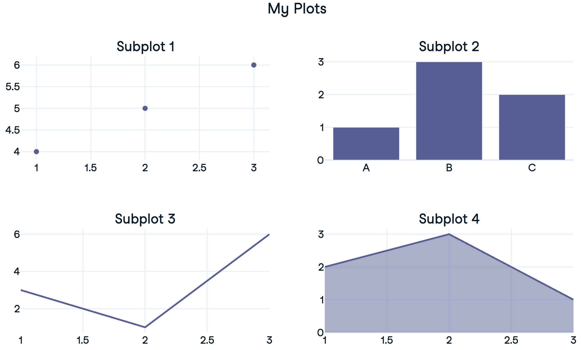
Creating a 1x2 subplot
Customizing subplots
Subplot titles
More options in the documentation
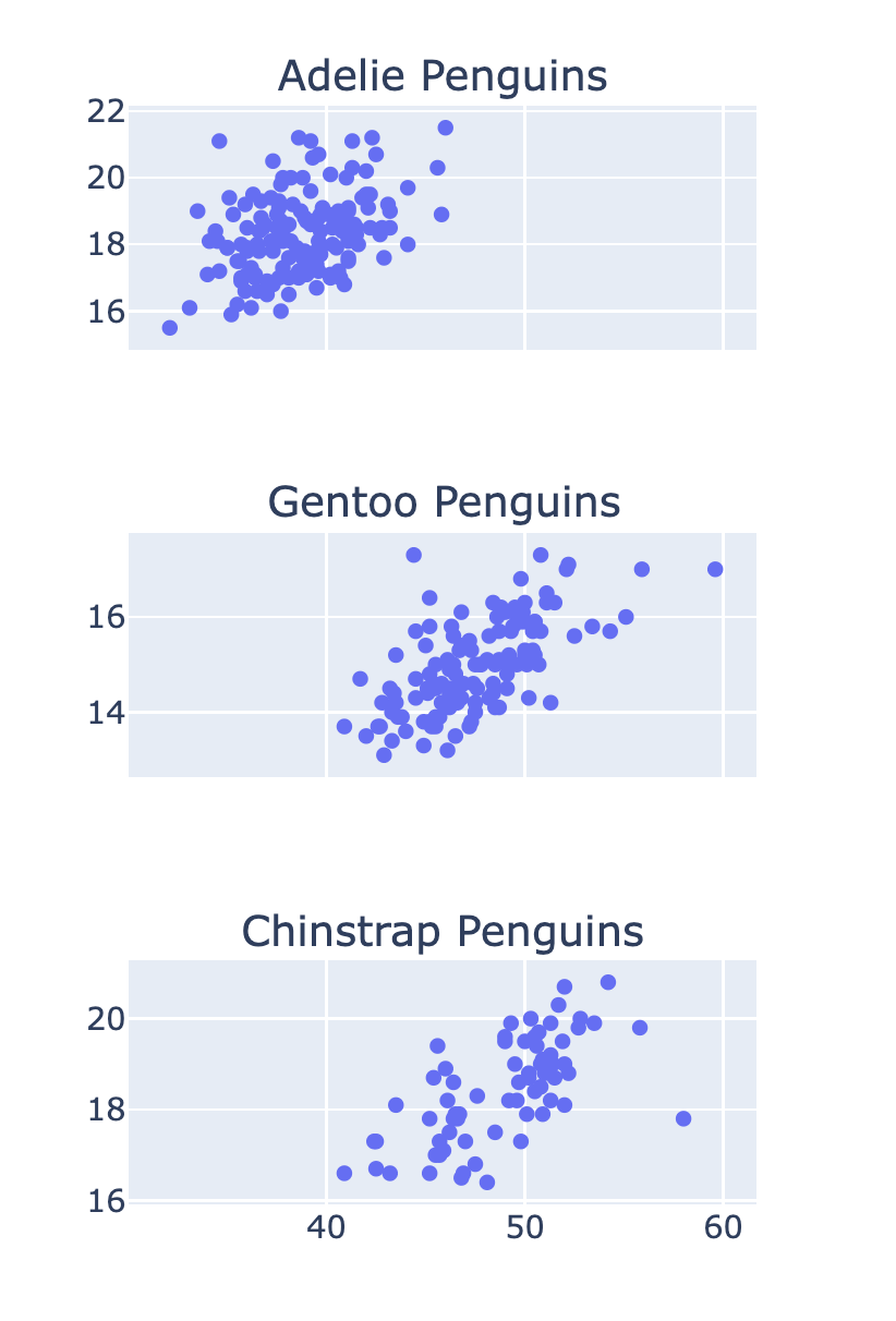
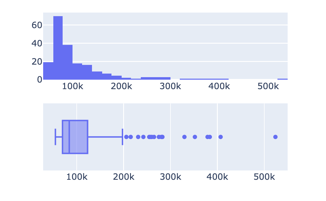
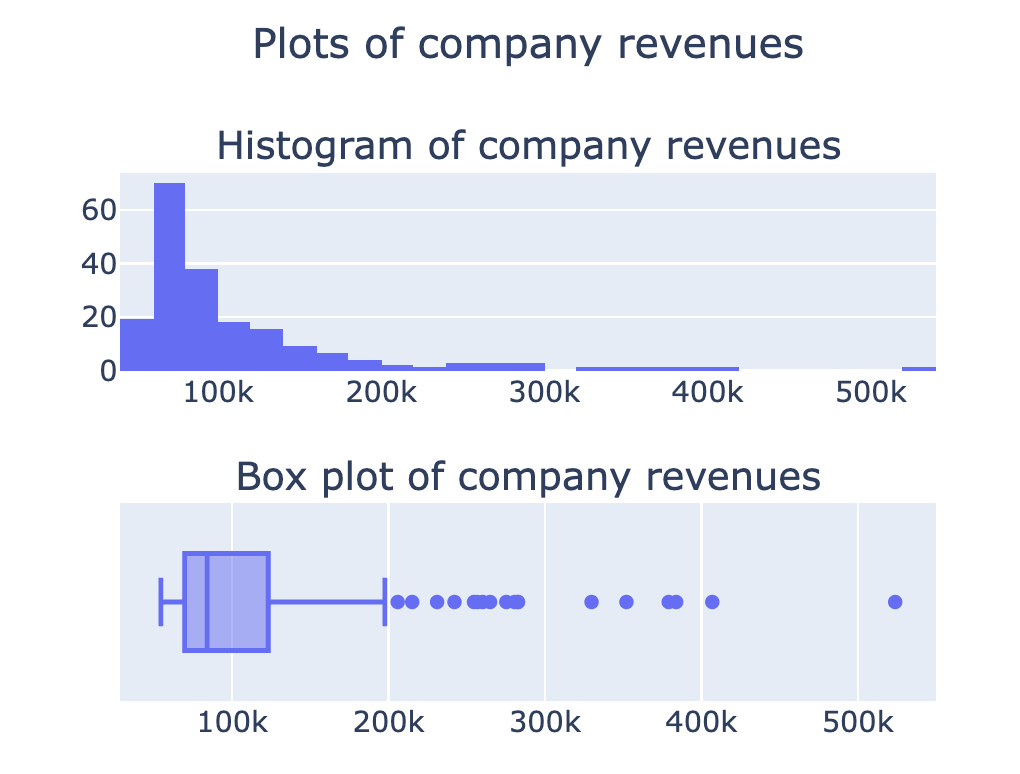
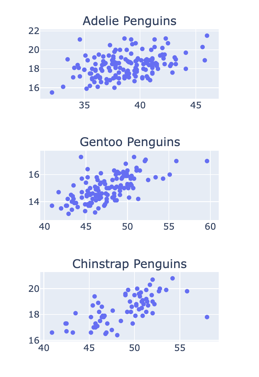
Stacked subplots
Subplots with shared axes