Customizing hover information and legends
Introduction to Data Visualization with Plotly in Python

Alex Scriven
Data Scientist
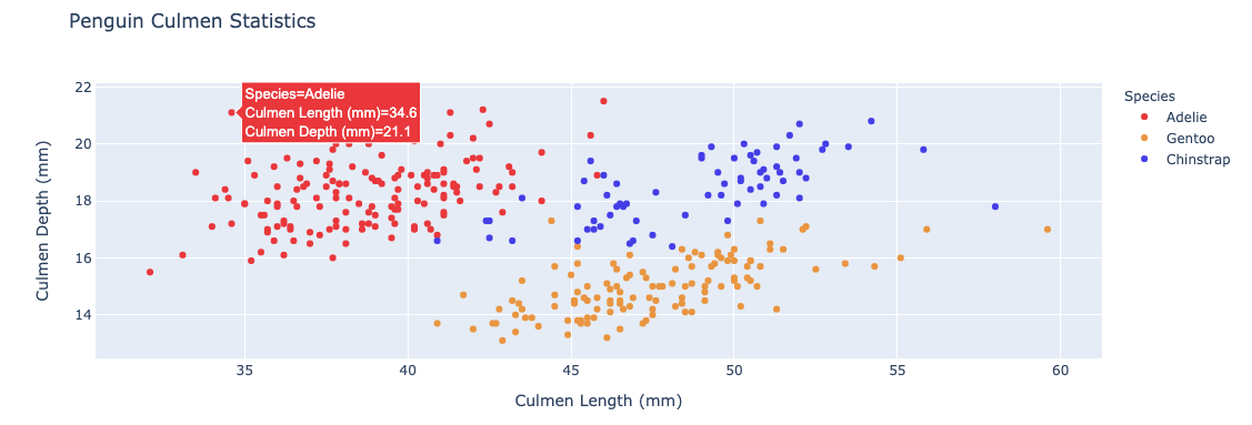
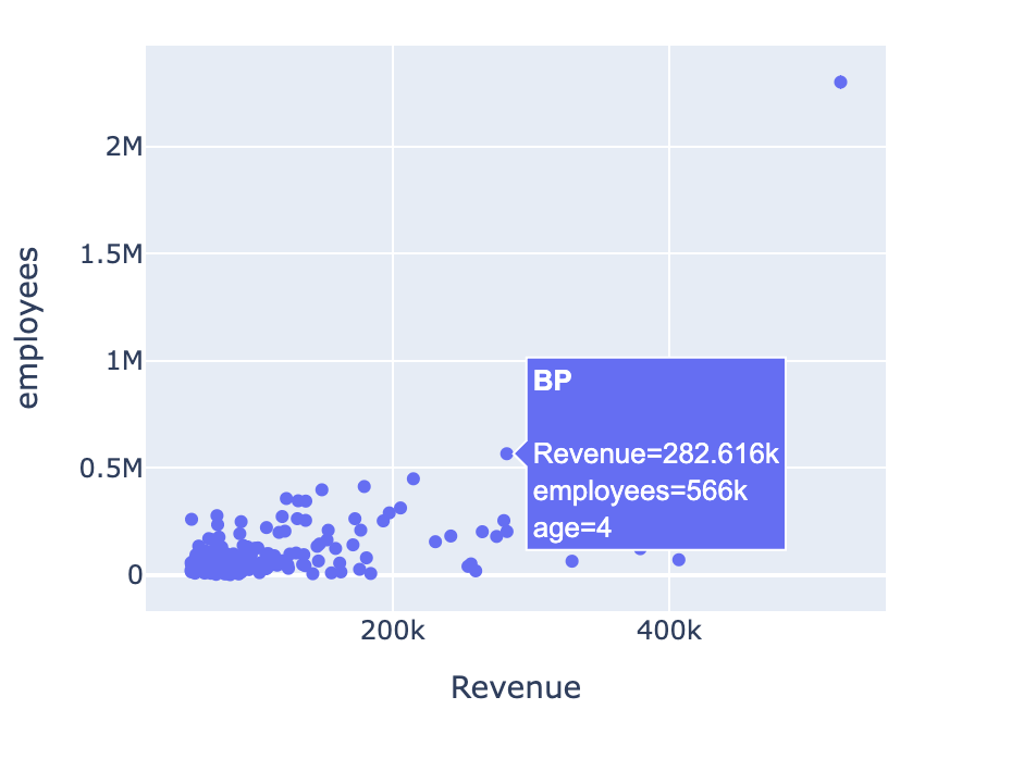
What do we mean by hover?
Hover information: The text and data that appear when your mouse moves over a data point
$$
Other default hover information
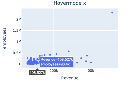
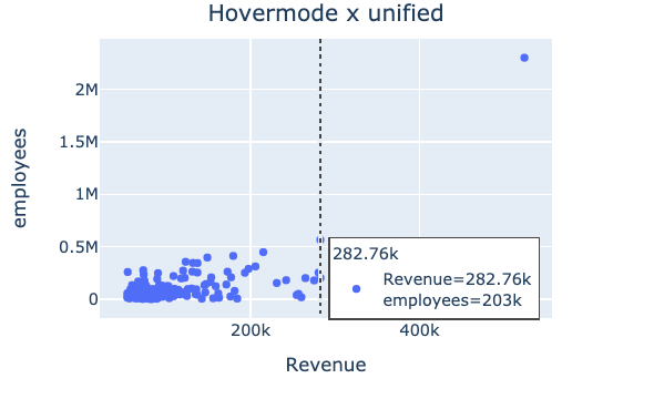
Variables in hover information
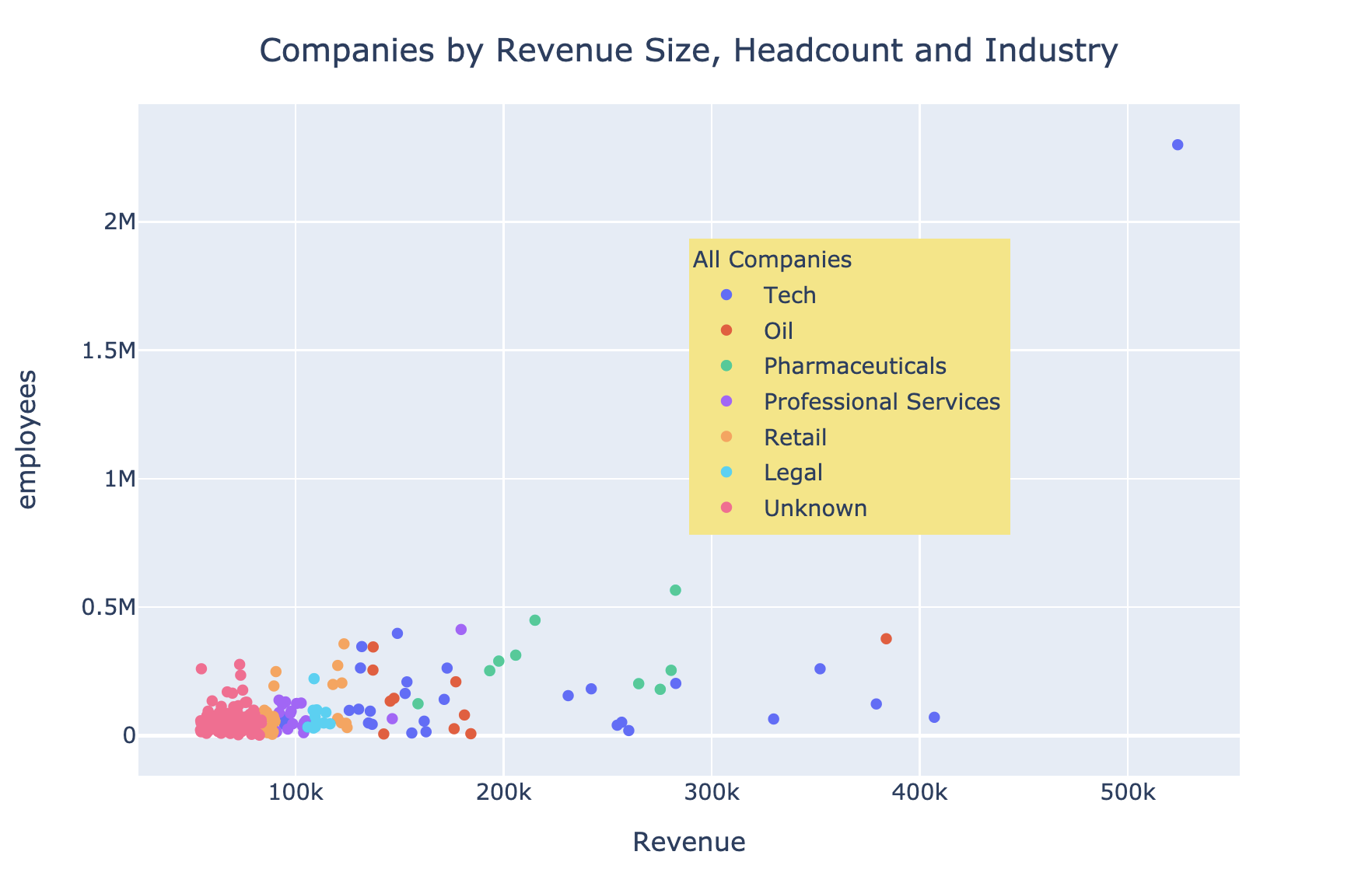
What is a legend?
- A visual guide that helps explain elements in your plot, like color or symbol
$$
- Usually added automatically when needed
- For example, when adding colors to our bar chart
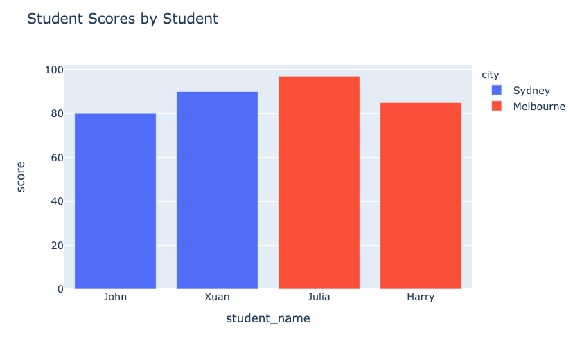
A styled legend