Visualizing model performance
Modeling with tidymodels in R

David Svancer
Data Scientist
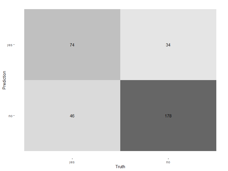
Plotting the confusion matrix
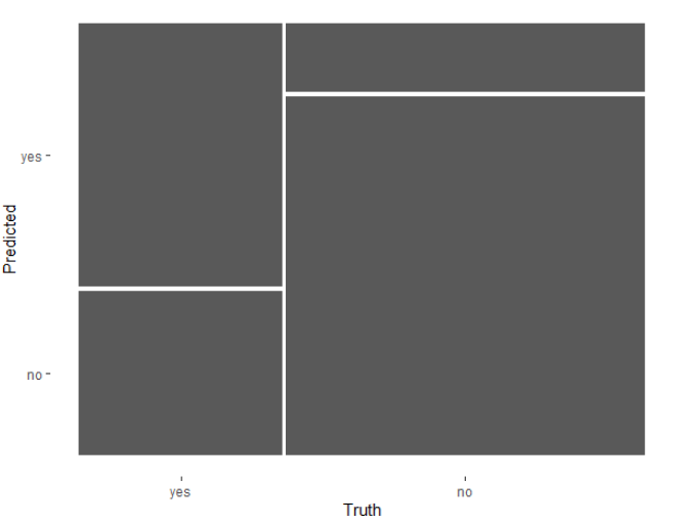
Mosaic plot
Mosiac plot
Visualizing performance across thresholds
Visualizing performance across thresholds
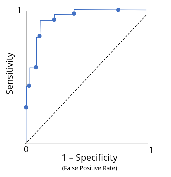
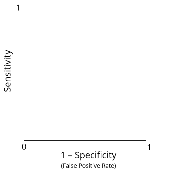
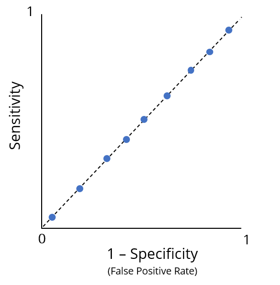
ROC curves
ROC curves
Summarizing the ROC curve
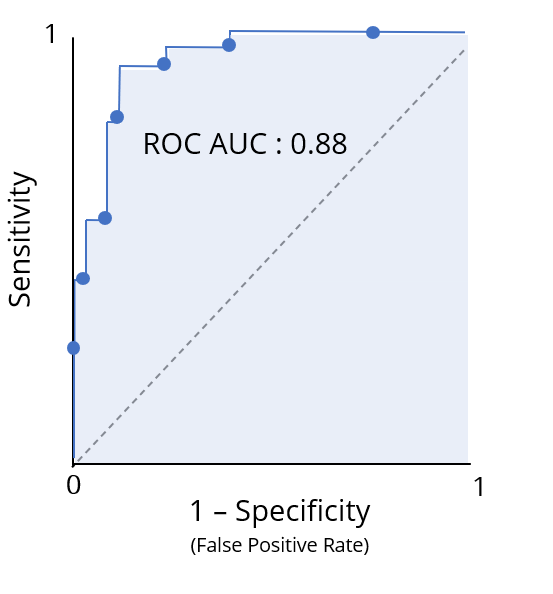
Plotting the ROC curve


