Dash AG Grid introduction
Building Dashboards with Dash and Plotly

Alex Scriven
Data Scientist
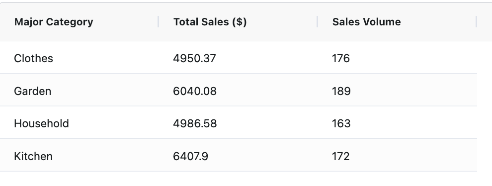
The basic table
grid = AgGrid( columnDefs=column_defs,rowData=major_cat_tb.to_dict("records"))app.layout = [grid]
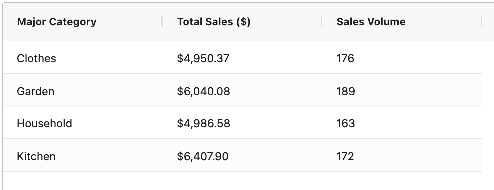
Format numbers output
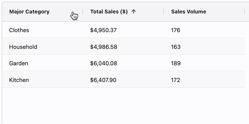
Add sorting
$$
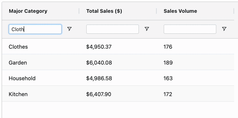
Add filtering
$$
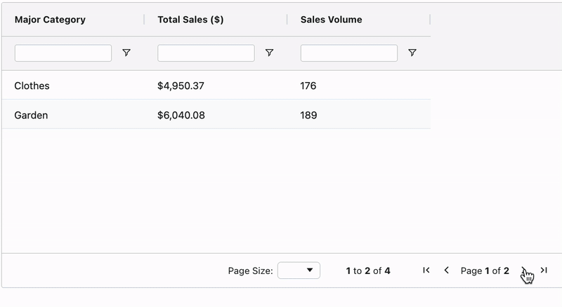
Pagination
$$
- Sort and filter apply table-wide 📌

