Positioning Dash components
Building Dashboards with Dash and Plotly

Alex Scriven
Data Scientist
HTML and the web


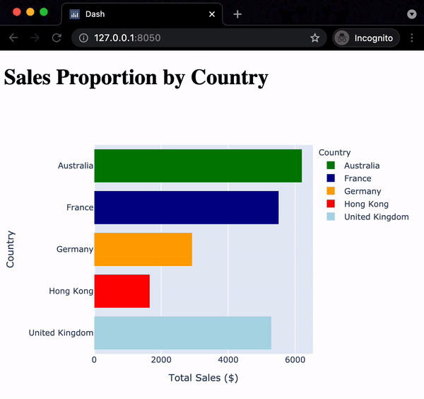
Our example displayed
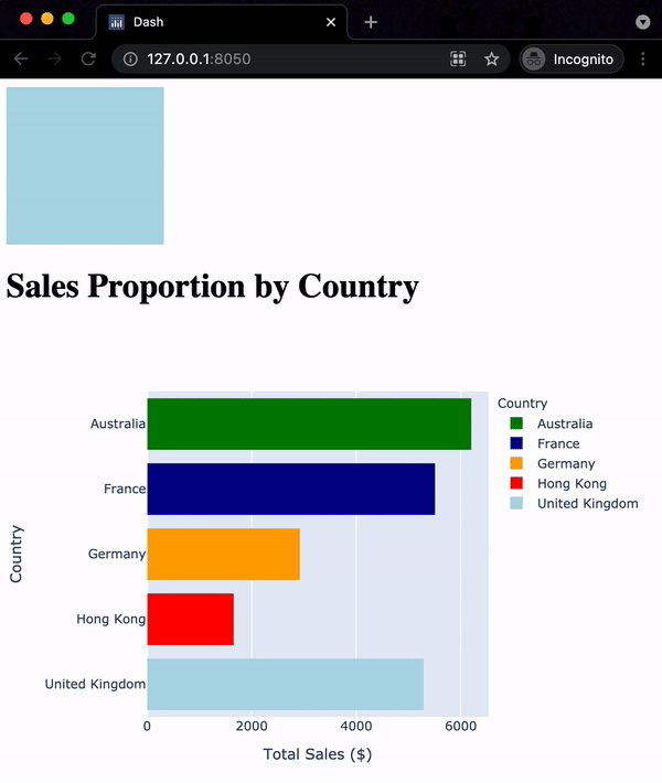
Graphs in the layout
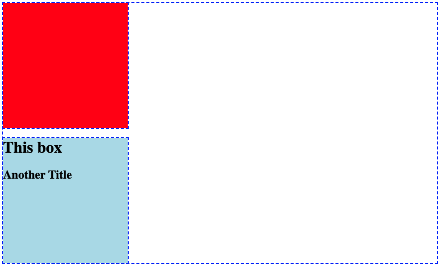
Adding more structure
$$
Building Dashboards with Dash and Plotly
Alex Scriven
Data Scientist
$$

