Advanced CSS in Dash

Building Dashboards with Dash and Plotly

Alex Scriven

Data Scientist

CSS for spacing between objects

The 'Box Model' considers each HTML element as a box with these properties:

  • Content of the object (height & width properties)
  • Padding (outside the content)
  • Border (between padding and margin)
  • Margin (outside the border, separating one element from another)
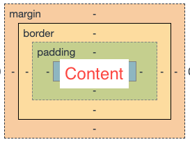
An image of four rectangles inside each other from smallest to largest. The smallest has the word content, the next ring out is padding, the next ring out is border and the final ring is margin.

Building Dashboards with Dash and Plotly

Adding a border


The border CSS argument has three elements:

  • 'border':'A B C'
    • A = width in pixels
    • B = style (E.g., solid or dotted)
    • C = color (E.g., red)
Building Dashboards with Dash and Plotly

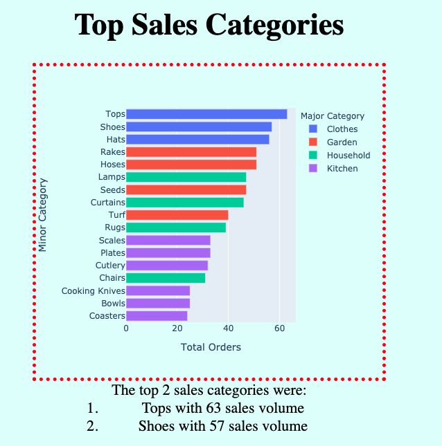
A border on our app


html.Div(dcc.Graph(figure=ecom_bar), 
 style={'width':'500px', 
        'height':'450px',
        'border':'5px dotted red'}

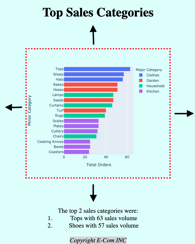
An image of a title "Top Sales Categories" below this, inside a red dotted border, is a horizontal bar chart with minor purchase categories on the y axis and total orders on the x-axis. Below this, outside the border, is a list noting the top two sales categories.

Building Dashboards with Dash and Plotly

CSS spacing

To set the spacing of an HTML element:

  • Specify four numbers for each property (Padding & Margin)
    • Clockwise will be top, right, bottom, left
  • Alternatively: one number (will be applied to all sides)
  • Alternatively: two numbers for top-bottom and left-right

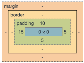
E.g., 'padding':'10px 5px 5px 15px'

Produces this:

An image of the box-model rectangles with the padding layer having numbers on each side. There is a number in the middle of each side of this rectangle. Clockwise starting at the top, these numbers are 10, 5, 5, 10

Building Dashboards with Dash and Plotly

Adding padding in Dash

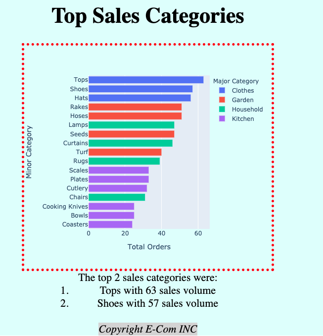
No padding:

The same image as before demonstrating the border concept. An image of a title "Top Sales Categories" below this, inside a red dotted border, is a horizontal bar chart with minor purchase categories on the y axis and total orders on the x-axis. Below this, outside the border, is a list noting the top two sales categories.

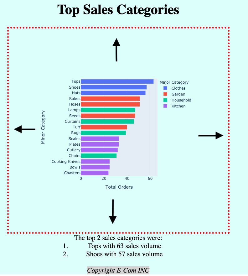
Adding 'padding':'100px':

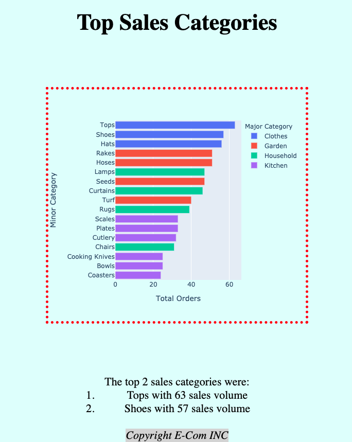
The same image as on the left-hand side, however the border has been pushed out on all sides, and there are back arrows to indicate this push. There is more space around the graph, and the title, inside the border, and text below have been pushed away.

Building Dashboards with Dash and Plotly

Adding margin in Dash

No margin:

The same image as before demonstrating the border concept. An image of a title "Top Sales Categories" below this, inside a red dotted border, is a horizontal bar chart with minor purchase categories on the y axis and total orders on the x-axis. Below this, outside the border, is a list noting the top two sales categories.

Adding margin: 100px auto:

Similar to the right-hand image on the previous slide, there are arrows to indicate additional space. However, this space is outside the border. The title and text below have been pushed out, but the space between the border and graph remains the same.

Building Dashboards with Dash and Plotly

Centering with auto margin

With: 'margin':'100px'
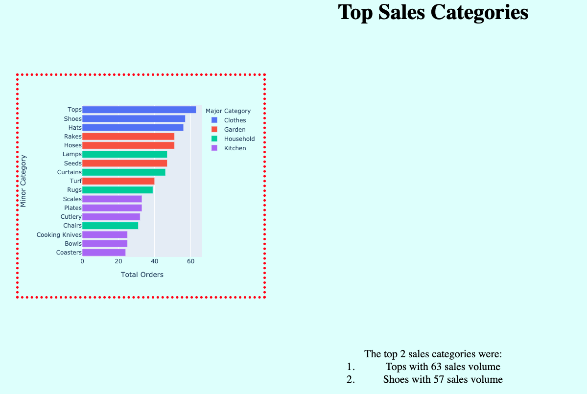
The same image as before demonstrating the border concept, however it is zoomed out, and the central graph has been left-aligned, so it is not under the title and above the text below. An image of a title "Top Sales Categories" below this, inside a red dotted border, is a horizontal bar chart with minor purchase categories on the y axis and total orders on the x-axis. Below this, outside the border, is a list noting the top two sales categories.

With: 'margin':'100px auto'

The same image as before demonstrating the border concept. The graph is center aligned under the title and above the text below. An image of a title "Top Sales Categories" below this, inside a red dotted border, is a horizontal bar chart with minor purchase categories on the y axis and total orders on the x-axis. Below this, outside the border, is a list noting the top two sales categories.

Building Dashboards with Dash and Plotly

CSS for layout

Elements not aligning? HTML elements can either be 'inline' or 'block' elements.

  • Inline render on the same line
    • Have no height or width (or box) properties
    • Examples include <strong>, <a>, <img>
  • Block stack on top of one another as they include a line break
    • Can't have more than one side-by-side
    • Examples include <h1>, <div>
  • There is also inline-block
    • Can set height/width/box properties
    • Can be side-by-side
Building Dashboards with Dash and Plotly

Inline-block elements

We can create some divs that are block and inline-block;

<div style='width:50px;height:50px;
     background-color:blue'></div>
<div style='width:50px;height:50px;
     background-color:red
     ;display:inline-block'></div>
<div style='width:50px;height:50px;
     background-color:green;
     display:inline-block'></div>

Notice the red beside green?

An image of three small colored boxes in an L-shape. There is a blue box stacked on top of a red box, which has a green box to the right of it.

Building Dashboards with Dash and Plotly

Let's practice!

Building Dashboards with Dash and Plotly

Preparing Video For Download...